Nature Photographers Network
This is the preserved archive of the original Nature Photographers Network. The community continues at naturephotographers.network.
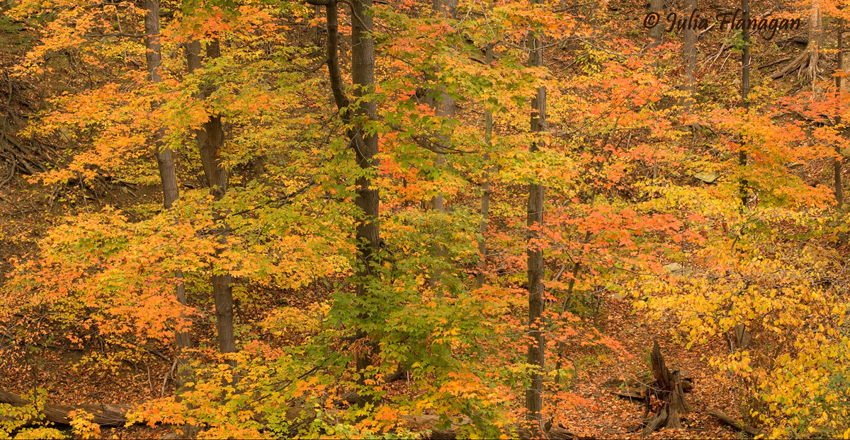
Chagrin Autumn Pano
‹ PreviousLandscape GalleryNext ›

Chagrin Autumn Pano

by Julia Flanagan

Gallery: LandscapePosted November 11, 2010414 views10 comments
Hi Folks,

Here's a stitch of 2 photos take this October near Cleveland, OH. Any comments you have are welcome. I am particularly wondering about composition - is the darkest tree too centered? Is there enough of a subject to interest you?

Is it too dark? I felt in taking the shot that the bright glow and the flow of colors in the leaves and their airy-ness was what attracted me most. Yet in processing this I don't think these things are coming across. When I brightened the image it seems do loose color richness. Hrumph. Minor adjustments in Camera RAW, stitched in CS2, levels, Tony's Luminosity Masks (not at all sure I'm using these right!)

What do you think?

Nikon D2X, Sigma 24-70mm f2.8; Manual exposure: 1/10s, f9, ISO 100

Thanks for your comments.

Comments

10 comments
Comment posted by Mark Zemmin on November 11, 2010 at 7:19 PM
Beautiful range of colors. Tough to get a nice clean woods shot like this, well done.
Registered on November 4, 2010, 8 Posts, 170 Comments
Comment posted by Morris McClung on November 11, 2010 at 7:24 PM
I think you planned out the stitch well. Excellent color and you have good structure in the comp. For personal preference, I think I would adjust the mid-tones a little more to give it a little more depth. Very well done.
Registered on May 7, 2007, 670 Posts, 19650 Comments
Comment posted by Mark Pelton on November 11, 2010 at 8:45 PM
I like the composition, Julia. You might try increading the mid tone contrast a little. Using TK's luminosity masks select basic or expanded midtones, then apply a slight S curve.
Registered on November 25, 2003, 380 Posts, 4647 Comments
Comment posted by David Page on November 11, 2010 at 11:53 PM
Beautiful color and composition. Chaotic woods are not easy to compose - you've done well with this one.
Registered on April 15, 2009, 19 Posts, 199 Comments
Comment posted by Youssef Ismail on November 12, 2010 at 11:10 AM
Julia,

Its a great composition. The only improvement I could think of is to have had another tree in the space on the right where that stump is now. Otherwise its perfect.
Registered on November 1, 2003, 474 Posts, 5555 Comments
Comment posted by Jimmy Gekas on November 12, 2010 at 12:12 PM
I like the colors and the simplicity of the image, even though the scene is far from simple. I'd look at boosting the mid tones a bit as Morris suggests and maybe even crop of the right to exclude the stump.
Registered on July 26, 2007, 244 Posts, 2807 Comments
Comment posted by Steve Sieren on November 12, 2010 at 1:50 PM
Nice fall color Julie, I'm voting for midtones!
Registered on January 2, 2008, 360 Posts, 5321 Comments
Comment posted by Tony Kuyper on November 12, 2010 at 4:06 PM
I like the scene, and the airiness you mention is here, I think. Color-wise it feels a bit warm, but that's fall color, and so it seems totally normal.
Registered on November 1, 2003, 364 Posts, 22328 Comments
Comment posted by Tony Colvin on November 12, 2010 at 10:42 PM
I think the dark tree in the middle is far enough to the left. Nice colors but maybe darken the mids a little. This looks good as is, though.
Registered on December 2, 2009, 15 Posts, 93 Comments
Comment posted by Steve Balke on November 13, 2010 at 9:31 AM
Sure reminds me of how things were around here a few weeks ago: before the leaves all fell! It seems to me it should be a bit brighter though, Julie. Such a beautiful capture should stand out more. I use the Viveza 2 Plug-in that makes things so much easier in dealing with cases like this. Nik Software has a free thirty day trial that you could download and try out on this image.
Registered on June 18, 2009, 229 Posts, 2915 Comments