Nature Photographers Network
This is the preserved archive of the original Nature Photographers Network. The community continues at naturephotographers.network.
Leidig Meadow Departure
‹ PreviousLandscape GalleryNext ›

Leidig Meadow Departure

by Lon Overacker

Gallery: LandscapePosted November 29, 2010292 views26 comments
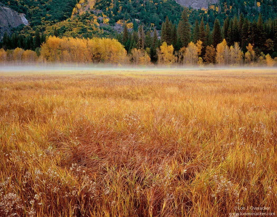
Departure because the fog was departing, but also a departure from my usual fare of trees and chaos. Here's a bit more of a regular landscape image with a near/far composition.

A few weeks back now, Harley, Preston, Kyle K. and myself wandered this meadow early one morning. The grasses were wet with dew and the fog across the meadow drifted in and out. I was fascinated with details, colors, patterns and layers in the grasses but had the hardest time finding something I could bring out the camera for.

So I'm not sure if this translates well on the web or if the brownish grasses in the little circle are enough to hold ones attention. I had a tough time with the scan and processing so I'm curious to hear what you all think about this one. Comp, colors, sat, processing, etc. etc.

Chamonix 4x5, Fuji 135mm, V100, F/45 @3s
TK's masks and actions.

Thanks!

Lon

Comments

26 comments
Comment posted by Nick Bristol on November 29, 2010 at 8:22 PM
Fantastic! I love the colors in the grass and the amazing detail. The fog at the base of the hills is a nice addition too. The different greens mixed in with the yellows look great. I like this alot, Lon. The time you spent coming up with a comp really paid off with this. Just wonderful!

Nick Bristol
Lone Rock, Wi.
Registered on February 1, 2004, 752 Posts, 14140 Comments
Comment posted by Jeremy Kessler on November 29, 2010 at 8:29 PM
Awesome! Love grasses like this, I'd love to lie down there right now. Already missing fall...
Registered on September 13, 2007, 36 Posts, 1283 Comments
Comment posted by Zack Clothier on November 29, 2010 at 8:32 PM
Hey Lon, IMO there is not enough FG elements to hold my interest here. I find my eye being focused on the fog and beautiful foliage in the background. As far as processing goes this one looks very natural to me. You did a nice job of nailing the exposure. :smile:
Registered on January 28, 2010, 343 Posts, 2257 Comments
Comment posted by Dan Baumbach on November 29, 2010 at 9:48 PM
I don't know, Lon. The large version is impressive and that foreground detail is awesome, but I want a stronger background to go with this. The larger version is definitely better so maybe a print of this would work.

- Dan.
Registered on November 1, 2003, 473 Posts, 7980 Comments
Comment posted by Harley Goldman on November 29, 2010 at 10:15 PM
I like it Lon. Great foreground grasses, leading into a nice band of fog and some matching trees. Pull a little blue out of the very background trees? Pretty minor nit. This one works for me.
Registered on November 19, 2003, 586 Posts, 11271 Comments
Comment posted by Tyson Fisher on November 29, 2010 at 10:17 PM
Fantastic image, Lon! The strip of dissipating fog is a great anchor. I don't find the fg empty at all. I'm really enjoying the swirling yellow, brown and green color palette in the grasses. Yet another winner.
Registered on September 17, 2008, 44 Posts, 623 Comments
Comment posted by Floris van Breugel on November 29, 2010 at 10:39 PM
That mist really adds something special to the scene. Lots of fall yellows to take in here!
Registered on December 19, 2008, 306 Posts, 4840 Comments
Comment posted by Paul Breitkreuz on November 29, 2010 at 10:49 PM
Lon, I really like the long lead into the background area toward the low ground fog as a result of an early morning warming affect over the meadow grass. The BG area of the first and second row of trees also provides an excellent backdrop. I will say that the large boulder or granite wall in the back area is a bit of an eye pull for me. I might be the only one who might suggest a very slight crop and or clone job in that area. Not sure why, but when I first opened the image up the draw was to that point. On the other hand, I find no issue at all with the boulder or granite wall to the left, it's fine as is. Just thinking out loud here.
I also see no negative issues with the processing at all. :cool:
Registered on February 25, 2006, 525 Posts, 8448 Comments
Comment posted by Chris Chamberlain on November 29, 2010 at 10:58 PM
This definately works for me. I think when you have such great rich natural color, combined with great detail, it's enough. I don't know why for sure, but I really took notice to the color and texture of the grasses in the meadows this year. I like your background just fine, and this is a great shot as is. But..... I can see a shot that is just the grasses fading into a fog bank and that's it. maybe it doesn't work here in this situation, and comp. But for future reference, if the fog was heavier/thicker(occupied more of the vertical real estate in the frame) you could just compose a tighter frame of the grasses and let it run into the fog that would cover the top portion of the frame. I'm thinking of those really simplistic ocean shots of just water that melds into the horizon/sky in a subtle way.

Chris
Registered on March 13, 2007, 500 Posts, 8365 Comments
Comment posted by Youssef Ismail on November 29, 2010 at 11:02 PM
Lon,

This is a tactile photo, you need to see it big to get a sense of the foreground grasses. The bigger the better. There might be a tad too much blue in the background trees on the slope as Harley mentioned. Otherwise print it real big. :biggrin:
Registered on November 1, 2003, 474 Posts, 5555 Comments
Comment posted by Tony Kuyper on November 29, 2010 at 11:09 PM
The grass textures are very appealing, Lon, and the high horizon makes for a very dynamic image. In the larger version the background trees seem a bit bluish, but that does add a sense of layering and depth to the scene.
Registered on November 1, 2003, 364 Posts, 22328 Comments
Comment posted by Preston Birdwell on November 30, 2010 at 12:12 AM
This is beautiful, Lon. It shows well the sense of space in the meadow. The maples on the south side look perfect.

I'd love to see a big print of this; the detail is really something.

Well done!

--P
Registered on November 1, 2003, 471 Posts, 5188 Comments
Comment posted by Julian Barkway on November 30, 2010 at 12:22 AM
Only 'sort of' a 'regular landscape', Lon. Where's the rock on a conjunction of thirds? The overblown sunset light? The strong wide-angle perspective...? Really, Lon. You can do better than this. :biggrin:

Actually, it pushes all the right buttons for me. I love it!
Registered on January 18, 2007, 344 Posts, 1961 Comments
Comment posted by Stan Rose on November 30, 2010 at 3:21 AM
Pretty, Lon! Great fg textures. Even though it would cut the treetops off, i prefer a crop just above the yellow trees--that would really emphasize their color agains the dark bg, and give even more emphasis to the great fg.
Registered on September 15, 2005, 836 Posts, 17099 Comments
Comment posted by Andreas Resch on November 30, 2010 at 5:13 AM
Shots like this one bump my LF enthusiasm even more. What a view must this be on a huge canvas. Just a stunning capture, Lon.
Registered on November 14, 2007, 322 Posts, 6101 Comments
Comment posted by Robert Dayton on November 30, 2010 at 9:45 AM
I like the colors and the emphasis on the FG.
The fog in the BG is definitely a plus. Well
seen and composed.
Registered on November 11, 2008, 281 Posts, 3958 Comments
Comment posted by Kah Kit Yoong on November 30, 2010 at 11:55 AM
It's very pretty Lon and the foreground details are delightful. However there's something a little off with the proportions of elements that doesn't make it work 100%.
Registered on September 27, 2006, 636 Posts, 10682 Comments
Comment posted by Jason Kim on November 30, 2010 at 1:03 PM
This looks very interesting to me, Lon. There is clearly a ton of fascinating detail in those grasses, and I think the composition is perfectly balanced.
Registered on July 1, 2006, 60 Posts, 1233 Comments
Comment posted by Michael J Greene, on November 30, 2010 at 1:06 PM
Lon,

The large version looks great.Lots of texture and a smattering of color to look at. To be very constructively critical - I'd say on my monitor I'd say the color balance here is slightly blue - most noticeble in the background conifers. Just a little though....I hope this helps.

Michael
Registered on June 18, 2009, 86 Posts, 2317 Comments
Comment posted by Vance Gese on November 30, 2010 at 3:34 PM
Fantastic Lon. The pattern and texture of the foreground grasses are superb, and I love the subtle circular pattern in those grasses; just enough to engage the viewer but not stopping the eye from exploring all the wonderful details and textures. That mist sure adds a wonderful element to the mood of the image. This is the type of art that needs to be viewed in a large print. Exquisite work.
Registered on November 13, 2008, 298 Posts, 6629 Comments
Comment posted by Dorin Bofan on November 30, 2010 at 4:37 PM
It might be something else from you, Lon, but one can easily recognize your style. It's subtle, intimate and it calls for the same attention to details. Do more like this one! It's superb!
Registered on April 30, 2007, 122 Posts, 3086 Comments
Comment posted by Kevin Trinkner on November 30, 2010 at 5:44 PM
Beautiful image Lon, love the soft mood of this one. Great colors and light throughout. I wouldn't mind a touch more room on the top, but I can understand why you were focused on the grasses. Nice work.
Registered on June 30, 2008, 203 Posts, 2641 Comments
Comment posted by Lon Overacker on November 30, 2010 at 6:09 PM
Thank you all for your comments and suggestions. Good calls on the blues of the evergreens in the far back and for lightening the part of the granite rock in the UL. If this ever sees the light of print, I'll be sure and fix those. Also like the crop suggestions although I think as a large print a crop would be needed less because I think the foreground detail would really show well - but it would have to be in a bigger print; not this teenie web stuff. I think Youssef nailed it calling it a "tactile" photo.

Thanks for the honest comments and critiques. Next, I think more trees....

:wink:

Lon
Registered on November 24, 2006, 521 Posts, 19147 Comments
Comment posted by Mark Pelton on November 30, 2010 at 9:27 PM
Very nice, Lon. Love the composition, although I would crop from top just down to the top of conifers on right.
Registered on November 25, 2003, 380 Posts, 4647 Comments
Comment posted by Bill Chambers on November 30, 2010 at 9:38 PM
Translates nicely IMO. I love the golden color and the comp with it's emphasis on th FG grasses. Beautiful image Lon.
Registered on April 10, 2005, 753 Posts, 21216 Comments
Comment posted by Mel Ladewig on December 1, 2010 at 9:16 AM
I'd say that works pretty darned well on the web Lon. Lots to see in the textures and an interesting background to complement the foreground patterns.
Registered on July 24, 2005, 114 Posts, 1205 Comments