Nature Photographers Network
This is the preserved archive of the original Nature Photographers Network. The community continues at naturephotographers.network.
Christmas Calla + B&W
‹ PreviousFlora GalleryNext ›

Christmas Calla + B&W

by Anne K. Rusk

Gallery: FloraPosted December 9, 201053 views14 comments
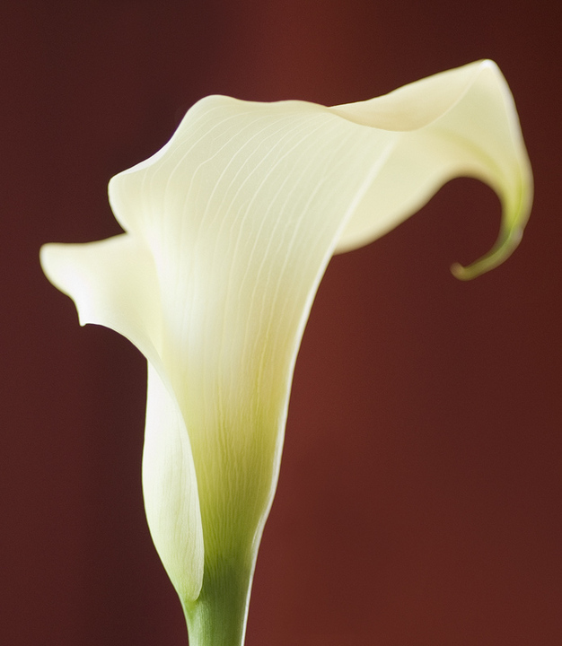
Here is a second attempt at the Christmas Calla. I have included a B&W conversion using Silver Efex Pro that I may like better than the color. What do you think? Do you like the vertical version better than the horizontal? All C&C welcome!
Thanks for looking,
Anne
105mm, f2.8, 1/125sec

Comments

14 comments
Comment posted by Anne K. Rusk on December 9, 2010 at 10:29 PM
Here's the B&W for comparison!
Registered on October 10, 2010, 65 Posts, 904 Comments
Comment posted by Pat Sampson on December 9, 2010 at 11:00 PM
Anne,

I prefer the vertical because I like the lines in it better. I also prefer the black and white version because the color seems to me to detract from the shape of the flower and I like the shape. I think I would probably prefer more dof in this but I like the image as posted.

pat
Registered on May 19, 2007, 953 Posts, 15989 Comments
Comment posted by Gary Yeoh on December 10, 2010 at 2:18 AM
Anne:
Pat said it all. The B&W is just fabulous but a little more DOF to get the top curvy bit sharp would be nice.
Registered on September 1, 2009, 588 Posts, 8184 Comments
Comment posted by Bob Duff on December 10, 2010 at 6:49 AM
B&W for me as well Anne. Te B&W emphasizes the graphical quality of the bloom and does keep the texture.
Registered on April 21, 2010, 160 Posts, 1675 Comments
Comment posted by Michael Lowe on December 10, 2010 at 9:48 AM
I'll echo the preceding comments. :wavey:
Registered on February 11, 2004, 777 Posts, 5252 Comments
Comment posted by Carol Hyman on December 10, 2010 at 10:06 AM
Hi Anne, I like your composition very much; in this particular case, I prefer the color.

One suggestion you might want to try would be to shift your background color gradation from horizontal to vertical since your focus goes in that direction. and truthfully, not sure if it will work.

Nice job and good experiment.

Cheers,

Carol
Registered on January 18, 2007, 597 Posts, 8062 Comments
Comment posted by Ed Lowe on December 10, 2010 at 10:59 AM
I'll have to jump on the B&W bandwagon also, Anne. It just seems like an elegant presentation for the calla.

Ed
Registered on February 7, 2004, 414 Posts, 7115 Comments
Comment posted by Buck Ward on December 10, 2010 at 2:04 PM
I'll be the contrarian here and say I prefer the color version. I really like the strong graphic composition. Having the curl on the right sharply in focus would have been a significant enhancement, IMO.
Registered on December 8, 2003, 96 Posts, 1917 Comments
Comment posted by Doug Roane on December 10, 2010 at 2:15 PM
wonderful graphic lines, which I think are best viewed in the BW. I also would like the top curve to be sharp to make this really work.
Registered on December 12, 2008, 213 Posts, 2226 Comments
Comment posted by Morris McClung on December 10, 2010 at 6:03 PM
Excellent background and pov! Beautiful image!
Registered on May 7, 2007, 670 Posts, 19650 Comments
Comment posted by Anne K. Rusk on December 10, 2010 at 9:24 PM
Thank you so much, everyone! I prefer the B&W for this one and really like how the flower seems to glow. I wish I had stacked the images to get the curl sharp, but I didn't leave myself that option. :mad: Lesson learned for the next time! Thanks for taking the time to comment!
Anne K.
Registered on October 10, 2010, 65 Posts, 904 Comments
Comment posted by Krunal Janani on December 11, 2010 at 8:40 AM
I'm a colour guy but i perfer the B/W version in this also like every1 i too wud like a bit more of DOF
Registered on September 16, 2010, 60 Posts, 1370 Comments
Comment posted by Bill Fach on December 12, 2010 at 10:20 AM
Anne: I'm mostly a color guy but in this particular case I do prefer the B&W. I much prefer this vertical presentation also but I think that's just cause I seem to see better in vertical comps (probably 75%+ of my own shots). I'm OK with the OOF curl and for some reason find it less of a problem - if at all - in the B&W. Nicely done.>=))>
Registered on November 1, 2003, 1805 Posts, 26981 Comments
Comment posted by Giuseppe Guadagno on December 13, 2010 at 3:19 PM
A white silhouette against a very elegant background. Simple and beautiful.
Take care.
Registered on February 3, 2007, 827 Posts, 5052 Comments