Nature Photographers Network
This is the preserved archive of the original Nature Photographers Network. The community continues at naturephotographers.network.
Moody Storr (BW & Color)
‹ PreviousLandscape GalleryNext ›

Moody Storr (BW & Color)

by Kah Kit Yoong

Gallery: LandscapePosted December 13, 2010241 views22 comments
Isle of Skye

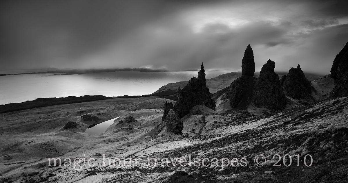
Morning fog rolls onto the Trotternish peninsula before a light show to remember. It's a close call but I like the BW version better.

Canon 5DMkII, 16-35mm 2.8L, ISO 100, f11, 10 seconds, GND filter, Gitzo Explorer tripod.

Comments

22 comments
Comment posted by Kah Kit Yoong on December 13, 2010 at 1:36 AM
And the colour.
Registered on September 27, 2006, 636 Posts, 10682 Comments
Comment posted by Floris van Breugel on December 13, 2010 at 1:38 AM
Those rock formations really are fascinating! I love the drama in the black and white, though I do wish for just a bit more detail in the blacks.
Registered on December 19, 2008, 306 Posts, 4840 Comments
Comment posted by Rick Lundh on December 13, 2010 at 3:11 AM
I agree...the B&W is more suited to this landscape. The spires seem a tad dark to me though. Very cool and stark image here.
Registered on April 28, 2004, 774 Posts, 4351 Comments
Comment posted by Lon Overacker on December 13, 2010 at 3:56 AM
Kah Kit,

Great take on this now popular location. It's amazing the number of places I had never heard of or even seen pictures of until becoming part of this international community.

I too prefer the b&w and here's why. The colors are great, especially the greens which we come to expect right? It's the rock where the shadow detail is lost. For me anyway, it's like I expect more detail in the color version, but the b&w version it's an asset helping to create the tonal range and great contrast in the landscape. and for that, I think it makes the b&w more of a bold landscape. If that makes sense.

Lon
Registered on November 24, 2006, 521 Posts, 19147 Comments
Comment posted by Catherine Reilly on December 13, 2010 at 4:15 AM
Mmm, close call indeed. B/W by a wisp. For those of us who don't know where this is-- where is it? :wink:
Registered on August 16, 2006, 603 Posts, 9192 Comments
Comment posted by Kah Kit Yoong on December 13, 2010 at 6:21 AM
The Isle of Skye in Scotland Catherine.
Registered on September 27, 2006, 636 Posts, 10682 Comments
Comment posted by Guy Tal on December 13, 2010 at 7:24 AM
Very dramatic setting and light. I like the beautiful classic tones and the silvery look of the water. I'm sure this will look fantastic in a print.

Guy
Registered on November 1, 2003, 566 Posts, 15507 Comments
Comment posted by Avi Hirschfield on December 13, 2010 at 7:47 AM
The B/W is great and yes a little to black in the rocks
But I would love to see this photodoubled with the colour and then desaturated so that there is just a hint of colour.
Thats MHO :wink: :wavey:
Registered on November 1, 2003, 518 Posts, 2114 Comments
Comment posted by Raymond D Smith on December 13, 2010 at 8:51 AM
I do prefer the black and white Kah. It would be nice to see a little more detail in the spires but I don't think it's necessary. This one is all about the mood and you have conveyed it beautifully. Cheers
Registered on January 22, 2009, 12 Posts, 479 Comments
Comment posted by Bill Chambers on December 13, 2010 at 9:15 AM
Definitely B&W for me. I like the pano crop, but I might crop 5% off the right side to eliminate the formation that is half cut off.
Registered on April 10, 2005, 753 Posts, 21216 Comments
Comment posted by Kurt Budliger on December 13, 2010 at 9:36 AM
Very nice, I too prefer the black and white, especially the contrast in the ground cover which almost looks like it could be snow in the b&w.
Registered on June 11, 2006, 113 Posts, 2116 Comments
Comment posted by Abdullaziz Bin Ali on December 13, 2010 at 9:45 AM
Wow
this location is amazing, You are lucky to have such a great result from there
I feel the blacks are a little bit dark
Well done Kah
Registered on May 31, 2009, 112 Posts, 1590 Comments
Comment posted by Nick Bristol on December 13, 2010 at 9:58 AM
This is a wonderful scene. I Lean towards the b/w version also, even though I think the color is beautiful. I do feel the darks are a little to dark also, but still think this is wonderful.

Nick Bristol
Lone Rock, WI.
Registered on February 1, 2004, 752 Posts, 14140 Comments
Comment posted by Harley Goldman on December 13, 2010 at 12:20 PM
Really nice image! I prefer the B&W, more mysterious and other-worldly mood, but the color works well too. Good stuff.
Registered on November 19, 2003, 586 Posts, 11271 Comments
Comment posted by dean hebert on December 13, 2010 at 1:57 PM
Well, I prefered the colour until I looked at the larger size, now I think I'm leaning towards the B&W. I agree with the crop from the right to remove the cut-off rock formation. I might even consider a crop from the left as well.
Registered on August 4, 2010, 70 Posts, 1132 Comments
Comment posted by Arnab Banerjee on December 13, 2010 at 3:13 PM
I would prefer some details on those spires - but probably the rocks (granite?) very dark there. I remember this view very well - an iconic location there...very well done with the mood
Registered on January 3, 2007, 313 Posts, 2270 Comments
Comment posted by Jim Lou on December 13, 2010 at 4:34 PM
I like the BW between. I feel it is more moody than the color version. Maybe it is my work monitor, I wish to see some details in the rock formation.
Registered on August 3, 2010, 86 Posts, 273 Comments
Comment posted by Jeremy Kessler on December 13, 2010 at 9:26 PM
I think I prefer the color version more, although they are both fantastic. I do wish there was just a tad more detail in the rocks.
Registered on September 13, 2007, 36 Posts, 1283 Comments
Comment posted by Dietrich Gloger on December 14, 2010 at 1:13 AM
Love it! The bw is excellent, love the stark contrast and the daramitic conditions. The pano crop works great for the scene too. The color version is as good - those typical greens are to be appreciated!
Registered on January 26, 2007, 360 Posts, 9876 Comments
Comment posted by Gino Cortez on December 14, 2010 at 2:58 AM
Dynamic black and white rendering. To me it evokes a haunting, almost melancholy sense of timelessness. I like this very much. :toast:
Registered on November 23, 2010, 57 Posts, 396 Comments
Comment posted by Chris Chamberlain on December 14, 2010 at 11:09 AM
It is a close call. I wouldn't want to choose. I guess in the end, the b&w does have more drama, and visual impact. Both are nice!

Chris
Registered on March 13, 2007, 500 Posts, 8365 Comments
Comment posted by Arild Heitmann on December 15, 2010 at 3:58 AM
I prefer the b&w...what a great landscape! Great mood...
Registered on October 13, 2010, 27 Posts, 378 Comments