Comment posted by dean hebert on December 18, 2010 at 7:23 PM
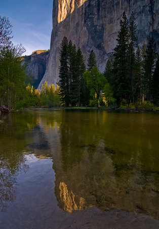
The light here is great but I don't think cutting off the very top of the mountain is working in your favour.
Registered on August 4, 2010, 70 Posts, 1132 Comments
Comment posted by Robert Dayton on December 18, 2010 at 7:46 PM
Great light and well composed, Jim! I like the lighting on the subtle colors.
Registered on November 11, 2008, 281 Posts, 3958 Comments
Comment posted by Andy Richards on December 19, 2010 at 9:24 AM
Well done reflection shots are always a draw for me. I like this one. I blogged about reflections a few weeks back and one of my points was that while the classic reflection shot seems to always be symmetrical, sometimes there is more interest if they are not. I am not sure when I look at this one, about excluding the top of El Capitan. I am betting you took an image where it showed, and ultimately, liked this one better. It creates a certain tension -- otoh, it also draws my eye into to the reflection, which is, I think, a good thing. I would be interested to hear your thinking on this.
Registered on November 7, 2010, 37 Posts, 114 Comments
Comment posted by Guy Tal on December 19, 2010 at 10:21 AM
Beautiful reflection, though I also think the composition could be stronger with either more (including the top) or less of the cliff in the upper half.
Guy
Registered on November 1, 2003, 566 Posts, 15507 Comments
Comment posted by Jim Lou on December 20, 2010 at 12:00 PM
Thanks for your feedbacks.
Andy, I considered of using classic symmetrical reflection composition, however, I felt it would divide viewer's attention. I wanted the reflection as focus. In additional, for this scene I felt not show entire El Capitan adds sense of its height. I also include bright triangle as pointer to the reflection.
Guy, as I explained above about not showing more of the top. I considered of removing part of top. But I struggled with cropping. I didn't think cropping out tree tops would work. What is your opinion?
Thanks
Registered on August 3, 2010, 86 Posts, 273 Comments
Comment posted by Lon Overacker on December 20, 2010 at 3:20 PM
Jim,
Thought I would chime in and tell you that I like the composition. I think you succeeded in making the reflection the main subject; and still showed the grandeur of El Cap. As far as cropping any more from the top, if it were mine, I wouldn't. You would have to crop well in to the trees and then go until you cropped out the sky too. That could certainly work as an alternate, but it's a completely different image. I think this works well as presented. Wish it were bigger though!
Lon
Registered on November 24, 2006, 521 Posts, 19147 Comments
Comment posted by Zaynab on December 20, 2010 at 10:11 PM
Very nice shot Jim. I would include the top of El Capitan in this photo other than that great
photo
-zaynab
Registered on November 16, 2010, 8 Posts, 30 Comments
Comment posted by Jim Lou on December 21, 2010 at 10:15 AM
Lon, thank you for the input and analysis. You are right that cropping out sky would give a different feel to the image. By doing that, I think the lighted tree top on the LHS would become more predominant. And RHS dark area would be over bearing as well. Either lighten that area or cropping out portion of it.
About posting a larger size, I always have trouble with a vertical shoot until it is too late. I wish we can edit photo link even after the photo has been posted.
Registered on August 3, 2010, 86 Posts, 273 Comments


Comments
8 commentsGuy
Andy, I considered of using classic symmetrical reflection composition, however, I felt it would divide viewer's attention. I wanted the reflection as focus. In additional, for this scene I felt not show entire El Capitan adds sense of its height. I also include bright triangle as pointer to the reflection.
Guy, as I explained above about not showing more of the top. I considered of removing part of top. But I struggled with cropping. I didn't think cropping out tree tops would work. What is your opinion?
Thanks
Thought I would chime in and tell you that I like the composition. I think you succeeded in making the reflection the main subject; and still showed the grandeur of El Cap. As far as cropping any more from the top, if it were mine, I wouldn't. You would have to crop well in to the trees and then go until you cropped out the sky too. That could certainly work as an alternate, but it's a completely different image. I think this works well as presented. Wish it were bigger though!
Lon
photo
-zaynab
About posting a larger size, I always have trouble with a vertical shoot until it is too late. I wish we can edit photo link even after the photo has been posted.