Nature Photographers Network
This is the preserved archive of the original Nature Photographers Network. The community continues at naturephotographers.network.
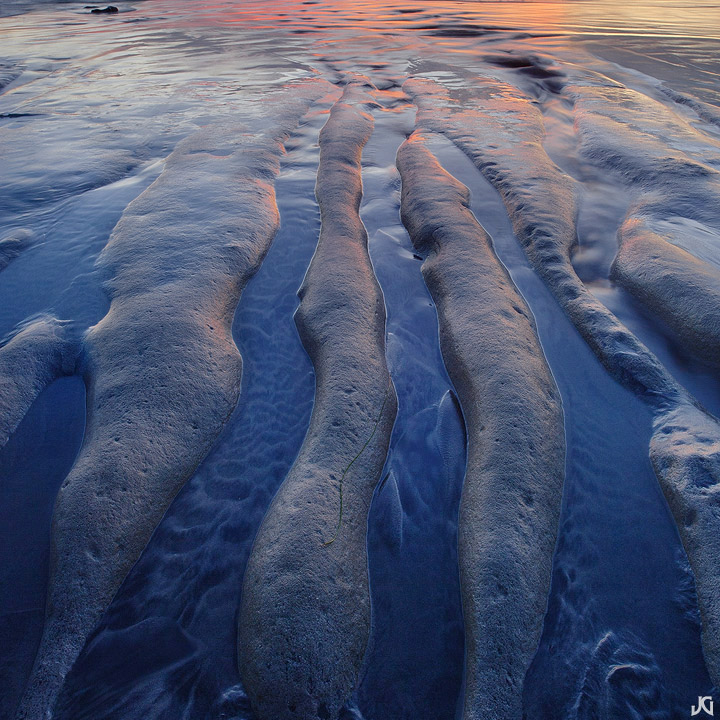
Color Grooves *w/edit*
‹ PreviousLandscape GalleryNext ›

Color Grooves *w/edit*

by Jimmy Gekas

Gallery: LandscapePosted December 20, 2010150 views12 comments
Carlsbad, California

It's nice to find a cool comp within a wider comp. I originally shot this to include some of the sky, but found that the grooves and little bit of reflection above were too good to ignore. I tried not to go overboard on the saturation, as the blues started to look too electric. I may have to crop or clone out those rocks in the upper left corner.

Canon 5Dmk2, Zeiss 21mm

Comments

12 comments
Comment posted by Anthony Vincent on December 20, 2010 at 2:29 PM
Love the finger like grooves Jimmy
I think you could go more blue but that's up to you

Nice portrayal
Thanks for sharing
Registered on February 5, 2009, 199 Posts, 2775 Comments
Comment posted by Kyle L. Krause on December 20, 2010 at 2:47 PM
Jimmy, the detail and color are just beautiful. Maybe a little crop off the top, I think it would be stronger with out the upper rock. Nicely done.
Registered on June 15, 2010, 29 Posts, 605 Comments
Comment posted by Wade Hardy on December 20, 2010 at 3:32 PM
The grooved rock is really cool and leads me right to the light at the top of the frame. I didn't even notice the small rocks in the upper left at first, but I guess it wouldn't hurt to clone them out.
Registered on May 2, 2006, 121 Posts, 1824 Comments
Comment posted by Guy Tal on December 20, 2010 at 4:29 PM
I love the way you see your environment, Jimmy. Your explorations resulted in some very insightful images that speak of great intimacy and familiarity. I like the composition as well as the subtle mix of blue, orange and red.

Guy
Registered on November 1, 2003, 566 Posts, 15507 Comments
Comment posted by dean hebert on December 20, 2010 at 5:39 PM
Beautiful light and reflections. If your going to clone the rocks I would clone the little line on the middle finger :wink: :toast:
Registered on August 4, 2010, 70 Posts, 1132 Comments
Comment posted by Harley Goldman on December 20, 2010 at 6:24 PM
I am thinking a very little top crop on this one, maybe a little ways below the upper rock (cutting out most of the horizontal lines?). Nice lines and color.
Registered on November 19, 2003, 586 Posts, 11271 Comments
Comment posted by Lon Overacker on December 20, 2010 at 7:04 PM
Jimmy,

Man, you surely get the most out of your beaches; low tide, high tide, light, no light... always something there to find and you do it masterfully.

The vertical lines and forms of these rocks are so strong that I might be tempted to even crop this from the sides - and if you crop from the left far enough to remove the little rocks up top, well you've got two with one stone so to speak. I think a narrower format really emphasizes the lines and forms even more. The color becomes a nice bonus.

Beautifully seen and captured.

Lon
Registered on November 24, 2006, 521 Posts, 19147 Comments
Comment posted by Harry Lichtman on December 20, 2010 at 9:25 PM
Jimmy - They look like sleeping crocs to me!. Great colors and detail in the mud. There is a green strip in the FG - is that seaweed? I might consider a slight crop off the top - the little black rock ULC takes away the balance a little. Another fine micro landscape.
:toast:
Registered on September 17, 2010, 304 Posts, 3507 Comments
Comment posted by Brian Schrayer on December 20, 2010 at 10:30 PM
Excellent composition, here. I would be hesitant to crop this. Although the rocks in the upper left are a little distracting I think one of the strong elements in this photo is the transition from cool to warm tones. If you were to crop the image you would loose too much of the warm tones. Great image as usual!!
Registered on May 28, 2004, 114 Posts, 2890 Comments
Comment posted by Tony Kuyper on December 20, 2010 at 10:35 PM
I really like the comp but agree with the thought about cloning the upper rocks. I could also see darkening the top some. I think it would look more abstract if the light were better balanced.
Registered on November 1, 2003, 364 Posts, 22328 Comments
Comment posted by Jimmy Gekas on December 21, 2010 at 1:14 AM
Thanks for all the input. Here's a cropped version from the sides and I cloned out the small rocks in the top left corner. Also, I darkened down the top a bit. I feel I can go a little more electric on the blue to make more of an impact, but it could be borderline oversaturated. Maybe I'll try a print and see.
Registered on July 26, 2007, 244 Posts, 2807 Comments
Comment posted by Vance Gese on December 21, 2010 at 1:23 AM
Love those lines, Jimmy. Wonderful form in the rocks and incredible light and color. The cropped version nails it composition wise in my opinion. Superb.
Registered on November 13, 2008, 298 Posts, 6629 Comments