Gallery: LandscapePosted December 23, 2010170 views6 comments
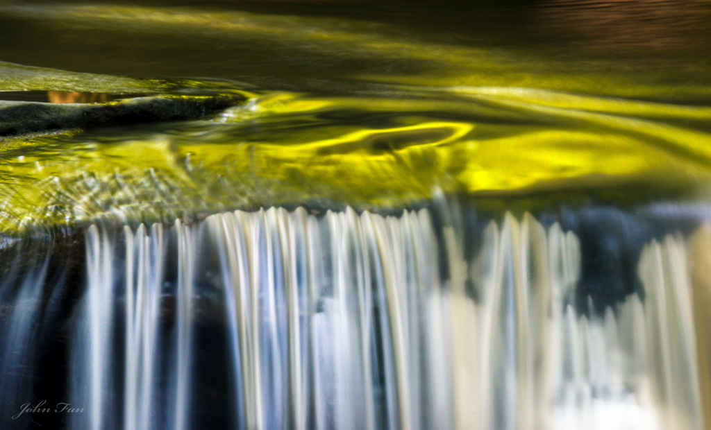
I went to Matthiessen State Park one summer afternoon to photograph waterfalls. I was immediately attracted to the reflection on the creek above this waterfall.
Comments
6 comments
Comment posted by Richard Teller on December 23, 2010 at 11:40 PM
I can't really say why, but this image doesn't work for me.
Registered on August 23, 2010, 1162 Posts, 6692 Comments
Comment posted by Jake Case on December 24, 2010 at 2:00 AM
I absolutely love the silky smooth texture of the water here! The gold up top is gorgeous as well. I do have a couple nits, however. First, the composition seems rather center heavy. Not much is happening in the top quarter of the image. I'd love to see more of the cascade in the bottom half, but not having been there, I don't know what is farther down out of frame that would interfere with the composition. I would definitely like to see this with a "pano crop" of 1/4 off the top. Also, it looks like you might have some depth of field issues. It's pretty obvious in the right hand part of the cascade, but also slightly in the surface up top. I'm wondering what aperture you used? Not really anything you can do about it now, but if you happen to have the opportunity to re-shoot this with a better depth of field and a similar lighting situation, I would certainly do it. I think this has a ton of potential!
Registered on December 13, 2010, 38 Posts, 167 Comments
Comment posted by Joel Hazelton on December 24, 2010 at 4:17 AM
Lovely and elegant colors and textures, John. I can definitely see why you were attracted to this reflection.
As far as the composition, there isn't much of a pattern for my eye to follow. I can see that your vision focused more on the beautiful colors in the scene, but I think this would be more effective if you concentrated on organizing the prominent shadows and negative space to better complement the areas with reflected light.
I hope you can go back and work this scene more, because I definitely see some potential
Registered on August 6, 2008, 194 Posts, 1315 Comments
Comment posted by Bill Maile on December 24, 2010 at 9:07 AM
Pretty neat little scene John, agree with the other posters, and think a crop of the top would help, maybe show more of the fall or not--but that copper/brown area in the BG throws it off a bit IMO.
Registered on March 2, 2009, 984 Posts, 2518 Comments
Comment posted by John Fan on December 24, 2010 at 12:49 PM
Thanks guys! Great suggestions! I was attracted to the reflection that can only be seen from this angle and from far away. It limited my options. I was struggling with the composition as you can tell. I will certainly try again next summer.
Merry Christmas!
Registered on August 24, 2010, 135 Posts, 489 Comments
Comment posted by Lon Overacker on December 24, 2010 at 10:02 PM
John,
I love the color and reflection here and the whole setup has huge potential. I'm not sure what happened and why there would be such a drop off in focus from left to right. It looks like there's one little pool in the back LH side that is in focus, so it may be that the focus point was too far in the back, causing the softness; usually it's front to back and not side to side.
Even though it would still be soft, I think cropping this in half and displaying only the left half would greatly improve this. Not sure how many pixels you've got to work with, but that's about all I can suggest at this point without returning here next time as you mentioned. It's definitely a place you should return to and work this great little scene.
Lon
Registered on November 24, 2006, 521 Posts, 19147 Comments

Comments
6 commentsAs far as the composition, there isn't much of a pattern for my eye to follow. I can see that your vision focused more on the beautiful colors in the scene, but I think this would be more effective if you concentrated on organizing the prominent shadows and negative space to better complement the areas with reflected light.
I hope you can go back and work this scene more, because I definitely see some potential
Merry Christmas!
I love the color and reflection here and the whole setup has huge potential. I'm not sure what happened and why there would be such a drop off in focus from left to right. It looks like there's one little pool in the back LH side that is in focus, so it may be that the focus point was too far in the back, causing the softness; usually it's front to back and not side to side.
Even though it would still be soft, I think cropping this in half and displaying only the left half would greatly improve this. Not sure how many pixels you've got to work with, but that's about all I can suggest at this point without returning here next time as you mentioned. It's definitely a place you should return to and work this great little scene.
Lon