Nature Photographers Network
This is the preserved archive of the original Nature Photographers Network. The community continues at naturephotographers.network.
Depths of Zion
‹ PreviousLandscape GalleryNext ›

Depths of Zion

by Harry Lichtman

Gallery: LandscapePosted December 29, 2010319 views17 comments
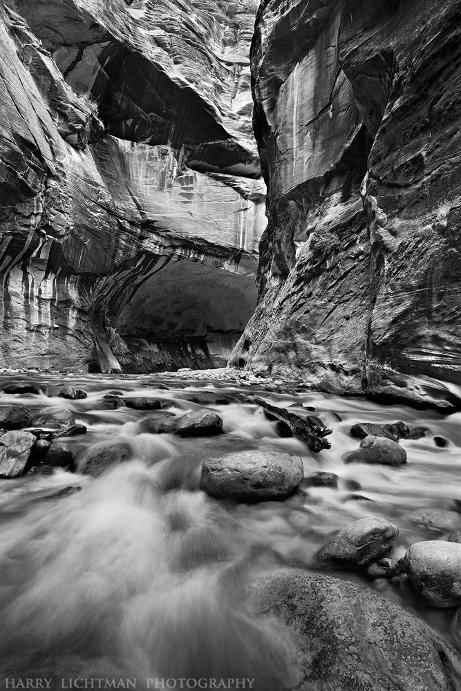
I thought I would add to the B&W parade of images. I was looking for a timeless impression of the Narrows in Zion, and liked how the detail and textures were rendered in this conversion. While the contrasting reddish walls and white-water seem the obvious combo, I'd be interested if you thought BW is as powerful. My thoughts are that there is maybe too much going on, and that the eye travels everywhere instead of moving through the image. White water in rock surroundings naturally directs the viewer in the color version. This may not be the one for a conversion.
Thanks, Happy New Year!

Comments

17 comments
Comment posted by Doug Roane on December 29, 2010 at 12:50 PM
Comp is excellent, as is your mono conversion here. I agree with you though, for me, it's very very complex and busy for a BW
Registered on December 12, 2008, 213 Posts, 2226 Comments
Comment posted by Jeffrey Sipress on December 29, 2010 at 1:29 PM
Pretty dramatic, Harry. I like it even tho there is lots going on. Probably because I was there about the time you were.

Do you have more of these? I've been waiting for a break in the narrows posts here so I can post one of mine!
Registered on February 17, 2004, 236 Posts, 1197 Comments
Comment posted by Barry Vangrov on December 29, 2010 at 2:04 PM
I agree with what you're saying but I still think this has a lot of potential (of course I'm a b&w guy to begin with). I'd try cropping the top down to a 4 x 5 to focus the eye more on the water and rocks with the canyon wall as a background and then increase contrast especially on the water and rocks and maybe also take some of the grain out of the water.
Registered on September 1, 2009, 148 Posts, 749 Comments
Comment posted by Harry Lichtman on December 29, 2010 at 2:18 PM
Jeffrey - Of course there are more! :biggrin:

I made quite a variety of compositions, hopefully not too repetitive. I say post away! There is always room for interesting images. I wil hold off, I'm tired of editing through my Zion shots by now!

Barry - I can see how a crop off the top might concentrate the focus. Looking back, I wished I had used the log mid ground as a FG element for a shot, would have been more unique. It's lost a bit in the BW. more obvious in the color.
Registered on September 17, 2010, 304 Posts, 3507 Comments
Comment posted by David Edwards on December 29, 2010 at 2:36 PM
I agree with your comments, Harry. It does seem quite busy, but I think the image is one for conversion. My eye wants to concentrate on the water, but is drawn up the walls by the strong contrast there. My only suggestion would be to soften off the contrast on the walls and perhaps also darken them down (to make them less prominant) so that the focus is on the water rapids, where you could also pump up the whites to make them stronger. You could also try cropping the top third of the image to make things simpler. This is a powerful scene and a fabulous comp. It makes me want to explore and find out what is up around the corner. Top shot!
Registered on December 6, 2008, 142 Posts, 2623 Comments
Comment posted by Lon Overacker on December 29, 2010 at 3:00 PM
Harry,

I too think the composition is excellent; and with the b&w I think that's important because the expected color versions from here often stand on their own simply because of the color. Now with the b&w you have to rely on tonal range and a little bit more on composition, IMO. And here you have both!

I might not use the word "powerful," but I certainly consider this a strong image and capture from the Narrows. Well done.

Lon
Registered on November 24, 2006, 521 Posts, 19147 Comments
Comment posted by Peter Richter on December 29, 2010 at 4:33 PM
Your picture expresses a threatening scene, which is not in the same way seen in well-known color images. So you show us another exciting aspect, simply by excluding colors.

Peter
Registered on November 10, 2010, 218 Posts, 2723 Comments
Comment posted by Luis Argerich on December 29, 2010 at 4:46 PM
Nice scene Harry, for some reason I prefer this type of landscapes in color maybe because I expect a rainbow of colors in the walls contrasting with the cool tones in the water.
Registered on December 22, 2009, 91 Posts, 1349 Comments
Comment posted by Eva McDermott on December 29, 2010 at 7:17 PM
After seeing your image Harry, I think Zion looks more powerful in B&W. Excellent B&W conversion, tonal range and comp. I especially love the detail in the larger version.
Registered on January 4, 2009, 1015 Posts, 13229 Comments
Comment posted by Tony Kuyper on December 29, 2010 at 9:32 PM
Lots to looks at and yes it's busy but the B&W treatment does simplify things to a large degree. Can't remember seeing this place in B&W, but it seems to work nicely. Now we just need a B&W subway pic.
Registered on November 1, 2003, 364 Posts, 22328 Comments
Comment posted by Chris Chamberlain on December 29, 2010 at 11:13 PM
Black and White works well here, Harry, I like it! Nice details and contrast.

Chris
Registered on March 13, 2007, 500 Posts, 8365 Comments
Comment posted by Stan Rose on December 30, 2010 at 4:50 AM
Hmmm. Your defintiely gonna get a range of opinions on this. I like the comp--the conversion is a tricky one for the reasons mentioned (busy). I think maybe while ordinarily youd want a wide range of tones, here it just complicates things. Id have to see it to know, but maybe there shold be more contrast in the water/lower portion and less up on the cliffs. Anyhow, a cool shot! :wavey:
Registered on September 15, 2005, 836 Posts, 17099 Comments
Comment posted by Harry Lichtman on December 30, 2010 at 6:24 AM
Stan, I agree that the water could use a little more contrast to separate it from the rocks and background. I didn't want to loose detail in the water, but I think it can stand more contrast without loss.

Tony, don't temptme! :biggrin: I thought of converting one of mine, but the orange tunnel glow seems such a part of the Subway experience, a brighter area as a substitute just doesn't seem to be as effective.
Registered on September 17, 2010, 304 Posts, 3507 Comments
Comment posted by Andreas Resch on December 30, 2010 at 7:00 AM
Flawless comp and great conversion. A pleasure to look at.
All the best wishes for 2011, Harry.
Registered on November 14, 2007, 322 Posts, 6101 Comments
Comment posted by Guy Tal on December 30, 2010 at 9:13 AM
This works beautifully in B&W. Excellent conversion and the contrast is just right. I love it.

Guy
Registered on November 1, 2003, 566 Posts, 15507 Comments
Comment posted by Kyle L. Krause on December 30, 2010 at 12:19 PM
The composition flows nicely, I do think it is a srtong image,but for me, color in the narrows is alot more powerful. Nicely done Harry, looking foreward to see more from this area.
Registered on June 15, 2010, 29 Posts, 605 Comments
Comment posted by Nick Bristol on December 30, 2010 at 2:00 PM
Very nice, Harry. Lots going on but this does appeal to me alot. Contrast looks good to me too. Great pictures from here! Hope you have a Wonderful New Year, Harry.

Nick Bristol
Lone Rock, WI
Registered on February 1, 2004, 752 Posts, 14140 Comments