Nature Photographers Network
This is the preserved archive of the original Nature Photographers Network. The community continues at naturephotographers.network.
High Desert Tones
‹ PreviousLandscape GalleryNext ›

High Desert Tones

by Doug Roane

Gallery: LandscapePosted January 6, 2011284 views11 comments
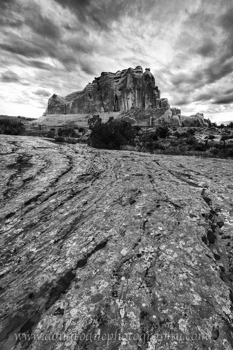
Arches National Park, UT, 6/10. This is another of those rare occasions that I have used HDR software, mostly in an attempt to make a compelling image out of not-so-great light to really bring out the rock textures. The color version, posted below, doesn't work so well for me, having that somewhat more obvious HDR look that I find a bit obnoxious. I think it works pretty well in B&W, though, and would appreciate your thoughts.

Canon 5DII. 16-35/2.8. ISO 100. f/19. 3 exposures, each double-processed in ACR and tonemapped using Photomatix 3.0. See LARGER VERSION for best detail

Comments

11 comments
Comment posted by Doug Roane on January 6, 2011 at 12:14 AM
Some may want to see the color version, which I find much less appealing.
Registered on December 12, 2008, 213 Posts, 2226 Comments
Comment posted by dean hebert on January 6, 2011 at 1:11 AM
Wow,Doug, this really jumps out at me! The bright clouds behind the hill really make it pop! Nice lines as well. :toast:
Registered on August 4, 2010, 70 Posts, 1132 Comments
Comment posted by Kent Mearig on January 6, 2011 at 1:22 AM
Well...we're all different right? There's actually nothing I don't prefer about the color version. Go figure.
Registered on September 4, 2006, 237 Posts, 4748 Comments
Comment posted by Floris van Breugel on January 6, 2011 at 4:10 AM
I don't actually find the color version to scream HDR, and I think the contrast of the blue sky and red rock (and green trees) creates some additional visual interest that helps guide me through the scene. With the B&W all the textures are so similar, and there's no high contrast direct light to split up the scene, so I get a bit lost.
Registered on December 19, 2008, 306 Posts, 4840 Comments
Comment posted by Hamed Musharbak on January 6, 2011 at 7:34 AM
more contrast will be winner :wink:

nice comp & texture in FG

Hamed
Registered on June 1, 2009, 372 Posts, 2282 Comments
Comment posted by Bill Chambers on January 6, 2011 at 8:25 AM
In this case, I actually prefer the color version for my taste, although the B&W works pretty well too. I enjoy the varies colors of the rock and lichens.
Registered on April 10, 2005, 753 Posts, 21216 Comments
Comment posted by Joel Hazelton on January 6, 2011 at 11:25 AM
I prefer BW by far. Seems to accent the curves, lines, and textures.
Registered on August 6, 2008, 194 Posts, 1315 Comments
Comment posted by Morris McClung on January 6, 2011 at 8:23 PM
Lots of drama. The color is o.k., but the b&w brings more to the image. Well done.
Registered on May 7, 2007, 670 Posts, 19650 Comments
Comment posted by Barry Vangrov on January 6, 2011 at 8:41 PM
I definitely like the b&w better but, then, I usually do. That's an awful lot of foreground rock leading the the peak though - maybe crop some of it to focus the eye more on the peak and sky.
Registered on September 1, 2009, 148 Posts, 749 Comments
Comment posted by Tony Kuyper on January 6, 2011 at 10:24 PM
Oh yes, the B&W white is definitely better. The sky, however, seems to have some blown out areas. Hard to say, but wondering if a dark sky would maybe work better than a light sky :confused:
Registered on November 1, 2003, 364 Posts, 22328 Comments
Comment posted by Darren Huski on January 7, 2011 at 8:06 AM
Mono all the way on this, you made the right call.
Registered on August 17, 2008, 61 Posts, 340 Comments