Nature Photographers Network
This is the preserved archive of the original Nature Photographers Network. The community continues at naturephotographers.network.
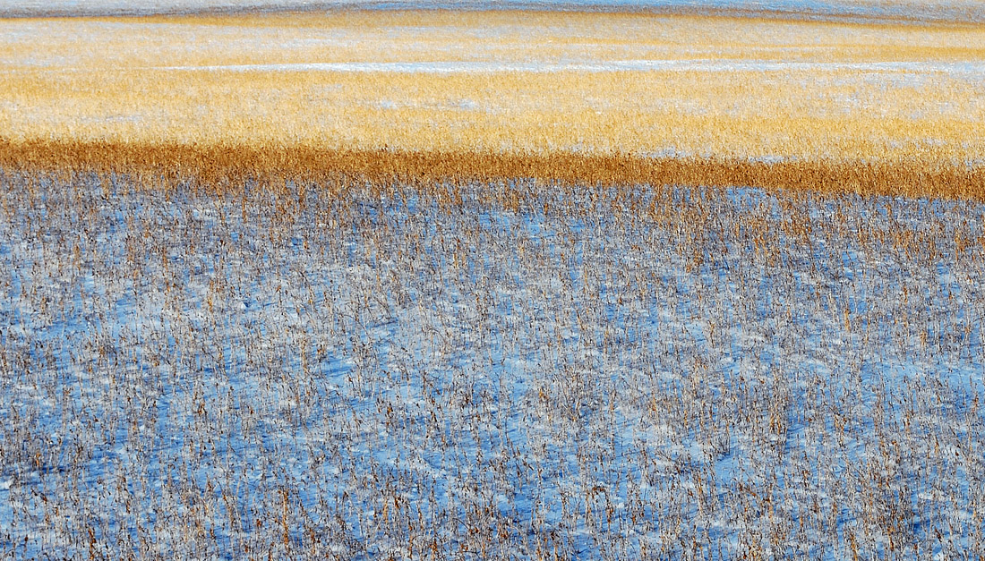
Band of Gold II
‹ PreviousLandscape GalleryNext ›

Band of Gold II

by Bill Maile

Gallery: LandscapePosted January 16, 201178 views9 comments
This is a follow up to my previous post using a different image and processing. In this one I've kept the dark gold band toward the center where shadow and light meet. In the FG, I tried to get rid of the slight blue FG cast in the first image. Almost cropped out the far BG, just thought it helped convey a sense of continuing on...

Larger posted, all C&C welcomed. :toast:

Comments

9 comments
Comment posted by Dan Baumbach on January 16, 2011 at 12:58 PM
I like this one a lot, including the top. Nice abstract.

- Dan.
Registered on November 1, 2003, 473 Posts, 7980 Comments
Comment posted by Andrew Morrill on January 16, 2011 at 6:37 PM
I bet this would be great in print - as its hard to get the feeling of how the colors interact online. I think leaving the top blue is a good decision -- its does make it seem to continue, as well as help to balance the right/down slope in the comp. I also like the "gold band" as it adds some variation. Great job.
Registered on June 10, 2010, 51 Posts, 216 Comments
Comment posted by John Mumaw on January 16, 2011 at 7:01 PM
Nice scene, Bill. I like the contrasting colors and the even light.
'Development' is right on.
Registered on September 9, 2005, 62 Posts, 2289 Comments
Comment posted by Tony Kuyper on January 16, 2011 at 8:34 PM
I like this better than the last one. Maybe just crop the top edge of blue and it becomes a very nice abstract.
Registered on November 1, 2003, 364 Posts, 22328 Comments
Comment posted by Chris Chamberlain on January 17, 2011 at 12:30 AM
Hmmm, it works well for me as an abstract. I have to say that I really like the pano version in the M&N Gallery!

Chris
Registered on March 13, 2007, 500 Posts, 8365 Comments
Comment posted by Barbara Graham on January 17, 2011 at 1:04 AM
The larger version of this really shines.
Registered on July 27, 2010, 1310 Posts, 5035 Comments
Comment posted by Bill Chambers on January 17, 2011 at 1:09 PM
This is very nice Bill; I much prefer this over the previous one. I might crop just the uppermost part off, but that's just my personal taste.
Registered on April 10, 2005, 753 Posts, 21216 Comments
Comment posted by Bill Maile on January 18, 2011 at 12:27 AM
Thanks fellow NPNers. I like this better than the previous. Obviously, that's a limited viewpoint. :wink: As for what Chris says about the M&N, exactly IMO. That's the winner, although it was not the intention I stopped for--this abstract was!
Registered on March 2, 2009, 984 Posts, 2518 Comments
Comment posted by Bill Maile on January 18, 2011 at 10:23 AM
Should have gone with the original thought of cropping the top, thanks for the suggestion(s). And yes John, I've had some good processing lessons lately. :wink: :toast:
Registered on March 2, 2009, 984 Posts, 2518 Comments