Nature Photographers Network
This is the preserved archive of the original Nature Photographers Network. The community continues at naturephotographers.network.
Cascading Wave Pattern
‹ PreviousLandscape GalleryNext ›

Cascading Wave Pattern

by Zack Schnepf

Gallery: LandscapePosted January 17, 2011824 views32 comments
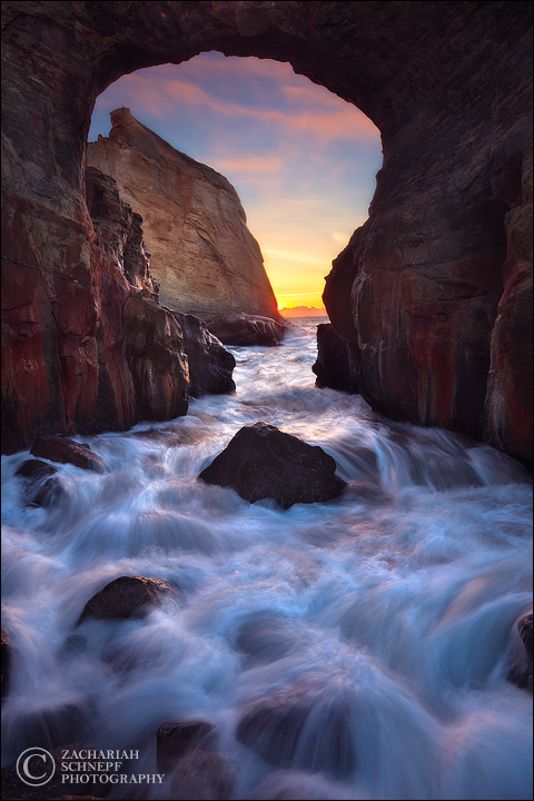
This is another from my shoot last week at Keyhole Arch. This was shot at the peak of sunset color. It was freezing cold and I was drenched from a number of waves crashing around me, I had a couple close calls with waves, but I was having the time of my life. The conditions lined up beautifully.

I experimented with a lot shutter speeds, and this shot was my favorite.

I think this will be one of the images I print large and frame for the upcoming show season.

3 exposures blended by hand in Photoshop using my advanced exposure blending techniques.
f/20, 0.4 sec, ISO 100

Comments

32 comments
Comment posted by Andreas Resch on January 17, 2011 at 4:33 AM
What a great spot. Excellent job on the blending and your choice for this shutter speed is really working for me too.
Registered on November 14, 2007, 322 Posts, 6101 Comments
Comment posted by Geoffrey Baker on January 17, 2011 at 6:37 AM
This is excellent, I like your composition, a quality piece of work :smile:
Well done.

Geoff.
Registered on August 20, 2010, 192 Posts, 980 Comments
Comment posted by Joseph Balcken on January 17, 2011 at 8:11 AM
Zack, both of your posts from this spot are exceptional. I prefer the shutter speed on this one. There isn't much horizon to notice it, but I feel that you may need a hair of CW rotation.

:toast: :toast:
Registered on November 29, 2009, 48 Posts, 249 Comments
Comment posted by Dan Baumbach on January 17, 2011 at 8:18 AM
Beautifully done. I like this one a lot better than the previous one.

- Dan.
Registered on November 1, 2003, 473 Posts, 7980 Comments
Comment posted by scott lanz on January 17, 2011 at 9:26 AM
Great comp and processing/presentation, Zack. I also prefer this version over the previous one, although both are superb. :toast:
Registered on November 14, 2003, 840 Posts, 12902 Comments
Comment posted by Nick Bristol on January 17, 2011 at 10:29 AM
Wonderful! Love this one Zack. The colors are great and the water is awesome.

Nick Bristol
Lone Rock, WI
Registered on February 1, 2004, 752 Posts, 14140 Comments
Comment posted by Gino Cortez on January 17, 2011 at 11:49 AM
Nice job with the blending. It' very close, but I think i prefer this to your last post. The water action and lighter rock tones, especially on the large stack outside the keyhole, are very nice. :toast:
Registered on November 23, 2010, 57 Posts, 396 Comments
Comment posted by Edward Nunez on January 17, 2011 at 11:52 AM
Zack, I prefer this one to the previous one you posted. I like the colors, and great detail in the water motion. Great! :toast:
Registered on April 19, 2007, 65 Posts, 711 Comments
Comment posted by Mat Malone on January 17, 2011 at 12:17 PM
Beautiful shot, same as the other version I saw. I like the amount of detail you have in the arch up at the top.
Registered on December 15, 2008, 91 Posts, 882 Comments
Comment posted by Kartik Venkatarama on January 17, 2011 at 12:51 PM
You nailed the water movement here, and great comp and overall exposure. There's a bit of halo on upper edges of the cliff in the background, and perhaps the shadows could be opened up a tad.
Registered on July 27, 2007, 197 Posts, 830 Comments
Comment posted by Zack Schnepf on January 17, 2011 at 1:07 PM
Joseph, you're right there is a slight tilt here, I've fixed it in the original.

Kartik, I'm going to disagree with you about the shadows. I intentionally left the shadows where they are, I wanted to avoid the look associated with an over tone mapped HDR image. Also, there are no halos in the original, any slight halos here are caused by sharpening for the web.
Registered on November 1, 2003, 403 Posts, 2528 Comments
Comment posted by Bill Chambers on January 17, 2011 at 1:27 PM
I MUCH prefer this over your previous one Zack; both the composition and water action are superior IMO. This is darn near as good as it gets!
Registered on April 10, 2005, 753 Posts, 21216 Comments
Comment posted by James Fougère on January 17, 2011 at 1:46 PM
WOW!! Amazing!! I must have those ADVANCED EXPOSURE BLENDING TECHNIQUES :biggrin:
Registered on October 25, 2010, 41 Posts, 831 Comments
Comment posted by Zack Schnepf on January 17, 2011 at 1:56 PM
Hehe... James. This was a particularly challenging image, I really had to pull out all stops on this one. I even developed a couple new techniques in the process to help deal with the chromatic aberrations around the keyhole that the lens correction filter.
Registered on November 1, 2003, 403 Posts, 2528 Comments
Comment posted by Gary McGhee on January 17, 2011 at 2:53 PM
I think I prefer this one too Zack, some nice water action and a lot more detail on the inner walls of the arch.

Gary.
Registered on April 15, 2010, 142 Posts, 2416 Comments
Comment posted by dean hebert on January 17, 2011 at 3:24 PM
Nicely done! I like the motion of the water and the detail of the cliffs. :toast:
Registered on August 4, 2010, 70 Posts, 1132 Comments
Comment posted by Chris Moore on January 17, 2011 at 3:59 PM
This one is my favorite of the series you have posted, I really like the hues of the reflected light on the water, and the shutter speed you chose is perfect.
Registered on January 12, 2010, 84 Posts, 388 Comments
Comment posted by Justin Reznick on January 17, 2011 at 4:59 PM
The water flow is gorgeous Zack, great exposure choice!
Registered on November 24, 2009, 79 Posts, 515 Comments
Comment posted by Lon Overacker on January 17, 2011 at 7:18 PM
Zack,

Great 2nd verse... Beautiful combination of frames. I love the water over the rocks, although it's almost too perfect... :wink: Beautifully crafted work.

Lon
Registered on November 24, 2006, 521 Posts, 19147 Comments
Comment posted by Barry Vangrov on January 17, 2011 at 7:26 PM
Beautiful image, Zack. Definitely one to be displayed at your shows.
Registered on September 1, 2009, 148 Posts, 749 Comments
Comment posted by Tony Kuyper on January 17, 2011 at 9:05 PM
Very nicely done. I like this shutter speed too. Could see doing a tad lighter with the blue in the sky.
Registered on November 1, 2003, 364 Posts, 22328 Comments
Comment posted by Bruce Omori on January 17, 2011 at 10:31 PM
Beautiful, Zack!! Love the movement of the water, as you've captured it well. The colors and details of the rock walls and sky sure add a pop to the composition! :smile:
Registered on December 6, 2010, 6 Posts, 175 Comments
Comment posted by Robert Dayton on January 18, 2011 at 9:43 AM
Lovely, Zack! Great post-processing. I hope to see
many more of your postings.
Registered on November 11, 2008, 281 Posts, 3958 Comments
Comment posted by Morris McClung on January 18, 2011 at 2:41 PM
Sweet light, color, water movement, and comp. Outstanding work.
Registered on May 7, 2007, 670 Posts, 19650 Comments
Comment posted by Scott Bean on January 18, 2011 at 4:16 PM
Simply excellent!
Registered on November 29, 2008, 21 Posts, 89 Comments
Comment posted by Nathan Buck on January 19, 2011 at 12:50 AM
Wow Zack. Love the texture in the waves. Fabulous.

Nathan
Registered on November 1, 2003, 1101 Posts, 13589 Comments
Comment posted by Stan Rose on January 19, 2011 at 11:47 AM
Im having another one of those twilight zone moments... :rolleyes:
The comp is superb, Zack, very dynamic and exciting. Terrific job on the surf exposure and some great light. But i have some issues with the blend (and maybe im having a drug induced flashback, since everyone else seems to be happy with it...). First, the top of the arch is too dark. There is no reason it should look any different than the two side walls, where you can make out detail. Id bring out the shadows just a tad there to match the detail of the walls. Second, the fg water is too radioactive/bright. The cyan 'glow' in the surf highlites is almost as bright as the direct light in the bg/outside surf--and as a result the dynamics suffer. These are relatively minor adjustments (which maybe is why no one feels like mentioning them :confused: ) but im pretty sure that you want to get this shot as perfect as you can, and at least IMHO, those are the two necessary corrections. :wavey:
Registered on September 15, 2005, 836 Posts, 17099 Comments
Comment posted by Zack Schnepf on January 19, 2011 at 1:07 PM
Stan, you're actually wrong on both counts. Let me explain. As you can see from this single raw exposure there is open sky on this side of the arch. And the exposure is extremely close to the water in the BG. This is straight out of ACR, no adjustments made in photoshop. You can also see the top of the arch is darker for the same reason, the open sky on this side of the arch.

Tony, I do agree that the upper sky needs to be lightened some, I'm working on adjusting it.

Thanks for the comments and critiques.

Registered on November 1, 2003, 403 Posts, 2528 Comments
Comment posted by Jimmy Gekas on January 19, 2011 at 1:11 PM
Dude! Another killer shot from here. WOW, so difficult to chose which I like more.... so, I won't. I like them both the same. :smile: I'd love to see them both in print sometime. :toast:
Registered on July 26, 2007, 244 Posts, 2807 Comments
Comment posted by Stan Rose on January 19, 2011 at 2:00 PM
Ok, Jack--thanks for the response, the open sky up top does explain things somewhat--but you cannot tell me that i am "wrong"--i am just giving you my subjective opinion, which you are free to disagree with (and since no one else except maybe Kartik shares my opinion--maybe you are wise to disagree!) In my opinion, your 'RAW' repost makes my point very well--a picture is truly worth a thousand arguments! In the repost, i can see just as much detail in the side walls as i can in the top arch--a least on this monitor, which is not calibrated but that shouldnt make a difference in the comparative detail. In fact, i prefer the exposure in the unedited version more so than in the 'final' version! It looks to me that the ony real difference between the two is that it looks like the side walls towards the bottom are brighter in the top version, like theyve been dodged or brightened. This causes what i perceive as a difference in the brightness--which is greater than that explained alone by the 'open sky' above. Similarly, i think the ocean exposure looks good in the RAW, the radioactive highlites arent present there up front so it looks much more natural to me--theres a clear difference in the bright areas in terms of comparative brightness. Again, these are minor points but IMO, they make a difference. Feel free to ignore my advice. :smile:
EDIT: I just saw your response to Tony--i didnt even mention that part since i thought it was too minor--but that actually might be the cause of what i perceive as an overly dark top part, since the sky is darker there it might be giving me the illusion that the arch is too dark also. Wouldnt know until i saw it 'corrected'.
Registered on September 15, 2005, 836 Posts, 17099 Comments
Comment posted by Zack Schnepf on January 19, 2011 at 2:40 PM
Stan, I'm surprised you're not working on a calibrated monitor, that might explain a lot actually. My screen is calibrated for my Epson 7900 printer, what I see on my screen is almost exactly what I see in a print. My screen is much more subdued because of that. This is important, the print is my end product, that is what I'm most concerned with. if I view this on an un-calibrated screen it may indeed look electric, on my calibrated screen it looks exactly how I want it to look. Admittedly that still might be too much for some people's taste, but that is another matter.

I may tone down the cyans in the FG a little though.
Registered on November 1, 2003, 403 Posts, 2528 Comments
Comment posted by Zack Schnepf on January 19, 2011 at 5:37 PM
Here is an updated version with the cyans pulled back in the FG just a tad, and the sky lightened a bit. I might lighten the sky just a hair more, but in the print is looks fantastic. Subtle changes, but I don't think it needed much, especially judging by the print.
Registered on November 1, 2003, 403 Posts, 2528 Comments