Nature Photographers Network
This is the preserved archive of the original Nature Photographers Network. The community continues at naturephotographers.network.
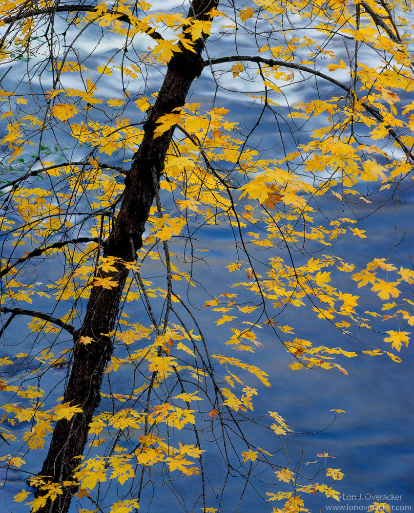
Over the Merced
‹ PreviousLandscape GalleryNext ›

Over the Merced

by Lon Overacker

Gallery: LandscapePosted January 20, 2011479 views40 comments
Yet another from our November trip to Yosemite. Harley posted a similar view of this Big Leaf Maple over the Merced a couple of months ago now.... We were standing fairly close together and captured slightly different images. Amazing how we can all see and capture things differently even when right next to each other.

Of all the images I came back with and have processed and presented, I've had the most difficulty in working this one from scanning to processing. I would love feedback especially on color and saturation.

Thanks for your comments on the previous image and my apologies for the corny title... :rolleyes:

As always your honest comments, critiques and suggestions are welcome.

4x5, V100, Nikkor 450mm, f/32 @ 2s

Thanks!

Lon

Comments

40 comments
Comment posted by dean hebert on January 20, 2011 at 2:03 AM
I like the gold against the blue and how the river picks-up some of the gold hue. It seems a bit busy for my taste but, I think the colour and sat are both done very well :toast:
Registered on August 4, 2010, 70 Posts, 1132 Comments
Comment posted by Kent Mearig on January 20, 2011 at 2:05 AM
I'm not too much help with color accuracy and saturation comments as I sit here checking this out on my phone, but for what it's worth, they look perfect. It is a scene well worth whatever troubles it took to get the processing right. It's not a brand new idea, but a welcome variation on the theme of foliage over the river, a moment well worth sharing.

Apparently my goal was to see how many times I could put the word "worth" in this comment.
Registered on September 4, 2006, 237 Posts, 4748 Comments
Comment posted by Giovanni Russello on January 20, 2011 at 2:17 AM
Hi Lon,
Looks good to me. I like the colour contrast between the foliage and the river.
Two seconds exposure and no movement in the leaves? Impressive timing considering that is taken on film!

gio
Registered on January 21, 2007, 95 Posts, 1617 Comments
Comment posted by Zack Clothier on January 20, 2011 at 2:19 AM
Lon, I knew this was yours before I looked :wink: A beautiful autumn image, one of my favorites of yours. It may seem a bit busy but the simplistic comp makes up for that at the same time.
Registered on January 28, 2010, 343 Posts, 2257 Comments
Comment posted by Steve Sieren on January 20, 2011 at 2:46 AM
With so many needed titles how can we keep finding new ones? For some reason I seem to be against saturation at the moment but this seems fine to me. I always love the color opposites.
Registered on January 2, 2008, 360 Posts, 5321 Comments
Comment posted by Guy Tal on January 20, 2011 at 6:11 AM
This is simply superb, Lon. Perfect composition and attention to detail (I especially like the way the two arching branches fit into the frame at the top) and beautiful combination of red and yellow.

Guy
Registered on November 1, 2003, 566 Posts, 15507 Comments
Comment posted by Lori Kincaid on January 20, 2011 at 6:26 AM
The color and saturation looks fine to me, Lon. I like the arrangement of the maple in the frame, though the whitewater in only the top half does pull by eye a bit.

Lori
Registered on November 15, 2003, 90 Posts, 2033 Comments
Comment posted by Andreas Resch on January 20, 2011 at 6:34 AM
Reminds me of a shot I did back in October but yours is way better. Love the colors.
Registered on November 14, 2007, 322 Posts, 6101 Comments
Comment posted by Stuart Williams on January 20, 2011 at 6:55 AM
brilliantly executed - the interplay of warms and blues coupled with the form of the tree and branches really make this wonderful
Registered on December 7, 2007, 247 Posts, 4792 Comments
Comment posted by Tristan Campbell on January 20, 2011 at 8:17 AM
Technically perfect and the colour contrast is lovely. 450mm lens??? My camera could not even focus such a lens! Superb image. Tristan
Registered on June 23, 2006, 113 Posts, 719 Comments
Comment posted by Abdullaziz Bin Ali on January 20, 2011 at 8:26 AM
Well, it looks awesome
Lon, I like the saturation, light, contrast, in general EVERYTHING
Registered on May 31, 2009, 112 Posts, 1590 Comments
Comment posted by Kevin Trinkner on January 20, 2011 at 8:41 AM
Can't go wrong with yellow and blue right.. Love the contrasting colors here, and I think the sat looks good. Nice capture.
Registered on June 30, 2008, 203 Posts, 2641 Comments
Comment posted by Barbara Graham on January 20, 2011 at 8:51 AM
Lon, I love this comp, and the light is just beautiful.
Registered on July 27, 2010, 1310 Posts, 5035 Comments
Comment posted by Bill Chambers on January 20, 2011 at 8:52 AM
I love the blue/gold color combination, and you habdled the water motion perfectly. Beautiful shot Lon.
Registered on April 10, 2005, 753 Posts, 21216 Comments
Comment posted by Nick Bristol on January 20, 2011 at 8:52 AM
Fantastic comp and beautiful picture. Love these colors! Everything looks great to me, Lon.

Nick Bristol
Lone Rock, WI
Registered on February 1, 2004, 752 Posts, 14140 Comments
Comment posted by Balakumar Kaushik on January 20, 2011 at 9:06 AM
Beautiful image - the typical Lon style.
Saturation and contrats looks fine to me.
Just wish the water in the top 1/3-rds was plain (like the bottom - i.e. without froth).
:toast:
Registered on January 4, 2008, 98 Posts, 1403 Comments
Comment posted by Raymond D Smith on January 20, 2011 at 9:24 AM
Love the colour contrasts Lon. You framed this perfectly with that yellow leaf in the lower right corner, just when your eye enters that corner the leaf pulls it back in and over to the other leaves and trunk, brilliant. The colour saturation looks about just right, Lori is right the white water does pull the eye, just a touch though. Cheers
Registered on January 22, 2009, 12 Posts, 479 Comments
Comment posted by Stan Rose on January 20, 2011 at 11:13 AM
A masterpiece, Lon-you keep topping yourself! Color, etc look perfect to me. :toast:
Registered on September 15, 2005, 836 Posts, 17099 Comments
Comment posted by Paul Breitkreuz on January 20, 2011 at 11:29 AM
Lon, the true highlight here to me is the contrasting colors. Yellow, red, blue, and the dark black tree trunk make for a super combination. As a result the scene provides wonderful detail and overall viewing aspects. I do think if the water had been a bit lighter or harsher the viewing would not be nearly as nice as this one is..... :cool:
Registered on February 25, 2006, 525 Posts, 8448 Comments
Comment posted by Eva McDermott on January 20, 2011 at 12:37 PM
Color looks wonderful Lon. I like the blue and gold as well as the comp you have chosen.
Registered on January 4, 2009, 1015 Posts, 13229 Comments
Comment posted by Jason Kim on January 20, 2011 at 1:24 PM
The color and saturation look good to me. If I had to make a suggestion to change, I'd say backing off on the saturation and contrast just a tiny bit would also work. I love the yellow leaves against the blue water.

Registered on July 1, 2006, 60 Posts, 1233 Comments
Comment posted by Gary McGhee on January 20, 2011 at 3:05 PM
Colour and saturation look spot on to me Lon, I like your comp with the angled tree on a diagonal third. Very pretty indeed.

Gary.
Registered on April 15, 2010, 142 Posts, 2416 Comments
Comment posted by Lorna Taylor on January 20, 2011 at 3:06 PM
Just beautiful, Wonderful pop of yellow against the blue!
Registered on November 12, 2010, 254 Posts, 3083 Comments
Comment posted by Reno DiTullio on January 20, 2011 at 3:49 PM
Stunning, Lon, love the blue bg :toast: :toast:
Registered on November 14, 2003, 130 Posts, 1644 Comments
Comment posted by Morris McClung on January 20, 2011 at 5:52 PM
The blues and yellows are singing to me! Wonderful color. The comp, of course, is your usual excellence. Marvelous image, Lon! :toast:
Registered on May 7, 2007, 670 Posts, 19650 Comments
Comment posted by Anthony Vincent on January 20, 2011 at 6:40 PM
.....over the Merced and through the woods, to Lon Overacker's house we go....... dah dah ah

Ok you get the picture. Classic style and beautiful portrayal.

Nicely done
Registered on February 5, 2009, 199 Posts, 2775 Comments
Comment posted by Eric Good on January 20, 2011 at 7:17 PM
Very nice Lon! The dark trunk and branches break up the carpet of blues and golds wonderfully. I can't think of anything I would do differently here... good stuff!
Registered on March 17, 2007, 116 Posts, 4764 Comments
Comment posted by Vance Gese on January 20, 2011 at 9:28 PM
The interplay of the yellow against the blue really makes this superb, Lon. Yet there is still a touch of subtle warmth on the water in places which really compliments those leaves. Love the pattern of the tree trunk and branches as well. Really beautiful work. Wouldn't change a thing in my opinion.
Registered on November 13, 2008, 298 Posts, 6629 Comments
Comment posted by Tony Kuyper on January 20, 2011 at 10:02 PM
The warm cool contrast really makes this. As does the diagonal and the OOF water. And the the sharp leaves (doesn't the wind every blow when you're around :confused: ). Colors and sat and contrast are all perfect. Fantastic eye for seeing this.
Registered on November 1, 2003, 364 Posts, 22328 Comments
Comment posted by Mark Pelton on January 20, 2011 at 10:04 PM
Hands down, your best of the season. Gorgeous color contrast and simplicity.
Registered on November 25, 2003, 380 Posts, 4647 Comments
Comment posted by Jimmy Gekas on January 20, 2011 at 11:36 PM
Could you please stop with the amazing fall colors in Yosemite? Seriously, you're killing me :wink: Lon, this one is really sweet. I love the contrast of both the bold colors of yellow and blue AND the sharpness of the tree and leaves vs the softness of the water. :toast:
Registered on July 26, 2007, 244 Posts, 2807 Comments
Comment posted by Andrew Morrill on January 20, 2011 at 11:49 PM
This is great Lon - color and fine detail are wonderful (except the few blowing leaves, but not super noticeable) - I would love to see a large print. ---- IMHO I think it could use more saturated yellows (just a little) and less saturated blues.
Registered on June 10, 2010, 51 Posts, 216 Comments
Comment posted by Pramod Viswanath on January 21, 2011 at 3:31 AM
Very artistic Lon! Love the contrasting colors here. Beautiful!
Registered on December 4, 2008, 60 Posts, 697 Comments
Comment posted by Julian Barkway on January 21, 2011 at 5:42 AM
Quintessentially you, Lon. Not much else to say.

:toast:
Registered on January 18, 2007, 344 Posts, 1961 Comments
Comment posted by Dietrich Gloger on January 21, 2011 at 5:20 PM
The blue-yellow combination is probably "thee" color contrast to look for in photography and it works very well here. As usual the comp. comes across as very elegantly designed and this is a worthy "Overacker". I can't find any flaw! Having said this it is now hard for me to write the following, really, but I owe you my honest opinion: I does move me a bit less than some of your other recent images. But for a fair assessment, a print or a much better monitor would be needed - I am on a really bad one at the moment. I will check it again, on my own screen in Linz.
Puh, that was not easy Lon. I now go to bed and I will sleep very bad...
Registered on January 26, 2007, 360 Posts, 9876 Comments
Comment posted by Chris Chamberlain on January 21, 2011 at 5:38 PM
My favorite thing about this is as Dietrich said, the Blue/gold color combo. Really nice! I like the comp too, and for whatever reason can't seem to pull it off as you have done here. Maybe it's that "kit" lens of mine. :rolleyes:

Chris
Registered on March 13, 2007, 500 Posts, 8365 Comments
Comment posted by Preston Birdwell on January 22, 2011 at 12:12 AM
You hit the color and tone of the water just right on this,. I love the yellow against the blue.

This one really sings for me, Lon.

--P
Registered on November 1, 2003, 471 Posts, 5188 Comments
Comment posted by Tom Haxby on January 22, 2011 at 6:39 AM
Just looking at the thumbnail I knew whose this was. Really beautiful. The contrast between the background color and the leaves really makes the leaves stand out. :toast:
Registered on July 6, 2006, 126 Posts, 647 Comments
Comment posted by Tyson Fisher on January 22, 2011 at 7:22 PM
Love this one, Lon! The color looks spot on to me. Great work as always!
Registered on September 17, 2008, 44 Posts, 623 Comments
Comment posted by Mohammad Hosseini on June 21, 2011 at 10:55 AM
Fantastic colors yellow on a blue BG works really well. Framing and composition is very much Lon's. Great image :toast:
Registered on May 16, 2011, 15 Posts, 301 Comments