Gallery: LandscapePosted January 22, 2011159 views8 comments
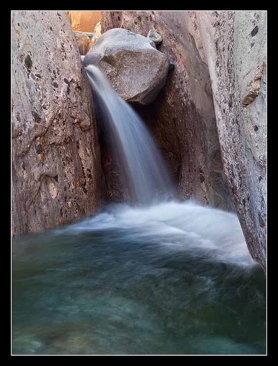
XTI, 17-40L @ 36mm, f16 @ 1sec,ISO 100, B&W CPL, Tripod, From Raw File
Comments
8 comments
Comment posted by Tony Kuyper on January 22, 2011 at 9:42 PM
Nice composition and light. The textures here are really nice. Could maybe see adding a bit more saturation.
Registered on November 1, 2003, 364 Posts, 22328 Comments
Comment posted by Craig Myers on January 23, 2011 at 12:23 AM
Nice image, Danny. Very pleasing composition.
Registered on September 1, 2008, 85 Posts, 757 Comments
Comment posted by Doug Roane on January 23, 2011 at 4:05 AM
I agree with Tony. It's difficult to get any sense of scale, which makes it interesting!
Registered on December 12, 2008, 213 Posts, 2226 Comments
Comment posted by Peter Richter on January 23, 2011 at 7:15 AM
A strong and impressive composition Danny, I enjoy the colors starting with the warm shades at the top and varying until to the coldness of the water at the bottom, thus resembling the flow of the fall! The shutter speed is perfect to show the dynamic.
Peter
Registered on November 10, 2010, 218 Posts, 2723 Comments
Comment posted by Paul Breitkreuz on January 23, 2011 at 11:43 AM
Well captured, Danny. I like the view that provides the tiny upper tier that makes us look deeper into the scene overall. I also think a slight boost of sat / contrast maybe to provide a bit of lift to the scene. That of course is very subjective and can be adjusted to personal preference. Otherwise very nice.
Registered on February 25, 2006, 525 Posts, 8448 Comments
Comment posted by Morris McClung on January 23, 2011 at 4:47 PM
I also like the comp and the water motion in this. And I agree, that all though a personal preference, a touch more sat would work more for me.
Registered on May 7, 2007, 670 Posts, 19650 Comments
Comment posted by Andrew Morrill on January 23, 2011 at 4:49 PM
The more I look at this the more I like it - the color in the water and top background is very soothing and nicely complementary. Looks like a very interesting place. I would suggest you try pushing the saturation on the top orange color a tad - to emphasize the relationship between the colors.
Registered on June 10, 2010, 51 Posts, 216 Comments
Comment posted by Chris Chamberlain on January 23, 2011 at 11:29 PM
From the thumbnail, I didn't think this was going to be very engaging, but it is! Nice composition, and color in the golden light, and foreground pool. I agree, a little more color too.
Chris
Registered on March 13, 2007, 500 Posts, 8365 Comments

Comments
8 commentsPeter
Chris