Nature Photographers Network
This is the preserved archive of the original Nature Photographers Network. The community continues at naturephotographers.network.
Gole di Breggia - 1
‹ PreviousLandscape GalleryNext ›

Gole di Breggia - 1

by Julian Barkway

Gallery: LandscapePosted February 6, 2011123 views11 comments
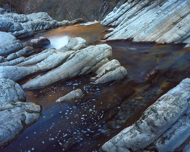
The Gole di Breggia is a relatively short gorge in the Italian-speaking Swiss Canton of Ticino. It's notable chiefly for the beauty of the stratified rock formations to be found there.

This image, and the two that follow, were made all in a stretch of the river of no more than 100 metres in length and are presented in chronological order of shooting. This one (and the next) continues my exploration of the suitability of Kodak Portra for this sort of landscape work....

----------------------------------------------------------------------------------
Ebony 45SU, 120mm with polariser, 2" @ f22, Kodak Portra 160NC

Comments

11 comments
Comment posted by Dietrich Gloger on February 6, 2011 at 11:57 AM
Very nice 4X5 composition! A scene well suited for this medium. The diagonal rock formations work very well here. I like the image very much. I am just not so sure about the bubbles and foam in the water - a slight distraction imo.

How would you describe the Portra compared to the other films you have used? (Compared to Velvia and Provia? )
Registered on January 26, 2007, 360 Posts, 9876 Comments
Comment posted by Dan Baumbach on February 6, 2011 at 12:28 PM
Very Nice! Love the rocks, color and foam on the water.

- Dan.
Registered on November 1, 2003, 473 Posts, 7980 Comments
Comment posted by Julian Barkway on February 6, 2011 at 1:06 PM
Thanks, guys!

Dietrich, regarding Portra: I like it very much. It has very smooth tonality and great subtlety of colour rendition. The colour-balance does tend towards excessive warmth, however.

Velvia is a film with which I have a love/hate relationship. In situations like this (open shade/blue sky) it's blue sensitivity kicks in and sends the blue reflected in the rock well over the top. Velvia also tends towards an ugly magenta cast. But, in the right circumstances, it's still a great emulsion.

Me and Provia parted company quite a while ago and now I never use it. The colour-balance is far too cool for my tastes.

Registered on January 18, 2007, 344 Posts, 1961 Comments
Comment posted by Stuart Williams on February 6, 2011 at 1:16 PM
very good - i like this composition. i might have preferred in b&w - but that's a personal pref and i understand your exploration of portra ...
Registered on December 7, 2007, 247 Posts, 4792 Comments
Comment posted by Paul Breitkreuz on February 6, 2011 at 1:55 PM
Julian, I really like the overall color rendition here, especially with this much water, the shady scene, and the amount of white rock.
The water-path leads towards the BG nicely which appears to be a drop off at that point. Looks like the Porta handled the scene very well. :cool:

I also agree with your complete outline on some of the Fuji Chromes, as listed in your follow up comment. Conditions vary out there as well as the abilities of those transparencies to meet the challenges. :smile:
Registered on February 25, 2006, 525 Posts, 8448 Comments
Comment posted by Steve Sieren on February 6, 2011 at 3:05 PM
I like all the striated diagonals that direct the veiwer through the scene.
Registered on January 2, 2008, 360 Posts, 5321 Comments
Comment posted by Adam Gibbs on February 6, 2011 at 3:34 PM
Really nice comp Julian. I like the lead in to the warm reflection :smile:
Registered on November 1, 2003, 168 Posts, 870 Comments
Comment posted by Dietrich Gloger on February 6, 2011 at 4:17 PM
Thanks for the info Julian. So far I prefered Provia over Velvia due to the slightly larger dynamic range and less heavy saturation. I liked the color casts so far I got with Provia, but I could like Portra from what I see here.
Registered on January 26, 2007, 360 Posts, 9876 Comments
Comment posted by Tony Kuyper on February 7, 2011 at 12:12 AM
I really like the comp and rock textures. More distant elements seem a bit distracting on my laptop image.
Registered on November 1, 2003, 364 Posts, 22328 Comments
Comment posted by Peter Richter on February 7, 2011 at 3:15 AM
Julian, I like the diagonals together with the spiral pattern in the water. I could imagine cropping the background to lead the attention to the center of interest in the foreground. The Kodak Portra has very favorable characteristics, a good choice for this scene. I also use it sometimes as 120 rollfilm (my post from 12/09/10).

Peter
Registered on November 10, 2010, 218 Posts, 2723 Comments
Comment posted by Vance Gese on February 7, 2011 at 10:52 PM
Beautiful, Julian. The diagonal strata are amazing and your composition is fantastic. Love the color and detail.
Registered on November 13, 2008, 298 Posts, 6629 Comments