Nature Photographers Network
This is the preserved archive of the original Nature Photographers Network. The community continues at naturephotographers.network.
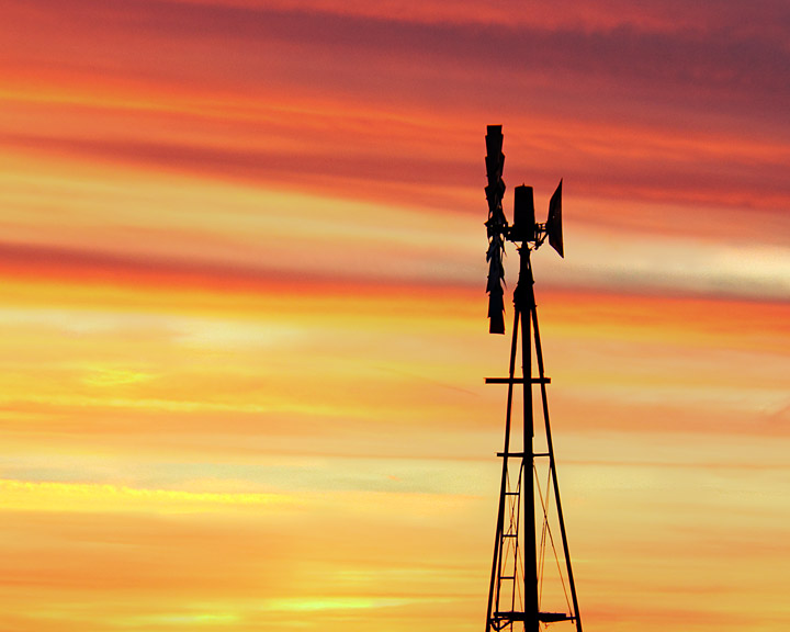
Sunset Windmill
‹ PreviousMan & Nature GalleryNext ›

Sunset Windmill

by Rob Graham

Gallery: Man & NaturePosted February 15, 201188 views8 comments
Here are 2 versions of the same image. In this version, I cropped to just the windmill and clouds. In the second version, I left much more. I'm thinking in the full version, the ground is too dominate, and that I should have gotten a lower perspective. What do you think? Thanks for looking.

Comments

8 comments
Comment posted by Rob Graham on February 15, 2011 at 7:06 PM
second version
Registered on August 22, 2006, 842 Posts, 2824 Comments
Comment posted by Lorna Taylor on February 15, 2011 at 7:50 PM
I think I like the first one best, beautiful sky !
Registered on November 12, 2010, 254 Posts, 3083 Comments
Comment posted by Wayne Rhodus on February 15, 2011 at 8:26 PM
Rob I like the first one best. It really lets you focus on the gorgeous sky and windmill.
Registered on November 16, 2003, 157 Posts, 3326 Comments
Comment posted by Ken Bachman on February 15, 2011 at 9:48 PM
I like the second one better, it shows more of the sky and I like the bare trees silouettes also. But I think I would crop about half of the foreground.
Registered on May 30, 2006, 66 Posts, 70 Comments
Comment posted by Larry Fischer on February 16, 2011 at 10:57 AM
For the reason you stated I like the first one without the ground.
The contrasting horizontal cloud-lines with the vertical and oblique windmill make a great visual presentation.
The color is sensational and makes the silhouette more bold.
the fisch
Registered on July 28, 2008, 155 Posts, 874 Comments
Comment posted by Brad Mangas on February 25, 2011 at 1:35 AM
Sweet shots Rob! Very nice job in composing this shot and nice job on the crop, I think I like it the best.
Registered on November 9, 2007, 94 Posts, 568 Comments
Comment posted by Darren Huski on March 14, 2011 at 11:18 AM
Like them both. The colors and simple graphics of the first are super but the second is also quite nice.
Registered on August 17, 2008, 61 Posts, 340 Comments
Comment posted by Bryan Simpson on March 23, 2011 at 7:56 AM
I'm late to the party here, but thought I'd chime in. Both are great captures, but I think I prefer the first. The color and pattern in the sky are what makes these shots, and the tighter crop serves to really focus on that. I imagine either would look good on a wall.
Registered on February 7, 2008, 5 Posts, 12 Comments