Gallery: FloraPosted February 18, 20111,822 views21 comments
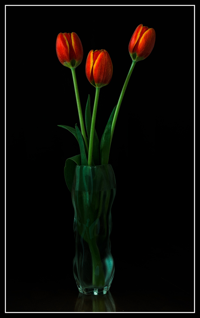
Sony A850
Leica 60 mm macro
Nik suite, LR 3, CS 5, Helicon Focus, MacBook Pro 17
I plan to post the workflow from this one on the flora forum.
Comments and suggestions welcome.
Pat
Comments
21 comments
Comment posted by Bill Chambers on February 18, 2011 at 2:19 PM
You knocked this opne out of the park Pat!! Absolutely beautifully composed and exposed. Real eye candy.
Registered on April 10, 2005, 753 Posts, 21216 Comments
Comment posted by Fabio Giarrizzo on February 18, 2011 at 2:32 PM
Great shot- Elegant, graphic composition and excellent treatment of light- A classy flora photography, Fabio
Registered on December 3, 2010, 90 Posts, 1614 Comments
Comment posted by Lorna Taylor on February 18, 2011 at 2:44 PM
So lovely and thank you for the tips!
Registered on November 12, 2010, 254 Posts, 3083 Comments
Comment posted by Richard Teller on February 18, 2011 at 3:25 PM
Very artistic comp and color.
Registered on August 23, 2010, 1162 Posts, 6692 Comments
Comment posted by Craig Myers on February 18, 2011 at 3:28 PM
Beautiful lighting and sharpness.
Registered on September 1, 2008, 85 Posts, 757 Comments
Comment posted by Philip Hodgkins on February 18, 2011 at 4:59 PM
You put in a lot of work with good results. I looked through your workflow—did you come on this by trial and error, or was it from a sketched out plan deduced a priori? However you came on it, I would stick with it—really stand out results!
Registered on July 24, 2006, 2741 Posts, 12349 Comments
Comment posted by Pat Sampson on February 18, 2011 at 6:17 PM
Thanks for the comments you all.
Phil,
At this point the flow is largely a priori. I generally know what I want to do for these types of set shots - either stacks or scans. The same is true for landscapes and avian too but the workflow is different between the two. This workflow originally grew out of working with stacks and from having played with the Flaming Pear Mr. Contrast filter for a couple of years. More recently, I've just been trying to figure out how to emulate Feinstein's look with my scans. I still don't have that right and am working it.
The truth of the matter is that If I'm shooting outdoors I'd rather shoot wildlife or landscapes than flora - at least usually. I enjoy the hunting aspect of capturing the wildlife. I do enjoy photographing trees and I do that a lot but I rarely have anything that I think is worth keeping or showing. I tend to avoid gardens and people like the plague. The thing I enjoy most about photography is the solitude - with the exception of Terri of course.
pat
Registered on May 19, 2007, 953 Posts, 15989 Comments
Comment posted by Bruce King on February 18, 2011 at 8:30 PM
Another awesone image. I like the highlight on the BRC of the vase, it upsets the symetry just enough......
I'd like to be a fly on the wall from capture to output while you're creating one of these.
Registered on January 14, 2010, 276 Posts, 2212 Comments
Comment posted by Bob Duff on February 18, 2011 at 8:38 PM
Pat very nice processing. The chiarscuro effect is wonderful. Thanks for the tutorial. Always nice to understand how somelse processes their images. Many ways to achieve similar results so it's interesting to understand where someone is coming from.
Question: is the brushed metal texture applied to the whole image or just masked for the blooms?
The only suggestions would have been to have a little more of the vase reflection on the table. I think that is a very supportive element to the overall image.
Not too much of the blue green cast on this image which is better for my tastes.
Registered on April 21, 2010, 160 Posts, 1675 Comments
Comment posted by Pat Sampson on February 18, 2011 at 9:42 PM
Bob,
In this case I did the entire image but then took the opacity on the layer down to about 30 percent.
Thanks for letting me know that you like the reflection. I do too. The problem for me when the image has this aspect ratio is trying to get flowers large enough to show. I try to crop as much as possible and I also want to try and make sure that the emphasis stays on the greenery and blooms. The next one of these I do, I'll increase the reflection size.
pat
Registered on May 19, 2007, 953 Posts, 15989 Comments
Comment posted by Anne K. Rusk on February 18, 2011 at 11:16 PM
Pat, I love this, especially the reflection. I think the amount included here is perfect for my taste; just enough to show that the vase is, in fact, sitting on a surface, not floating in air. I bet this would be so special to see in print. Beautiful work as always!
Registered on October 10, 2010, 65 Posts, 904 Comments
Comment posted by Krunal Janani on February 19, 2011 at 2:15 AM
Artistically beautiful Pat
Registered on September 16, 2010, 60 Posts, 1370 Comments
Comment posted by Morris McClung on February 19, 2011 at 9:57 AM
Listen to me very carefully, Pat. Quit your day job!
Registered on May 7, 2007, 670 Posts, 19650 Comments
Comment posted by Bill Fach on February 19, 2011 at 11:12 AM
Pat: Just a marvelous result and a joy to view. Your mastery of the software really lets you get the most of your captures. Superbly crafted image. >=))>
PS: Thanks for the workflow tutorial.
Registered on November 1, 2003, 1805 Posts, 26981 Comments
Comment posted by Balakumar Kaushik on February 19, 2011 at 2:31 PM
Such gorgeous lighting, Pat.
Simple and very elegant presentation.
Registered on January 4, 2008, 98 Posts, 1403 Comments
Comment posted by Ken Smith on February 19, 2011 at 8:13 PM
Beautifully composed with painterly light applied by an artist's eye.
Ken S
Registered on September 5, 2008, 449 Posts, 2444 Comments
Comment posted by Mark Windom on February 20, 2011 at 12:28 AM
Wow!!
Thanks for posting your workflow description....alot went into creating this effect and it was well worth it.
Registered on November 1, 2003, 176 Posts, 2302 Comments
Comment posted by Nathan Buck on February 20, 2011 at 3:43 AM
I love your vases. I love the reflection on the table. What a pretty shot Pat. The three tulips together works really well. I missed some tulips that looked a bit like this at Costco the other day. I got some others at the grocery store, so I am going to try them tomorrow. My shots will not be this nice, though...Excellent.
Nathan
Registered on November 1, 2003, 1101 Posts, 13589 Comments
Comment posted by David W. Kelly on February 20, 2011 at 12:45 PM
Beautiful Pat.
Registered on October 7, 2005, 883 Posts, 6590 Comments
Comment posted by Albert Darmo on February 20, 2011 at 9:37 PM
Hi Pat Been admiring this presentation for some time, it leaves me spellbound The quality of color and light is astounding
Albert Darmo. Canada
Registered on November 25, 2008, 1386 Posts, 11978 Comments
Comment posted by Giuseppe Guadagno on February 21, 2011 at 3:52 AM
A beautiful work, Pat; as usual. I like the idea of showing the reflection of the vase but not the plane of reflection. Thanks for sharing the interesting WF in the Flora forum.
Cheers.
Registered on February 3, 2007, 827 Posts, 5052 Comments

Comments
21 commentsPhil,
At this point the flow is largely a priori. I generally know what I want to do for these types of set shots - either stacks or scans. The same is true for landscapes and avian too but the workflow is different between the two. This workflow originally grew out of working with stacks and from having played with the Flaming Pear Mr. Contrast filter for a couple of years. More recently, I've just been trying to figure out how to emulate Feinstein's look with my scans. I still don't have that right and am working it.
The truth of the matter is that If I'm shooting outdoors I'd rather shoot wildlife or landscapes than flora - at least usually. I enjoy the hunting aspect of capturing the wildlife. I do enjoy photographing trees and I do that a lot but I rarely have anything that I think is worth keeping or showing. I tend to avoid gardens and people like the plague. The thing I enjoy most about photography is the solitude - with the exception of Terri of course.
pat
I'd like to be a fly on the wall from capture to output while you're creating one of these.
Question: is the brushed metal texture applied to the whole image or just masked for the blooms?
The only suggestions would have been to have a little more of the vase reflection on the table. I think that is a very supportive element to the overall image.
Not too much of the blue green cast on this image which is better for my tastes.
In this case I did the entire image but then took the opacity on the layer down to about 30 percent.
Thanks for letting me know that you like the reflection. I do too. The problem for me when the image has this aspect ratio is trying to get flowers large enough to show. I try to crop as much as possible and I also want to try and make sure that the emphasis stays on the greenery and blooms. The next one of these I do, I'll increase the reflection size.
pat
PS: Thanks for the workflow tutorial.
Simple and very elegant presentation.
Ken S
Thanks for posting your workflow description....alot went into creating this effect and it was well worth it.
Nathan
Albert Darmo. Canada
Cheers.