Nature Photographers Network
This is the preserved archive of the original Nature Photographers Network. The community continues at naturephotographers.network.
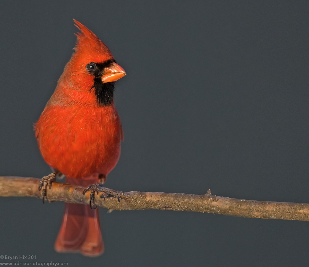
Cardinal at Sunset
‹ PreviousAvian GalleryNext ›

Cardinal at Sunset

by Bryan Hix

Gallery: AvianPosted February 27, 2011164 views16 comments
This was taken a couple of years ago almost to the day. I took this at a setup that was next to an oiler feeder. I waited all afternoon for this pair of cardinals to show up. They literally came right before the sun went down. I did have to back down the saturation in the red channel. I think reds are the most difficult to exposure properly of any color. I had to add canvass and clone/fabricate about 1/3 of the branch to the right side to get the space I needed. Comments welcome.

Date taken: 3/1/2009
Montello, WI
Metadata:
ISO 640, 1/160 @ f/7.1, Eval Meter 0, AvMode
Canon 1D Mk3, Canon 500mm f/4 + 1.4x TC, No Flash
Edited with LR 3.3, curves adjustment, Reds de-saturated, fill light increased, sharpened, cropped. Canvass added and branch cloned to increase width.

Comments

16 comments
Comment posted by Richard Teller on February 27, 2011 at 4:33 PM
I really like the detail in this image.
Registered on August 23, 2010, 1162 Posts, 6692 Comments
Comment posted by Richard Ditch on February 27, 2011 at 5:02 PM
I agree about the difficulty of exposing and processing red. The near dust behavior of cardinals is what we experienced in our NJ days - they'd show up in numbers for the seed but only when the light was almost gone.

Nice detail in the cardinal, and from the catchlight I had assumed fill flash. I had wondered about the branch as it looks funny around the area you mention for the extension.
Registered on November 1, 2003, 1031 Posts, 12705 Comments
Comment posted by Mia McPherson on February 27, 2011 at 5:25 PM
Bryan,

I also think reds can be a challenge to photograph, I thnk your desaturation of them helped so that these reds appear very natural and not over saturated. The late light really made this cardinal shine. Love the raised crest and great view of the eye. I can see where you added the canvas and that part of the branch, with a little more work I think it could be more natural looking and I believe this image would be worth the effort.
Registered on June 25, 2007, 491 Posts, 12566 Comments
Comment posted by Bryan Hix on February 27, 2011 at 5:30 PM
Help me out, what can I do to make the branch look more natural, or better yet what makes it look not natural. I have worked on it too much to be able to see critically now. All I know is my wife had no clue. :wink:
Registered on June 13, 2008, 117 Posts, 755 Comments
Comment posted by Mark Seaver on February 27, 2011 at 5:38 PM
Beautiful shot of the bird. The colors look perfect. I don't think you need the added space. I think ending the picture about where the nub on the branch is would still leave a great shot and enough space so that he doesn't seem crowded.
Registered on January 23, 2011, 1103 Posts, 17270 Comments
Comment posted by John Blumenkamp on February 27, 2011 at 6:15 PM
Gorgeous details and overall composition Bryan... congrats!
Registered on February 26, 2011, 58 Posts, 313 Comments
Comment posted by Mia McPherson on February 27, 2011 at 6:39 PM
Bryan,

The issue I see with the added part of the perch it that the detail there, even out of focus, doesn't seem to match up with the textures and details of the rest of the perch. In color tones it does match well. It also goes from nearly in focus on the right foot of the bird to very OOF just after the foot, if that area there were more "focused" and the OOF'ness was more gradual it wouldn't be as obvious. Does that makes sense?
Registered on June 25, 2007, 491 Posts, 12566 Comments
Comment posted by Brian Gatlin on February 27, 2011 at 8:36 PM
lovely light and detail, Bryan. the bg is really nice too, and your handling of the reds is really good. your added canvas looks good, but I would also consider a vertical comp.
Registered on March 21, 2009, 202 Posts, 4187 Comments
Comment posted by Bryan Hix on February 27, 2011 at 10:26 PM
Thanks Mia. I have a question though, are you talking about the left side of the frame or the right? Because I didn't add anything on the left, it's actually on the right. Just want to clarify. Thanks.
Registered on June 13, 2008, 117 Posts, 755 Comments
Comment posted by Ron Bielefeld on February 28, 2011 at 4:11 AM
Bryan, I like this shot. Reds look good. Love the late light. The added canvas to the right of the bird looks really good to me. I honestly can not tell anything was done. Nice job.
Registered on December 6, 2008, 360 Posts, 7132 Comments
Comment posted by Graham Brown on February 28, 2011 at 8:12 AM
This has got to be one of the most attractive species to photograph.I think the colours , detail and light are excellent but to me it cries out for a vertical crop. Graham
Registered on November 20, 2007, 275 Posts, 1365 Comments
Comment posted by Angela McCain on February 28, 2011 at 10:59 PM
Well done image of this beautiful cardinal. Great detail and sharpness and I love the plain background. The added branch is well done, but I'm not sure necessary. A vertical crop would work well.
Registered on April 19, 2009, 367 Posts, 3589 Comments
Comment posted by Andrius Pašukonis on March 1, 2011 at 12:31 AM
Looks great to me! Beautiful light and color. I would not notice anything odd on the right side, but I'm not the most sharped-eyed around here.
Registered on July 23, 2005, 111 Posts, 408 Comments
Comment posted by Michael Lotito on March 1, 2011 at 6:15 AM
Getting the exposure correct on the red cardinal is no easy feat but you have done it. I don't know if you intended it this way but the head is tack sharp really drawing attention to the birds eyes. Great job adding branch. :toast:
Registered on June 26, 2009, 181 Posts, 1558 Comments
Comment posted by Howard Cheek on March 1, 2011 at 8:26 AM
The head/eye is clear & sharp Bryan, good comp with the negative space RT.
I especially like the late light, great catchlight too :toast:
Registered on July 24, 2008, 1201 Posts, 10758 Comments
Comment posted by Nate Chappell on March 18, 2011 at 12:57 AM
Hi Bryan,
Do you have any more room at the bottom and/or bottom? The reason I ask is that this image to me really begs for a vertical presentation and then you wouldn't have had to mess with adding any canvas. The reds look great, the lighting is beautiful and that dark bg really sets off the cardinal nicely. :toast:
Registered on February 1, 2006, 1158 Posts, 19528 Comments