Gallery: Weekly ChallengePosted March 20, 201177 views13 comments
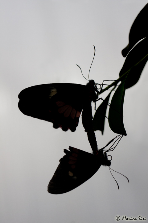
I took this image at a tropical center in Switzerland, where a lot of butterflies flied freely around me.
Thanks for viewing.
C&C are very welcome.
Comments
13 comments
Comment posted by Stan Rose on March 20, 2011 at 5:34 PM
Good subject and nice graphical quality to it! Any big reason to leave the wing spots visible here? Im not sure if id like this more with or without them, just curious on your decision...
Registered on September 15, 2005, 836 Posts, 17099 Comments
Comment posted by Morris McClung on March 20, 2011 at 6:00 PM
I agree with Stan about the nice graphic quality to this. Well done.
Registered on May 7, 2007, 670 Posts, 19650 Comments
Comment posted by Luca Mussato on March 20, 2011 at 6:38 PM
Hi Monica, i like the composition you made; like Stan I'm not sure about the visible spot at least for this challenge.
Cheers, Luca
Registered on November 14, 2006, 118 Posts, 855 Comments
Comment posted by Richard Olsen on March 20, 2011 at 6:50 PM
Sweet photo Monica!
Registered on October 19, 2006, 306 Posts, 1571 Comments
Comment posted by Nancy Lea Sandy on March 20, 2011 at 7:55 PM
I think I actually like the wing spots. To my eye, they add interest to an already interesting image. Nicely done
Registered on January 24, 2011, 576 Posts, 6942 Comments
Comment posted by Steve Balke on March 20, 2011 at 8:39 PM
I like the complexity of this image, Monica: these butterflies have so many parts to them and to see them joined together and in silhouette is quite interesting. I'm fine with the wing spots: they remove the image just a little from being a pure silhouette.
Registered on June 18, 2009, 229 Posts, 2915 Comments
Comment posted by RL Potts on March 21, 2011 at 1:52 AM
I am with Nancy on the wingspots. As long as they match, they are added interest. I really like the repeated antennae and proboscises (spelling?) This is very much like a monochrome. How would it look with a color cast?
Registered on November 24, 2003, 188 Posts, 985 Comments
Comment posted by Peter Richter on March 21, 2011 at 8:33 AM
Monica, I like your image very much as it is, the color spots add a lot and make it really interesting; without them there would be a too large black area without structure, I think.
Peter
Registered on November 10, 2010, 218 Posts, 2723 Comments
Comment posted by Monica Siri on March 21, 2011 at 2:02 PM
Thanks everybody for the nice comments.
Stan, I chose to leave the wing spots because I think they add interest to the image.
The contrast between the black of the silhouettes and the colors of the spots remind me the glass mosaic effect ..... in very low light.
Registered on September 20, 2009, 132 Posts, 3764 Comments
Comment posted by Howard Cheek on March 22, 2011 at 8:26 AM
Works for me Monica, great graphic quality as already stated.
The very low light is perfect for this action.
Well done!
Registered on July 24, 2008, 1201 Posts, 10758 Comments
Comment posted by Mark Seaver on March 22, 2011 at 9:17 PM
Very nice graphic image and a novel way to portray butterflies. I'm curious about your "philosophy"? Was this shot as a silhouette or was that a processing decision?
Registered on January 23, 2011, 1103 Posts, 17270 Comments
Comment posted by Monica Siri on March 23, 2011 at 5:19 AM
Thanks Howard and Mark for your comments.
Mark, considering the shot condition the BFs were taken as silhouettes, in fact the background was very bright. I had no chance to go on the other side and so I tried the silhouette solution because I liked the specularity of the two BFs and I thought it might have a nice effect. The PP work was only slight tone down the two leaves not perfectly dark and anything else.
Registered on September 20, 2009, 132 Posts, 3764 Comments
Comment posted by Varina Patel on March 28, 2011 at 3:09 PM
This is a unique shot. I love the composition - especially with one butterfly upside down. It makes for such a neat image. The silhouette leaves us free to focus on the unusual patterns and shapes. I love the details. Nice shot!
Registered on August 22, 2008, 45 Posts, 1578 Comments

Comments
13 commentsCheers, Luca
Peter
Stan, I chose to leave the wing spots because I think they add interest to the image.
The contrast between the black of the silhouettes and the colors of the spots remind me the glass mosaic effect ..... in very low light.
The very low light is perfect for this action.
Well done!
Mark, considering the shot condition the BFs were taken as silhouettes, in fact the background was very bright. I had no chance to go on the other side and so I tried the silhouette solution because I liked the specularity of the two BFs and I thought it might have a nice effect. The PP work was only slight tone down the two leaves not perfectly dark and anything else.