Nature Photographers Network
This is the preserved archive of the original Nature Photographers Network. The community continues at naturephotographers.network.
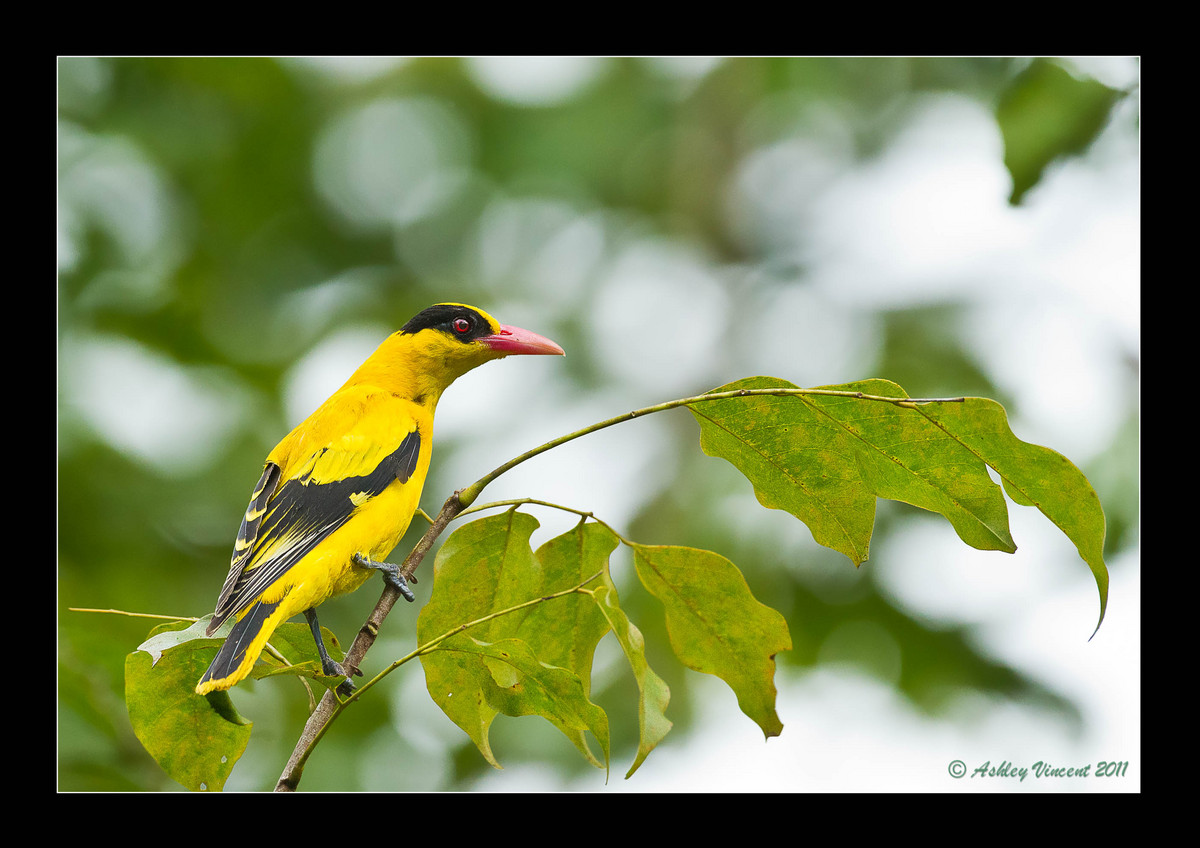
BN Oriole - Reworked!!!
‹ PreviousAvian GalleryNext ›

BN Oriole - Reworked!!!

by Ashley Vincent

Gallery: AvianPosted April 3, 2011111 views18 comments
Canon EOS 7D, EF 500mm f/4L IS USM, Shutter Priority @ f/5.6 (1/1000 sec), ISO 2000, Exposure Compensation: 2/3, Tripod, JPG from RAW, Cropped to About 60% of Full Frame

Here's another wonderfully colourful subject I managed to capture a number of images of in the very same tree as those Asian Fairy Bluebirds and several other different species of bird.

Prior to this opportunity I'd again had several others here in Thailand, but my even lower level of skill, perhaps combined with the circumstances I found them in, failed to get me pictures anywhere close to this. While I'm sure there's still flaws with this image – which is one of the main reasons I'm showing it to you, in hope of some feedback – for the simple reason I was able to delete all the other shots I had of Black Napped Oriole on file from my hard drive soon as I returned from Malaysia, I'm more than a little happy with this one as it stands ;^)

But as suggested above, I'm looking for critique more than a pat on the head, so please feel free to offer your candid opinions and, possibly, recommendations if you will, thank you in advance :^)

Comments

18 comments
Comment posted by Fabio Giarrizzo on April 3, 2011 at 3:39 AM
Beautiful shot- Great bird's pose, sharpness and composition- Only minor nit is the background, that's a bit busy, but obviously you couldn't do anything to improve that- IMO you've done an excellent job with this shot- Well done, Fabio
Registered on December 3, 2010, 90 Posts, 1614 Comments
Comment posted by Rob Drummond on April 3, 2011 at 6:14 AM
Fantastic Ashley - love the setting and the bird and perch are nice and sharp. Maybe fraction onto the bottom and off the top??

cheers
Rob
Registered on November 8, 2003, 617 Posts, 8267 Comments
Comment posted by Harry Harris on April 3, 2011 at 8:57 AM
Ashley, I got up this morning, made coffee and signed on to NPN. You provided a very pleasant image to wake up to. I really like the colors and sharpness of the bird but the bright highlights on the right are a distraction to me and take away from the bird. Have you thought of using a vertical crop. I do like the look of the entire perch but maybe taking some of it off might not be that bad. Also ( I am new to processing) is there a way to darken theses highlights some. As always enjoying your shots and narratives.

Harry
Registered on August 2, 2010, 169 Posts, 741 Comments
Comment posted by Brian Gatlin on April 3, 2011 at 9:35 AM
cool bird with a nice pose, Ashley. Looks surprisingly good for ISO 2000 and a sizeable crop. I think you might be able to pull more detail out of the bird by desaturating the yellows a little. I agree with Rob on the comp.
Registered on March 21, 2009, 202 Posts, 4187 Comments
Comment posted by Jorne de Bruin on April 3, 2011 at 9:50 AM
Lovely perch and pose here Ashley, the yellow and green contrast nicely but I agree with harry about the highlights being slightly distracting. :wavey:
Registered on June 26, 2008, 178 Posts, 2136 Comments
Comment posted by Dan Harbour on April 3, 2011 at 8:38 PM
Beautiful colors. I love the pose and the perch.
Registered on January 4, 2008, 113 Posts, 2416 Comments
Comment posted by Matt Shellenberg on April 3, 2011 at 8:49 PM
What a beautiful bird, Ashley. I like the pose and that great curving perch. The yellows seem a little overexposed, lacking detail in the wing and flank areas.
Registered on February 6, 2008, 168 Posts, 3118 Comments
Comment posted by Rick Cloran on April 3, 2011 at 9:22 PM
Nice capture Ashley, The comp is solid though I'm inclined to agree with Rob on his crop suggestions. Detail looks good in the large version but I think Brian is on to something that would improve the detail in the strongest yellows. You seem to have one colorful subject after another. I'm definitely starting to get spring fever looking at so many beautiful birds.
Registered on April 6, 2004, 119 Posts, 1989 Comments
Comment posted by Angela McCain on April 3, 2011 at 10:32 PM
Your skills are quite well, Ashley. I would add a little to the bottom of this image, but overall I like the comp you chose. Back off the yellow channel a little and I think you will get more detail on the back and wing. Nice.
Registered on April 19, 2009, 367 Posts, 3589 Comments
Comment posted by Ashley Vincent on April 3, 2011 at 11:33 PM
Many thanks for the feedback and advice Fabio, Rob, Harry, Brian, Jorne, Dan, Matt, and Rick, much appreciated :^)

Much as I love this image for the simple fact that it was quite an achievement for me to finally get a decent shot of a Black-Napped Oriole after so many failed attempts, I knew there were flaws in the way I processed it, and what I really needed were pointers from alternative perspectives, and in that department you guys came up in trumps! :^)

OK, it's taken me a good portion of the morning to completely rework this (hopefully with time and practice something that I'll be able to do with other photos in the future with greater speed and dexterity!) according to your collective observations, I much prefer this this version, however, if any of you could spare a little more time, I'd really appreciate reading your opinion.

In any case, thanks again for your continued interest in my work and encouragement :^)

Best regards,

Ashley
Registered on March 1, 2011, 154 Posts, 2083 Comments
Comment posted by Ashley Vincent on April 3, 2011 at 11:45 PM
Thanks Angela :^) Guess we must have posted about the same time, hence the reason why I only just got to see your comment ;^)

There was a sliver I had originally cropped from the bottom edge, which I've now reintroduced; hope this creates a more pleasing composition for you :^)

Harry: I did actually consider a vertical crop to combat the brighter highlights on the right of the frame, however, as Matt observed, one of the more pleasing aspects of the image is the way the perch curves so nicely in the direction in which the subject is looking, and I really didn't want to lose that. All the same, seeing as I've spent so much time reworking this image, I thought I may as well go the extra mile and present you with the best vertical crop I could come up with in the hope of giving you yet another reason to smile over your morning coffee ;^)
Registered on March 1, 2011, 154 Posts, 2083 Comments
Comment posted by Harry Harris on April 4, 2011 at 9:20 AM
Good morning Ashley, After seeing the reposts, I agree with both you and Matt, that keeping the entire perch is better. A big thank you for the special repost, I am honored.

Harry
Registered on August 2, 2010, 169 Posts, 741 Comments
Comment posted by Brian Gatlin on April 4, 2011 at 9:41 AM
Ashley, I'm thinking maybe somewhere in between on the yellows is the happy medium, you definitely have more detail now, but I do miss the bright color of the original, not just in the bird but in the leaves. of course, you're the one who knows the true color of the bird, so you'll have to decide what is the best balance between natural color and detail for you. I like the added space on the bottom and like how you took care of that bright leaf edge just to the left of the bird's tail--I didn't notice it in the original but it definitely looks better without it.
Registered on March 21, 2009, 202 Posts, 4187 Comments
Comment posted by Ashley Vincent on April 4, 2011 at 11:03 AM
Many thanks for taking the time to view and remark on the reworked versions Harry and Brian, much appreciated :^)

Harry: The privilege of going the extra mile for you was all mine ;^) And yep, I too prefer the landscape version for the curving twig, but always good to look at things from different perspectives, so I thank you again :^)

Brian: I agree with you wholeheartedly that the brightness in the yellows ought to be brought back a bit, as in real life the yellows of this bird are strikingly bright; more than a few times all I've seen is that bright flash of yellow before it disappeared leaving me only in the knowledge that I'd yet again missed a wonderful opportunity with beautiful Black-Napped Oriole ;^p

It's coming up to 10 pm my time, and tomorrow I'm heading up to Bangkok with my wife to check out a professional print lab (major thanks again to Charlie if he happens to read this, as he's the one that pointed me in the right direction!) in the hope of them being able to cater to my larger printing needs, so I'll have to leave reworking another version of this one for now.

BTW, re the bright leaf edge I removed to the left, very well spotted my friend ;^) As it happens, while scrutinizing the whole picture carefully for the rework, I noticed that and decided to remove it, as well as another small strand you may not yet have noticed connecting the subject's chest to the perch ;^)

Thanks again guys, and wishing you a great one ahead :^)
Registered on March 1, 2011, 154 Posts, 2083 Comments
Comment posted by Fabio Giarrizzo on April 4, 2011 at 11:36 AM
Hello again, Ashley- I 've seen again your interesting repost, and surely in my modest opinion I prefer the original horizontal composition- as regards the yellow (that's always a tough colour to reproduce well), I agree with Brian about using a softer desaturation of the colour, to keep that colour in a more realistic way. You could also try to use the "shadows-highlights" tool (if you have it in your software arsenal) to fix the problem of the brighter highligths. Ciao, Fabio
Registered on December 3, 2010, 90 Posts, 1614 Comments
Comment posted by Rick Cloran on April 4, 2011 at 3:20 PM
Ashley, you've certainly done a ton of work on this one. The original horizontal composition with the tweaks Rob recommended is the more pleasing to me for the reasons Matt and others have cited. I'm also inclined to agree with Brian that the reposts definitely show more detail in the yellows, but we may have gone a bit too far on the desaturation losing some of the pop in the process. As an alternative to something more global, if you have full Photoshop, try using the Sponge Tool, set to Desaturate, at a low opacity, maybe 5 - 10% tops, and try painting in the desaturation only where you can see a noticable gain in detail on the repost. With a soft edged brush at low opacity it should blend without looking altered and you can limit the amount in any one area by the number of strokes you make with the brush. It might provide more control.
Registered on April 6, 2004, 119 Posts, 1989 Comments
Comment posted by Cheryl Molennor on April 5, 2011 at 12:22 PM
I think it's great. The perch is awesome and I am a fan of bokeh so thumbs up from me :toast:
Registered on June 30, 2009, 300 Posts, 5051 Comments
Comment posted by Ashley Vincent on April 7, 2011 at 12:19 AM
Thanks once again for your valued comments and feedback Fabio, Rick, and Cheryl :^)

Rick: Thanks for your detailed advice for utilising the Sponge Tool, which is one of many tools I do have working with CS5, but have no practical experience with so far. I just had a quick run with it, to see and appreciate the effect it can offer, but I'll probably leave reworking this image again now until just before I'm ready to print.

Thanks again one and all for your continued interest :^)
Registered on March 1, 2011, 154 Posts, 2083 Comments