Winter Cheer + REPOST
by John Launstein
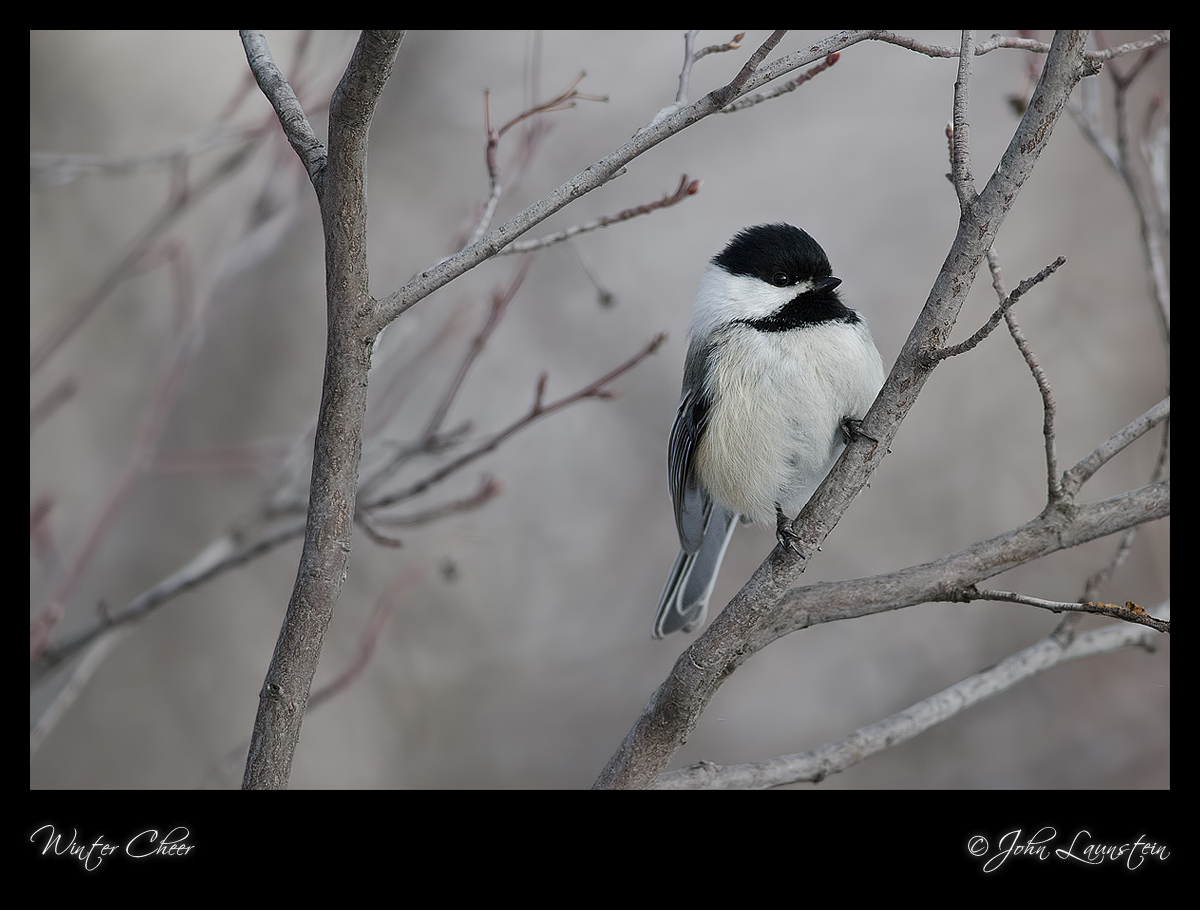
I've got several owl images to process so I thought I'd post this cheery fellow in hopes of soliciting input on comp and crop.
This is a virtually untouched version of the image as shot...cropped to 74% of original and only minimal selective dodging and burning, and of course some unsharp masking.
I've tried several crop options on this image and actually liked them all! The small branches above the chickadee's head was what initially prompted me to try a slight crop from top and left, and I liked it. Then I tried a more significant crop, while still keeping the bird from getting too big, and liked that too! Finally I tried a vertical crop, and almost went with it, but realized I might learn more from asking you all what you would do. I should get about as many opinions as comments this way, I realize, but it should be interesting, too!
Feel free to make suggestions on any other pp needs...I literally converted from RAW, did some quick dodging and burning, sharpened, and posted. I'm almost certain the image can be improved by being brightened a bit, for example.
Thanks in advance...
Nikon D7000
Nikkor 300mm f/4 AF-S with TC-14EII
ISO 500
1/800sec @f/5.6
monopod
Cropped to 74% of original

Comments
13 commentsI would reprocess this if it were mine, keeping more room in front of the bird and less room behind, and not sharpening quite so much. It is a good image, worth polishing.
I will post a second comp/crop later...yes, I have room to the right but even though it "breaks a rule" I really liked the feel and balance of the image this way. I know he's looking into the right edge as opposed to open space, but I try to "think outside the box" when I'm re-composing/cropping in case I find something that just feels right despite it not following the normal guidelines. For me, and this is highly subjective, the image just looked more natural and interesting this way than with other positioning of the subject. BUT that's exactly why I asked for suggestions!
Thank you...
Your detail, color and bokeh is beautiful!
Chrisie Jackson
Denver, Colorado
The setting is lovely with the pale background and the gray branches. I find the pose of the bird to be very appealing and I love the eye contact shown here. I am seeing a fine. thin halo along some of the branches you sharpned, being very careful when selectively masking and making sure none of the background is within the sharpening mask resolves that issue most of the time. I also see the halo around the bird's bill. Personally I would prefer more room on the right and less on the left because the bird is close to the edge of the frame on the right, composition is a personal thing and for me it is about balance more than it is about rules.
While I always appreciate "thinking out of the box" that creates unusual imagery, one thing in compositions I find extremely hard to break away from is the necessity of having more space for a subject to look or move into, though this is more likely in line with my level of OCD rather than looking to stick within the relative safety of "The Rules" ;^)
The branches get VERY busy to the right of this crop line, so try as I might, I couldn't talk myself into a horizontal crop with the chickadee on the left...the background also has some additional colours included on the right side of the original frame which I felt, coupled with the branch mayhem really depreciated the strength of the image.
Thank you again!
The left-hand edge could afford to be pulled out a little more to the left without it centering the subject too much; as is, I feel the subject's back is too close to the edge of the frame.
I would remove or clone out the three individual pieces of twig from the left-hand edge that now don't seem to be connected to anything at all and only serve as a distraction.
While I think others will disagree, personally I much prefer the tones in the original image, as I really feel they add so well to the mood; lightening this up as much as you have seems to soften the image as a whole. Perhaps a fraction more might help to get a little more detail in the blacks, but I'm more than satisfied that you caught that catchlight in it's eye so well to set it out from it's black cap.
Them's me thoughts anyhow ;^)
I much prefer the composition of the repost. The bird is centered top to bottom though and I might consider either taking some off of the bottom and leaving more room at the top or vice versa.
Your techs, color, etc are spot on, John, btw.
I got to say that having untethered elements in an image usually isn't a good idea. In this case its the branches over the bird's head and to the left of it. I would include at least some of the vertical branch that these sprout from. Then of course I'd probably feel the need for more room on the right of the image-if those elements are tethered.