Nature Photographers Network
This is the preserved archive of the original Nature Photographers Network. The community continues at naturephotographers.network.
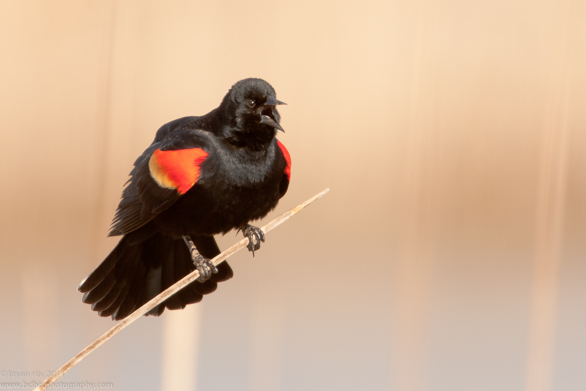
RW Blackbird Calling
‹ PreviousAvian GalleryNext ›

RW Blackbird Calling

by Bryan Hix

Gallery: AvianPosted April 16, 2011161 views12 comments
About a month ago, the RWBBs arrived on the scene and started their morning calling rituals at a local marsh. I was actually down in the cattails trying to get some good photos of waterfowl, but as things slowed down, I switched over to these guys. I could have upped the exp comp more to bring out even a little more detail in some of the blacks. Unfortunately, it doesn't look very good when I try to adjust the in post-processing, so I left them a little darker. I also debated cloning out or reducing the size of some of the vertical cattail reeds. Before I mess with it, I thought I would wait for some opinions about it first.

Canon 1D Mk4
600mm f/4 | 1.4x TC
ISO 500, 1/1250 @ f/5.6, AvMode +1 eval meter.
LR3.3, sharpen, curves adj, selctive burn of reed

Comments

12 comments
Comment posted by Ron Bielefeld on April 16, 2011 at 11:11 AM
Bryan, I would not touch the vertical reeds. They make this image IMO. Really a great element of the BG and overall image. The bird is nice with a great calling pose and a nice simple comp on the one perch reed. My only very small nit is the well lit blacks on the head and upper breast area seem to contain a little less detail than I would like to see. Maybe focus was off just the slightest bit. Overall, very nice as posted.
Registered on December 6, 2008, 360 Posts, 7132 Comments
Comment posted by Sharon Hallowell on April 16, 2011 at 11:34 AM
Excellent comp and pose! Love the bg...don't clone! Sharon
Registered on November 1, 2003, 392 Posts, 4810 Comments
Comment posted by Bryan Hix on April 16, 2011 at 12:04 PM
Did some minor adjustments to curves/contrast and tried to selectively sharpen some areas especially around the eye and top of the head. Thoughts?
Registered on June 13, 2008, 117 Posts, 755 Comments
Comment posted by Ron Bielefeld on April 16, 2011 at 12:15 PM
Bryan, I think the blacks in the bird are much more natural looking. Much, much better in that regard. Sharpness looks better, but tough to tell without a larger version. Sure wish we could replace the larger version with reposts too. The overall color tone changed a ton between images. Is this the same color space? I am not sure which colors are more accuate to the actual scene you shot, so I cannot comment on the change in colors. However, I would go for what most accurately represents what you saw in the field.
Registered on December 6, 2008, 360 Posts, 7132 Comments
Comment posted by Bryan Hix on April 16, 2011 at 12:19 PM
Ron, when I adjusted the contrast/curves, it made the reds look bolder and not so washed out. I think that tend to be more like a remember them in the field. These guys are difficult because you really have to add light to get the detail in the darks, but then that messes with the reds. I don't think I have ever nailed it perfectly without having to adjust things in post-processing. I am liking the re-post better than what I originally posted.
Registered on June 13, 2008, 117 Posts, 755 Comments
Comment posted by Steve Canuel on April 16, 2011 at 3:47 PM
Nice classic pose and BG for this species. I wouldn't clone out the reeds but may try to tone it down if it bothers you. Repost is a slight improvement for me. These guys are tough to expose without cooking those reds and still getting some details in the darker blacks. The edges seem to be especially susceptible. I select the epaulet edges and tweak the red color channel by adding a slight yellow hue and adjusting the sat and brightness to tame it a bit.
Registered on September 12, 2010, 53 Posts, 660 Comments
Comment posted by Wayne Willison on April 16, 2011 at 6:16 PM
Really like the comp here, Bryan. And the repost took care of the slight softness, although I like the colors better in the original post. They seem more in keeping with this bird species, but that's just my opiniion. Very effective image.
Registered on April 10, 2009, 292 Posts, 3967 Comments
Comment posted by David Haynes on April 16, 2011 at 10:12 PM
Bryan,
The repost is much better in my opinion. First of all in the original the reds on the wing looked very hot. Remember, you can bow out reds and yellows just as you can whites and I think the reds may have been borderline in the original. The background looks like a more natural tan color rather than the reds in the original post. I agree with everything you've said after your repost. Nice grab on a very difficult to expose for subject.
Registered on February 20, 2010, 110 Posts, 1511 Comments
Comment posted by Brian Gatlin on April 16, 2011 at 10:21 PM
love the setting and pose here, Bryan. totally agree that the bg reeds are very appealing. repost looks better to me.
Registered on March 21, 2009, 202 Posts, 4187 Comments
Comment posted by Ashley Vincent on April 17, 2011 at 12:09 AM
Very pleasing image to look at Bryan, thanks for sharing :^)
Registered on March 1, 2011, 154 Posts, 2083 Comments
Comment posted by Jim DeWitt on April 17, 2011 at 1:06 AM
I prefer the re-post; the differences are subtle but effective. Put me down as another fan of the reeds; they give the scene context.
Registered on August 28, 2006, 1240 Posts, 8506 Comments
Comment posted by Mia McPherson on April 17, 2011 at 7:47 AM
Bryan, I'd leave the vertical lines as they are, I think they look very natural and give a sense of place thus are appealing to me. I agree with Ron D about the head and upper breast area. The calling pose is great, love the background colors and the comp you used. I prefer the repost very much. Agree with you on how the light has to be just right for blackbirds.
Registered on June 25, 2007, 491 Posts, 12566 Comments