Nature Photographers Network
This is the preserved archive of the original Nature Photographers Network. The community continues at naturephotographers.network.
The Refinery
‹ PreviousLandscape GalleryNext ›

The Refinery

by James Fougère

Gallery: LandscapePosted April 29, 2011577 views27 comments
I had a great time in the American SW recently, and wanted to thank everyone here that helped me with getting familiar with the area :smile:

I happened to run into Jack Graham in Monument Valley, and he hooked me up with a decent native guide, who gave me a financial break to get out to the private area of Monument Valley. Being on my own with the guide, I was able to move quickly, and go where I preferred (Thanks Jack).

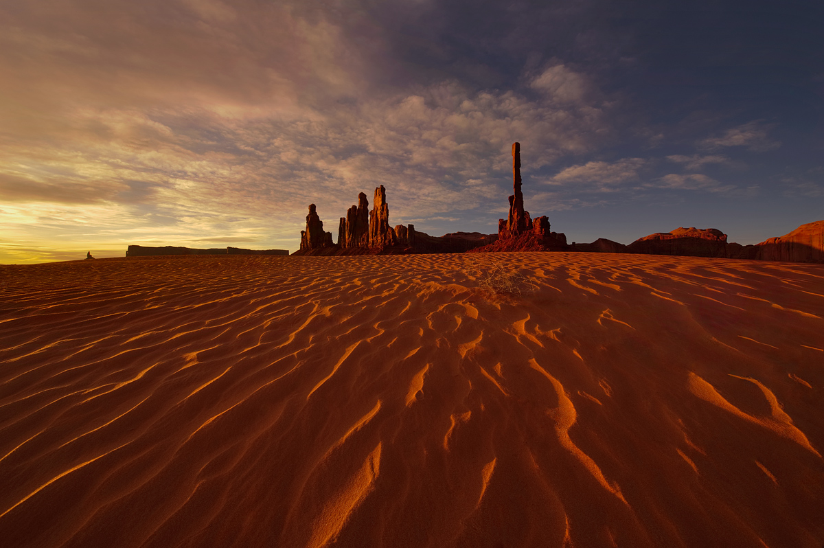
The side lighting was nice on this dune in front of the Totem Pole. I am sure there are many shots of this iconic monument. It reminded me of a "oil refinery" hence the title. I would have prefered to get the tumbleweed out of the way, or to have it in a better position, but being sand dunes, it was not possible. I also included a larger format to view.

I am still trying to get used to using Photoshop for processing, sorry for the nits here. One issue I am having is the jpg file presented here seems rich in red and saturation when viewed with a web based viewer, but looks fine when I view it with photoshop or a windows viewing tool.

I have lots of processing work to do with the images of my SW trip!!

Please feel free to comment.


Nikon 3Ds, 14-24mm F2.8, 1/40sec, ISO100, F16, tripod



Comments

27 comments
Comment posted by Cory Freeman on April 29, 2011 at 8:20 PM
really fine image James!
Registered on December 16, 2003, 107 Posts, 1341 Comments
Comment posted by Nick Bristol on April 29, 2011 at 8:20 PM
Awesome! I love it, James. This is so cool to look at. Neat work! I think I could easly look at the large version the rest of the night...but I gotta go eat.

Nick Bristol
Lone Rock, WI
Registered on February 1, 2004, 752 Posts, 14140 Comments
Comment posted by Eva McDermott on April 29, 2011 at 8:42 PM
The highlights and the texture in the foreground are a wonderful lead in to the rock forms and gorgeous sky James. Beautiful work!
Registered on January 4, 2009, 1015 Posts, 13229 Comments
Comment posted by scott lanz on April 29, 2011 at 8:44 PM
Fantastic. Is this a single image if you don't mind me asking?
Registered on November 14, 2003, 840 Posts, 12902 Comments
Comment posted by James Fougère on April 29, 2011 at 8:53 PM
Yes Scot, this is a single image. I was able to balance the light with out having to use 2 images :)
Registered on October 25, 2010, 41 Posts, 831 Comments
Comment posted by Jason Kim on April 29, 2011 at 8:54 PM
Very nice image, James. The texture of the sand and the lighting work great to pull the eye into the comp. As for your color issues, there's a couple of helpful discussions in the forums (search Tony's K's posts) that might answer some of those questions. I don't remember the specific links.
Registered on July 1, 2006, 60 Posts, 1233 Comments
Comment posted by James Fougère on April 29, 2011 at 8:54 PM
I added a little more contrast to the sky, to bring out a little more detail in the clouds. I must master Photoshop!!!
Registered on October 25, 2010, 41 Posts, 831 Comments
Comment posted by Jared Atencio on April 29, 2011 at 8:58 PM
Nice work here James. I have never really felt the draw to Monument Valley like many others, mainly due to the logistics of getting around on Navajo land, but this is the one location within MV that I would love to shoot some day. I like the darker processing and the warm light here, and the centered comp also seems to work very well for me in this case.

*Edit* I tend to like the first version over the second...
Registered on June 23, 2009, 21 Posts, 422 Comments
Comment posted by Neil Paskin on April 29, 2011 at 9:10 PM
Wonderful shot James. Amazing subject with super lead in lines of light on the sand. Love the title too.
Registered on May 30, 2008, 7 Posts, 39 Comments
Comment posted by Zack Schnepf on April 29, 2011 at 9:17 PM
Very cool James. I like the second version even better. We'll figure out the conversion color issue, It's probably a simple fix.
Registered on November 1, 2003, 403 Posts, 2528 Comments
Comment posted by Tony Kuyper on April 29, 2011 at 9:58 PM
Fantastic scene, James, and the clouds really make it, as does the wide, wide-angle. My only thought might be to balance the light a bit more. Sky looks a bit polarized even thought it's not.
Registered on November 1, 2003, 364 Posts, 22328 Comments
Comment posted by James Fougère on April 29, 2011 at 10:07 PM
I agree Tony, I am still trying to understand photoshop ! But every processed image I do, is a lesson learned :biggrin:

Thank you for all the comments.
Registered on October 25, 2010, 41 Posts, 831 Comments
Comment posted by John Mumaw on April 29, 2011 at 10:08 PM
This is one of the best Totem Pole images I've seen, James.
The textured, side lit sand works great in leading one's eye to the formations. I like what you did with the skies in the repost.
Looks like you have a good handle on 'development' with PS if this one is any indication. No nits whatsover in that (or any) regard.
Registered on September 9, 2005, 62 Posts, 2289 Comments
Comment posted by Mark Metternich on April 29, 2011 at 10:17 PM
James, nice talking w you and very nice post here. I too like the re post best. I think you did a nice job. Maybe others can give you some things that might be improved but I'm thinking it is close. The only thing that came to mind is a graduated luminosity adjustment from the right of the frame to the left lightening up the right very slightly. Then maybe a careful burn of the far left highlights, in luminosity mode, with the blending sliders positioned so that no tones from grey to black exist on the layer (that might be over some peoples heads). The blending sliders (with luminosity mode used) allow one to make the dodging and burning tools work much better...

Again, I think you have a winner here and you did a very good job. :toast:
Registered on June 19, 2009, 276 Posts, 6240 Comments
Comment posted by Koveh Tavakkol on April 29, 2011 at 10:48 PM
Really nice shot James. I like the leading lines in the foreground quite a bit.
Registered on September 1, 2009, 41 Posts, 608 Comments
Comment posted by James Fougère on April 30, 2011 at 12:24 AM
Thanks again for the comments everyone. John, I am glad you like it! Being that you live in that area of the country, I appreciate your input, I would have liked to hook up with you down there. I will be back this fall to pick up where I left off. :biggrin:
Registered on October 25, 2010, 41 Posts, 831 Comments
Comment posted by James Fougère on April 30, 2011 at 1:23 AM
I found some color controls in PS I have not played with before, and was able to remove the "polarized" look to this image, even though I did not use one.
Registered on October 25, 2010, 41 Posts, 831 Comments
Comment posted by Enrique Vizcarra on April 30, 2011 at 1:57 AM


Wow!!! Fastastic composition :toast:
Registered on September 10, 2009, 223 Posts, 393 Comments
Comment posted by R.Bill Moser on April 30, 2011 at 3:03 AM
You did a nice job on this one. I love the wide angle view and the light, texture and pattern in the foreground
Registered on January 29, 2010, 285 Posts, 4281 Comments
Comment posted by Abdullaziz Bin Ali on April 30, 2011 at 7:53 AM
Love the light
Awesome
Registered on May 31, 2009, 112 Posts, 1590 Comments
Comment posted by John Mumaw on April 30, 2011 at 9:53 AM
I don't see a lot of difference between reposts #1 and #2.
Honestly, this looks pretty natural to me considering that the sun is rising (setting?) on the left.
Registered on September 9, 2005, 62 Posts, 2289 Comments
Comment posted by Robert Dayton on April 30, 2011 at 10:37 AM
Beautiful, James! It glows. Great leadin lines with sharp details. The
sky is another plus. Of the two versions I prefer the second.
Registered on November 11, 2008, 281 Posts, 3958 Comments
Comment posted by James Fougère on April 30, 2011 at 2:12 PM
John, It was a sunrise shot, and I got a bit lucky with the clouds, to diffuse the otherwise harsh light that would have arrived much quicker. With everyone using different monitors etc, using the web to analyze images is difficult. I personally like version 3, because the blue sky seems a bit more attractive, where is the 2 version looks like a polarizer was used.

Mark, thanks for your time as well, you have a lot of great information I would really like to download into my brain!
Registered on October 25, 2010, 41 Posts, 831 Comments
Comment posted by dean hebert on April 30, 2011 at 2:39 PM
Fantastic! I love the lines in the FG. Good luck with photoshop, it seems I learn something new everytime I open the program. :toast:
Registered on August 4, 2010, 70 Posts, 1132 Comments
Comment posted by Richard Hartmann on May 1, 2011 at 12:50 AM
Heck yah, James!! With captures like this you can take your time learning Photoshop.
Just love it. I hope to see more from you.
Registered on January 15, 2009, 13 Posts, 772 Comments
Comment posted by Vijay Raj on May 1, 2011 at 8:10 AM
Nice light on a equally nice landscape.
Registered on November 22, 2010, 29 Posts, 100 Comments
Comment posted by Marc Adamus on May 2, 2011 at 4:55 PM
This is everything I thought it would be, James. Amazing stuff!
Registered on September 17, 2005, 780 Posts, 8091 Comments