Nature Photographers Network
This is the preserved archive of the original Nature Photographers Network. The community continues at naturephotographers.network.
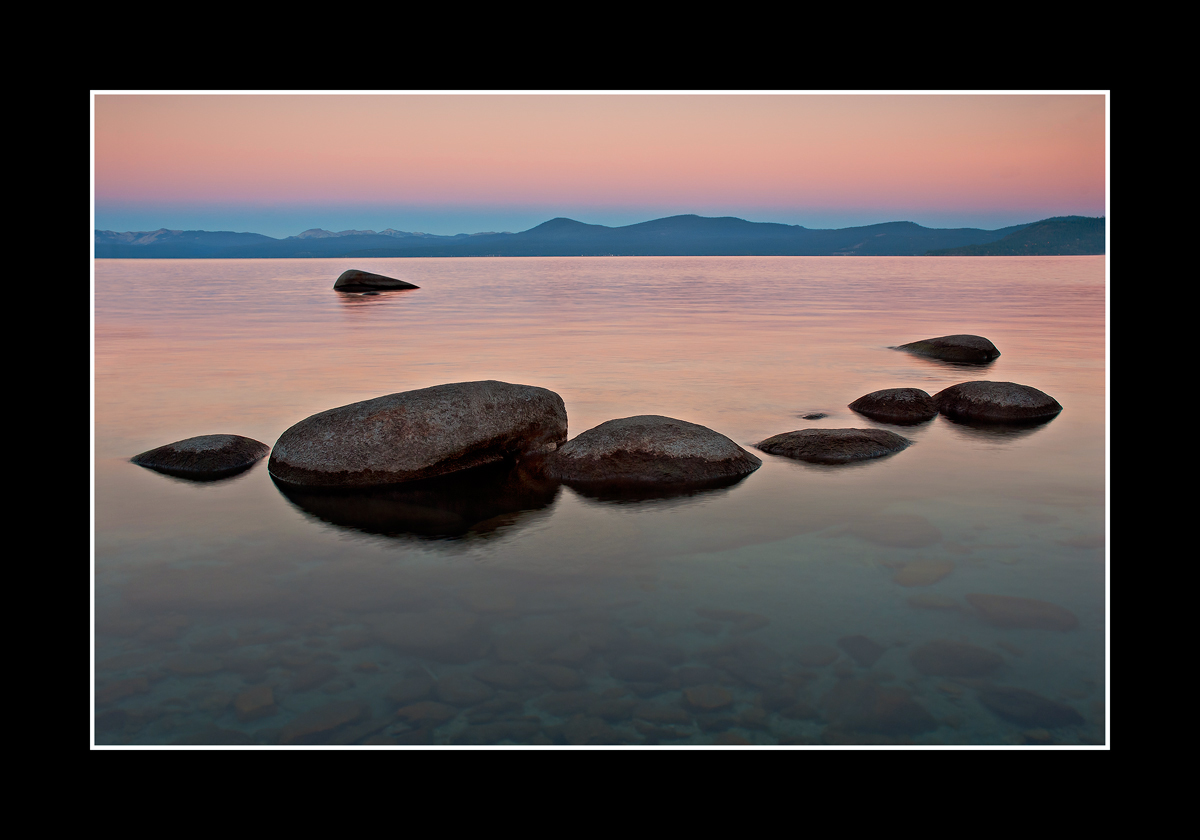
Pinks and Blues ll/ W Edits
‹ PreviousLandscape GalleryNext ›

Pinks and Blues ll/ W Edits

by Chris Chamberlain

Gallery: LandscapePosted May 10, 2011351 views39 comments
This horizontal comp was captured earlier than the last post while the earth shadow was still strong. I tend to prefer this one to the last, but all my non-photographer friends and family like the transparent foreground of the last one over this comp. I'd love to hear your thoughts! Large version included.

D200,
18-70mm,
GND,
3/4sec, F11,

Chris

Comments

39 comments
Comment posted by Scott Miller on May 10, 2011 at 7:17 PM
I too prefer this one, I might even remove just a little more of the foreground water. To me the pink reflections and the natural curve formed by that line of rocks are the stars here, so removing a little more of the foreground might accentuate it even more. Not too much more, just a bit. Regardless I love the image, well done.
Registered on May 9, 2011, 23 Posts, 322 Comments
Comment posted by Eva McDermott on May 10, 2011 at 7:22 PM
I love the clean comp of this view Chis as well as the salmon color in the reflected light and sky. Beautiful work.
Registered on January 4, 2009, 1015 Posts, 13229 Comments
Comment posted by Cory Freeman on May 10, 2011 at 7:24 PM
I like what you've got going here chris. I think the curve of the fg rocks really sets the harmony and balance to the image. that said the bg rock really works against that harmony the fg rocks convey. if the bg rock wasn't there this would, dare I say, be rock solid. ;) my $.02
Registered on December 16, 2003, 107 Posts, 1341 Comments
Comment posted by Brian Schrayer on May 10, 2011 at 7:24 PM
I think I prefer this one too, Chris. I like the pattern of the rocks in the foreground as well as the quality of light here. I also like how the transition of color in the sky is repeated almost proportionately in the reflection and the sky.
Registered on May 28, 2004, 114 Posts, 2890 Comments
Comment posted by Chris Chamberlain on May 10, 2011 at 7:28 PM
Cory,
Thanks, I agree completely with your comment. I'm seriously considering making that rock disappear! :wink:

Chris
Registered on March 13, 2007, 500 Posts, 8365 Comments
Comment posted by Marc Adamus on May 10, 2011 at 7:33 PM
Wow, very nice layers here Chris. I really enjoy the soft palette too.
Registered on September 17, 2005, 780 Posts, 8091 Comments
Comment posted by SandyRichardsBrown on May 10, 2011 at 7:38 PM
Very calming and serene. I prefer this one too, and would also cut out a bit of the nondescripot FG - the colours of the sea and sky are what is best in this shot, and the grayish FG doesn't add a thing.
Nice work!
Sandy
Registered on November 24, 2003, 3937 Posts, 12909 Comments
Comment posted by Chris Chamberlain on May 10, 2011 at 7:48 PM
Thanks,
Here's a version sanz rock, and a pano as well below. I think I prefer the 2/3 format, but do agree that it doesn't need as much foreground either.

Chris
Registered on March 13, 2007, 500 Posts, 8365 Comments
Comment posted by Chris Chamberlain on May 10, 2011 at 7:48 PM
The pano.
Registered on March 13, 2007, 500 Posts, 8365 Comments
Comment posted by Cory Freeman on May 10, 2011 at 7:49 PM
:toast: ya snuck that pano in while I was toasting ya! pano feels a little tight on the bottom. nice work!
Registered on December 16, 2003, 107 Posts, 1341 Comments
Comment posted by Phil Pogledich on May 10, 2011 at 7:52 PM
The original here works best for me . . . I didn't find the boulder objectionable, and I prefer the 2:3 rather than the pano. Splendid shot all around. Hard for me to choose between this one and your prior post with the vertical format. But I, like you and some of the others, would choose this one if forced to decide.
Registered on August 24, 2009, 123 Posts, 3099 Comments
Comment posted by Barry Vangrov on May 10, 2011 at 8:12 PM
I think you got it right with the original although a tiny crop at the bottom wouldn't hurt. I like the underwater rocks as the foreground and wouldn't crop them out. Nice job.
Registered on September 1, 2009, 148 Posts, 749 Comments
Comment posted by Derek Yow on May 10, 2011 at 8:14 PM
I prefer this version over the first, and in this thread I like the second.
Love the pinks and blues and the curve in the rocks
Registered on May 18, 2010, 26 Posts, 655 Comments
Comment posted by Steve Sieren on May 10, 2011 at 8:33 PM
I remember you showing me a similar print Chris, great stillness to it. Keep Tahoe Blue and drink Tahoe Brew!
Registered on January 2, 2008, 360 Posts, 5321 Comments
Comment posted by Wayne Jones on May 10, 2011 at 9:09 PM
Oh Man, I love that transparent foreground, but this is a much cleaner comp. The 2x3 without the far rock is even cleaner, so if you don't mind people wondering what happened to the other rock it works. :wink: For the sake of the whole truth and nothing but the truth, that rock is not that bad, though.
Registered on April 18, 2007, 953 Posts, 6435 Comments
Comment posted by Joseph Rossbach on May 10, 2011 at 10:11 PM
Beautiful and serene composition Chris. The color and soft muted light is just perfect as well!! :toast:
Registered on November 25, 2005, 484 Posts, 1377 Comments
Comment posted by Michael R Reynolds on May 10, 2011 at 11:37 PM
Chris,
Absolutely wonderful image. Love the earth shadow and the comp. Best Regards.
Registered on February 26, 2008, 54 Posts, 812 Comments
Comment posted by Kah Kit Yoong on May 10, 2011 at 11:56 PM
I prefer the sans rock version and the original framing. A strong composition and beautiful light.
Registered on September 27, 2006, 636 Posts, 10682 Comments
Comment posted by dean hebert on May 11, 2011 at 12:13 AM
Well...here goes...I like this better than the first post. I don't mind the rock but I prefer the version without it. I think the pano simplifys the whole comp but it does feel a bit tight. :toast:
Registered on August 4, 2010, 70 Posts, 1132 Comments
Comment posted by Vance Gese on May 11, 2011 at 12:50 AM
This is stunning, Chris. The pastel colors, and the simplified composition compared to the previous makes this incredible. Your composition could not be better in my opinion. I see some suggested removing the far rock, but I feel it acts as a perfect counter to the curve of the rocks on the right hand side, and for me at least, I wouldn't change a thing. Don't mean to contradict others, just giving my opinion. This must look fantastic on the wall. Beautiful art.
Registered on November 13, 2008, 298 Posts, 6629 Comments
Comment posted by Zack Clothier on May 11, 2011 at 1:12 AM
I just looked up your previous post Chris and I have to say I like this comp much better. There was just to much empty space in the vertical even with the transparent water. Nicely composed!
Registered on January 28, 2010, 343 Posts, 2257 Comments
Comment posted by Danny Laureys on May 11, 2011 at 1:22 AM
Excellent, I do like the original :toast: :toast: :toast:
Registered on January 5, 2008, 590 Posts, 1261 Comments
Comment posted by Michael J Greene, on May 11, 2011 at 1:47 AM
Beautiful sweeping composition Chris. This is one that grows on you on the longer you look at it. I like this a lot.

Michael
Registered on June 18, 2009, 86 Posts, 2317 Comments
Comment posted by Youssef Ismail on May 11, 2011 at 3:04 AM
Chris,

I like the 2:3 version best as well without the rock. Nice work.
Registered on November 1, 2003, 474 Posts, 5555 Comments
Comment posted by David Chauvin on May 11, 2011 at 5:13 AM
Don't touch the original comp. It has a great sense of balance and serenity. :cool:
Registered on August 5, 2004, 1007 Posts, 5595 Comments
Comment posted by Kevin Trinkner on May 11, 2011 at 8:02 AM
Beautiful scene Chris, very calming. Great comp with some very nice soft light throughout. The bg rock really didn't bother me much, but the scene does feel more balanced without it. I prefer some of the fg over the pano version.

Great work.
Registered on June 30, 2008, 203 Posts, 2641 Comments
Comment posted by Bill Chambers on May 11, 2011 at 8:14 AM
I much prefer this one over the previous - the comp is more balanced and easier on the eyes. Even the BG rock doesn't really bother me. This would make a very nice large print.
Registered on April 10, 2005, 753 Posts, 21216 Comments
Comment posted by Paul Duval on May 11, 2011 at 8:28 AM
Chris,

I don't want to over analyze this, but sometimes it's interesting to consider why photographers and the VP ( viewing public ) choose one image over another. Especially when the images are from the same place, same day just a slight different comp and a small separation in time. Image one has the deep depth of field and the sharpness in the foreground which reveals the shallow bottom in the foreground it graduates through interesting shapes in the mid ground with the soft luscious sky color reflected in the water, the peaks separate the sky from the water and a beautiful pink sky that's evenly colored. Where as the Second image has a slightly stronger comp ( with or without the boulder ) there is a hint of the substrate in the foreground but it doesn't start the eye there. But the piece de' resistance for photographers is the well rendered earth shadow just above the peaks and the pink sky. It shows in a way the first image doesn't a place a moment of time, the edge of the transition between day and night. My first thought on opening the thumbnail was great image of the earth shadow Chris. Anyway that's my take on the two images FWIW.

Paul
Registered on June 30, 2009, 508 Posts, 1907 Comments
Comment posted by Tony Kuyper on May 11, 2011 at 9:48 AM
Very Zen-like, Chris. The reflection sure makes the light special.
Registered on November 1, 2003, 364 Posts, 22328 Comments
Comment posted by Mike Ryan on May 11, 2011 at 9:52 AM
Hi Chris

My vote would be for #2. I don't mind the rock in the background but without just works that much more for me. Everything else is great and did well to capture a great comp at a great time. Is this around Sand Harbor? I hope to go there for the first time early next month.
Registered on June 29, 2008, 85 Posts, 636 Comments
Comment posted by Nick Bristol on May 11, 2011 at 1:18 PM
These are really very nice Chris. You captured a really nice time with a wonderful feel. I like both the first and second version, but I would stick with the original myself. This is nice work.

Nick Bristol
Lone Rock, WI
Registered on February 1, 2004, 752 Posts, 14140 Comments
Comment posted by Santosh Ponnan on May 11, 2011 at 9:23 PM
I really like this horizontal comp. Nice colors and simple composition.
Registered on June 15, 2007, 56 Posts, 113 Comments
Comment posted by Dietrich Gloger on May 12, 2011 at 1:12 AM
Hi Chris, yes I am back - for the time being at least. Another image that displays pure elegance. A very well designed and "clean" composition. Love it!
Registered on January 26, 2007, 360 Posts, 9876 Comments
Comment posted by Abdullaziz Bin Ali on May 12, 2011 at 2:04 AM
Chris this is amazing
I really like the small stones in the FG which are almost hidden
lovely
Registered on May 31, 2009, 112 Posts, 1590 Comments
Comment posted by Stuart Williams on May 12, 2011 at 4:54 AM
perfect composition and perfect serenity. great shooting!
Registered on December 7, 2007, 247 Posts, 4792 Comments
Comment posted by Jared Ropelato on May 12, 2011 at 4:34 PM
very simple and elegant comp. It's engaging, love the colors and the clarity of the water and the tones are just gorgeous.
Registered on March 1, 2011, 25 Posts, 204 Comments
Comment posted by Harry Lichtman on May 13, 2011 at 10:53 AM
Wonderfully peaceful image. The submerged rocks add another dimension to the shot. I prefer the 1st image to this - the rock seems to break up the flow of the shot. The pano really works well too. :toast:
Registered on September 17, 2010, 304 Posts, 3507 Comments
Comment posted by Terry Jung on August 22, 2011 at 2:33 AM
The light is phenomenal, the composition works very well. Excellent !
Registered on March 2, 2011, 8 Posts, 72 Comments
Comment posted by Jared Ropelato on August 22, 2011 at 8:35 PM
Nice peaceful comp and color combo and dig the water clarity
Registered on March 1, 2011, 25 Posts, 204 Comments