Gallery: LandscapePosted May 18, 201160 views7 comments
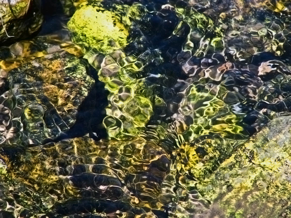
Aquatic plants and flat stones pattern the bed of the creek. This is from last spring but I like the colors and shapes in it. Thanks for looking
Canon Powershot
1/400sec f/3.5 72mm
Comments
7 comments
Comment posted by Bill Chambers on May 19, 2011 at 11:34 AM
Makes me want to go stick my feet in the cool, fresh water! The highlights at the top center are a little too bright - might want to burn them some, but otherwise it's nice.
Registered on April 10, 2005, 753 Posts, 21216 Comments
Comment posted by Jason Risinger on May 19, 2011 at 1:23 PM
Nancy, this is by far the best of these types of images that you have posted here. I really enjoy the rippled patterns, and the colors complement each other very well. And I like how the ripples allow just a hint of the stone forms below, but keep them nicely abstract.
I would agree with what Bill mentioned about the highlights at the top center, and add that the bottom right is just a little bright too.
Registered on July 13, 2010, 13 Posts, 91 Comments
Comment posted by Barbara Graham on May 19, 2011 at 2:33 PM
Nancy, this is beautiful. I agree that you could tone down the brightest highlights a bit and still maintain the beauty.
Registered on July 27, 2010, 1310 Posts, 5035 Comments
Comment posted by Nick Bristol on May 19, 2011 at 4:32 PM
Hi Nancy, I like this one the best of these images so far too. The water looks so clear and fresh! I agree with the suggestions on the highlights. Nice!
Nick Bristol
Lone Rock, WI
Registered on February 1, 2004, 752 Posts, 14140 Comments
Comment posted by Phil Pogledich on May 19, 2011 at 5:04 PM
The textures are wonderful. I agree with the others on the highlights . . . I think the textures will carry this image if you can dial back the brightness of the highlights.
Registered on August 24, 2009, 123 Posts, 3099 Comments
Comment posted by Nancy Lea Sandy on May 19, 2011 at 5:47 PM
Highlights toned down. Thank you all for the suggestion.
Registered on January 24, 2011, 576 Posts, 6942 Comments
Comment posted by Mark Seaver on May 19, 2011 at 9:14 PM
Nancy Lea, this works very well. The shapes are fairly simple and they work with the colors to keep my eyes moving.
Registered on January 23, 2011, 1103 Posts, 17270 Comments

Comments
7 commentsI would agree with what Bill mentioned about the highlights at the top center, and add that the bottom right is just a little bright too.
Nick Bristol
Lone Rock, WI