Nature Photographers Network
This is the preserved archive of the original Nature Photographers Network. The community continues at naturephotographers.network.
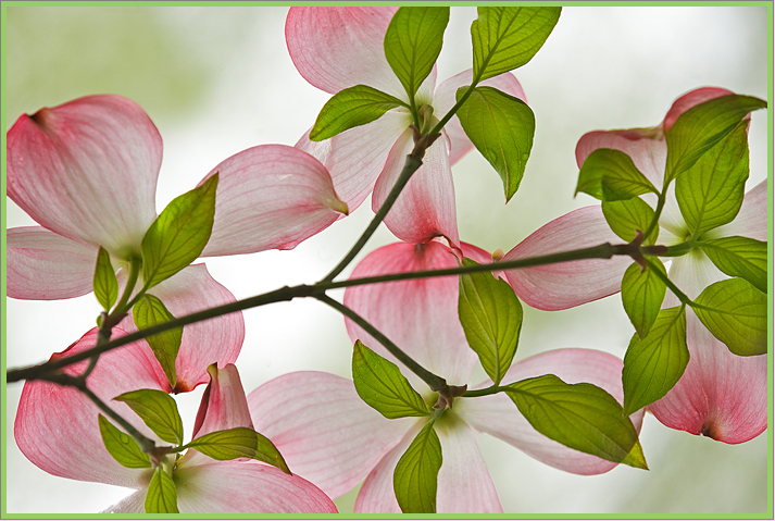
Pink Dogwood
‹ PreviousFlora GalleryNext ›

Pink Dogwood

by scott lanz

Gallery: FloraPosted May 25, 2011322 views25 comments
I took some shots of dogwood leaves and blossoms last week in a gentle rain (rain, what a surprise). I'd like to post a couple for feedback, starting with this one. I will post the same image in a vertical orientation below. Comments appreciated, including which orientation is preferred. Fellows Riverside Gardens, Youngstown, Nikon D700, Tamron 180, iso 400, f8, 1/320, handheld.

Comments

25 comments
Comment posted by scott lanz on May 25, 2011 at 8:47 AM
Here is the vertical.
Registered on November 14, 2003, 840 Posts, 12902 Comments
Comment posted by Nancy Lea Sandy on May 25, 2011 at 9:00 AM
This is lovely. Delicate, elegant, beautifully balanced, I think the horizontal image has better flow.
Registered on January 24, 2011, 576 Posts, 6942 Comments
Comment posted by Patricia Brundage on May 25, 2011 at 9:50 AM
Looks like a stained glass rendering with a beautiful backlighting. Prefer the horizontal. Great choice of perspective.
Registered on March 23, 2006, 1111 Posts, 6531 Comments
Comment posted by David W. Kelly on May 25, 2011 at 10:32 AM
Lots of detail yet it still has a softness to it. Beautiful.
Registered on October 7, 2005, 883 Posts, 6590 Comments
Comment posted by Gary Yeoh on May 25, 2011 at 10:39 AM
Scott:
This is nice and I like this a lot. This would be a very nice candidate for high key images. Of the two, I think the horizontal is stronger but I would like to see a vertical flip upside down before committing. Wish the stem was also sharp. Good as posted too.
Registered on September 1, 2009, 588 Posts, 8184 Comments
Comment posted by Ramamohan Pai on May 25, 2011 at 11:01 AM
I prefer the vertical here, Scott. I like that dark line moving throughout the frame carrying those lovely dogwood blossoms :cool:
Registered on November 1, 2003, 550 Posts, 9037 Comments
Comment posted by beth summer on May 25, 2011 at 11:23 AM
Lovely, Scott...beautiful diffused lighting, delicate mood, wonderful color. Not sure which one I like...both provide differnet feels for me. I do wish the branch was in better focus but then you'd probably lose somoe of the blurred bg. BUT it's not a dealbreaker at all either. A slight orton might work to your advantage for the branch...wonderful overall, Scott and I'd be happy to have this in my portfolio :smile:
Registered on November 1, 2003, 437 Posts, 5220 Comments
Comment posted by Ken Smith on May 25, 2011 at 1:26 PM
Stained glass-like...what an effective display of this/ Well seen and crafted.
Registered on September 5, 2008, 449 Posts, 2444 Comments
Comment posted by Derek Yow on May 25, 2011 at 1:27 PM
They're both beautiful Scott, but if I had to choose I think I lean towards the horizontal version. I love the transluscence of the blooms and leaves, and the droplets showing through.
Registered on May 18, 2010, 26 Posts, 655 Comments
Comment posted by Brigitte Lorenz on May 25, 2011 at 3:13 PM
The colors are wonderful, very lovely image...I prefer the vertical version

Brigitte
Registered on January 10, 2009, 187 Posts, 1507 Comments
Comment posted by Nathan Buck on May 25, 2011 at 6:41 PM
This is just plain magical Scott. I love the 'from underneath' comp. The light and color is fantastic. Excellent work on the plane of focus too. Excellent results! Very creative!

Nathan

PS - Horizontal one works best for me.
Registered on November 1, 2003, 1101 Posts, 13589 Comments
Comment posted by Pat Sampson on May 25, 2011 at 6:54 PM
Scott,

I'll add my kudos to both images. Beautiful work. I think I prefer the horizontal but it may just be because I can follow the flow of it without scrolling on my MacBook. Gorgeous.

pat
Registered on May 19, 2007, 953 Posts, 15989 Comments
Comment posted by Paul Duval on May 25, 2011 at 8:39 PM
Beautiful soft presentation with a subtle palette of color, but I wish the DOF was just a little deeper that soft branch crossing the middle is distracting to the rest. It's a minor nit, though.


Paul
Registered on June 30, 2009, 508 Posts, 1907 Comments
Comment posted by Wayne Jones on May 25, 2011 at 10:02 PM
I thought that I would not like a vertical, because I envisioned it pointing up. Then I saw your second version pointing down, and instantly liked it at least as well as the horiz. version. I think I prefer the vertical now, after looking again.
GREAT idea to shoot this from below!
Registered on April 18, 2007, 953 Posts, 6435 Comments
Comment posted by Anne K. Rusk on May 25, 2011 at 11:01 PM
I prefer the horizontal image... In that one I didn't notice the stem was not sharp at all...in fact, I mainly focused on the abstract nature of the image enjoying the colors and shapes more than the actual subject. In the vertical image, I immediately noticed the stem because I was looking at a branch instead of an abstract. Does that make sense? Sometimes it's hard to convey what I'm thinking...Beautifully seen. Great job isolating this!
Registered on October 10, 2010, 65 Posts, 904 Comments
Comment posted by Bill Fach on May 26, 2011 at 12:07 AM
Scott: Got a nice little :eek:-meter spike from this one! Fantastic colors and BG. Really well done.>=))>
Registered on November 1, 2003, 1805 Posts, 26981 Comments
Comment posted by Miro Susta on May 26, 2011 at 2:00 AM
I prefer the horizontal version. Excellent image with all details and composition. Nicely done Scott
Registered on August 18, 2006, 719 Posts, 3736 Comments
Comment posted by Ian Wolfenden on May 26, 2011 at 2:43 AM
Like Patricia, I thought immediately of stained glass - a light, airy and beautifully toned image, Scott. Think I prefer the horizontal version, maybe as having more of an upwards movement, which seems to suit the lightness of the shot.
Registered on May 18, 2007, 1108 Posts, 7647 Comments
Comment posted by Morris McClung on May 26, 2011 at 10:19 AM
Both are just pure art. :toast:
Registered on May 7, 2007, 670 Posts, 19650 Comments
Comment posted by Carolyn Derstine on May 26, 2011 at 3:23 PM
Love the transparent look of this. Just beautiful! I probably prefer the horizontal view--don't know why, it just seems to flow better IMO.
Registered on February 16, 2011, 610 Posts, 3684 Comments
Comment posted by Mike Moats on May 26, 2011 at 9:03 PM
Hey Scott, very cool image, love the comp and color combo.
Registered on October 20, 2004, 892 Posts, 6324 Comments
Comment posted by Bernie Kasper on May 27, 2011 at 5:29 PM
Sweet images Scott !!


:toast:
Registered on June 5, 2005, 251 Posts, 3734 Comments
Comment posted by Albert Darmo on May 28, 2011 at 10:18 PM
Hi Scott :wavey: You really nailed this one!! A marvelous composition with excellent color and lines :toast:
Albert Darmo
Registered on November 25, 2008, 1386 Posts, 11978 Comments
Comment posted by May Haga on May 30, 2011 at 1:56 PM
Totally cool Scott. Lovely soft colors. If I had to choose I might pick the horizontal.
May
Registered on February 22, 2007, 714 Posts, 8470 Comments
Comment posted by Lucy Aron on June 22, 2011 at 9:53 PM
Lovely delicate colors and textures. I prefer the vertical orientation.


lucy
Registered on February 25, 2011, 189 Posts, 1160 Comments