Comment posted by Floris van Breugel on May 26, 2011 at 9:03 PM
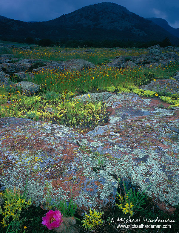
I like the cactus flower, the rocks, the yellow flowers, and blueish sky tones, but I find the top and bottom much too cramped for my tastes. There also appears to be a (too) strong gradient
Registered on December 19, 2008, 306 Posts, 4840 Comments
Comment posted by Tony Kuyper on May 26, 2011 at 9:14 PM
I like the elements and light, but could see trying to give a little more breathing room top and bottom.
Registered on November 1, 2003, 364 Posts, 22328 Comments
Comment posted by Lon Overacker on May 27, 2011 at 1:33 AM
Michael,
Really love the foreground with all the color, texture and detail. I'm afraid though I don't understand why the image graduates to such darkness? Looks like a 3 stop hard, but you didn't mention a grad. Looks to me like Velvia could have handled the light range in this particular setting. But then I wasn't there, so hard to say. I can say that I know that there are no zoom lenses with the large format so I expect at your limit of the 90mm which is why the top and bottom are so tight.
Lon
Registered on November 24, 2006, 521 Posts, 19147 Comments
Comment posted by Stuart Williams on May 27, 2011 at 4:44 AM
michael - nice scene - i hope that you made a second image just focusing on those colours and textures in the lower half of the image. i find the gradient a little too hard as well.
Registered on December 7, 2007, 247 Posts, 4792 Comments
Comment posted by Ron Pederson on May 27, 2011 at 6:54 AM
Really nice color, details and lighting in the FG. I'd have been tempted to crop this one square and drop the sky/hills.
Registered on October 19, 2010, 95 Posts, 470 Comments
Comment posted by Harry Lichtman on May 27, 2011 at 8:52 AM
Hey Michael - Wonderful colors and textures, but I would prefer more breathing room at the top and bottom. I am wondering if the natural lighting creatd the bright to dark transition? Sometimes spotlight lighting might have this effect. Looks like a moody place under these lighting conditions.
Registered on September 17, 2010, 304 Posts, 3507 Comments
Comment posted by Aaron Burdick on May 27, 2011 at 7:32 PM
Beautiful foreground colors (flowers and lichens) but the top section appears to dark to me so that it almost looks like a flash used at twilight.
Registered on May 1, 2009, 31 Posts, 197 Comments
Comment posted by Steve Sieren on May 29, 2011 at 6:33 PM
I love the lighting in this!
Registered on January 2, 2008, 360 Posts, 5321 Comments

Comments
8 commentsReally love the foreground with all the color, texture and detail. I'm afraid though I don't understand why the image graduates to such darkness? Looks like a 3 stop hard, but you didn't mention a grad. Looks to me like Velvia could have handled the light range in this particular setting. But then I wasn't there, so hard to say. I can say that I know that there are no zoom lenses with the large format so I expect at your limit of the 90mm which is why the top and bottom are so tight.
Lon