Nature Photographers Network
This is the preserved archive of the original Nature Photographers Network. The community continues at naturephotographers.network.
Another BOP
‹ PreviousFlora GalleryNext ›

Another BOP

by Gary Yeoh

Gallery: FloraPosted May 31, 2011151 views18 comments
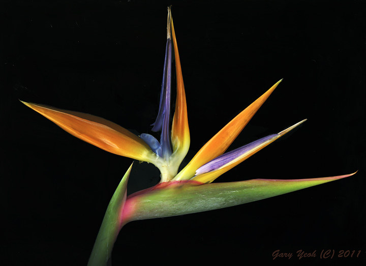
This is a scan of a different BOP as the previous one because that one was just too big to fit on the flat bed scanner. The one is a little smaller and occupied the entire flat bed and the resultant scan image is over 100 MB, one of the largest file in my library. The mood between this one and the high key one is very different, more solid color and texture. Would be interested to hear your views on the difference between the two images.

Epson 4990, CS5, TK masks.

Comments

18 comments
Comment posted by Luke Ormand on May 31, 2011 at 9:14 AM
Excellent colors and lines - very simple
Registered on February 4, 2009, 1093 Posts, 7035 Comments
Comment posted by Charlie Baugh on May 31, 2011 at 9:23 AM
Like night and day. :biggrin:

This is dramatic Gary. Great work.
Registered on April 18, 2011, 329 Posts, 1985 Comments
Comment posted by Nick Bristol on May 31, 2011 at 9:48 AM
Beautiful. These colors are fantastic, and very dramatic. Yes, the moods between this and the high key version are very different. I like them both.

Nick Bristol
Lone Rock, WI
Registered on February 1, 2004, 752 Posts, 14140 Comments
Comment posted by Barbara Graham on May 31, 2011 at 10:38 AM
Exquisite, elegant, beautiful colors, texture you can almost feel.
Registered on July 27, 2010, 1310 Posts, 5035 Comments
Comment posted by Ramamohan Pai on May 31, 2011 at 10:44 AM
I like the previous version, Gary. Not that there is anything wrong with this photo but just may be my taste :cool:
Registered on November 1, 2003, 550 Posts, 9037 Comments
Comment posted by Ian Wolfenden on May 31, 2011 at 4:24 PM
For me, the rich colours of this flower come out best on the black bg, Gary. I like the simplicity of the composition - you've let the flower do the talking !
Registered on May 18, 2007, 1108 Posts, 7647 Comments
Comment posted by Carol Hyman on May 31, 2011 at 4:43 PM
Gary, both images are interesting. And both specimens are different. Much prefer the specimen in the high-key version because of the pattern formed by the rays of the bracts. Like the above for the depth and feeling of the colors.

Would suggest reworking high-key version to see if you can bring out the levels of coloring. White background appears to be more dynamic.

Toss up.

Cheers,

Carol
Registered on January 18, 2007, 597 Posts, 8062 Comments
Comment posted by Derek Yow on May 31, 2011 at 4:44 PM
Oh yeah Gary, this one gets my vote! Dont get me wrong, the high key version is special also. This version just shows all the variety of colors and textures of these amazing flowers. Beautifully done!
Registered on May 18, 2010, 26 Posts, 655 Comments
Comment posted by Pat Sampson on May 31, 2011 at 6:12 PM
Gary,

There's certainly nothing wrong with this image but it doesn't really grab my attention the way the first did. It was/is the texture, almost translucent petals and subtle colors that appealed to me in the first - as well as the comp of course. They both have excellent composition. I also thought that parts of the first image were sharper than this one and I'd expect that from a scanned image. In fact the clarity of the first image is one of the things that really caught my attention - maybe not consciously at the time but certainly now as I compare the two images. There's nothing in the first image that I want to clean whereas parts of this one look the way any bird of paradise I've ever seen looks - a little dirty and worse for wear. This image lacks the graphic quality, at least for my tastes of the first. I really like the first a lot better. (smile) Just my taste also.

pat
Registered on May 19, 2007, 953 Posts, 15989 Comments
Comment posted by Mike Moats on May 31, 2011 at 8:03 PM
Hey Gary, very nice details.
Registered on October 20, 2004, 892 Posts, 6324 Comments
Comment posted by scott lanz on May 31, 2011 at 9:37 PM
The variety of colors in this version is beautiful. However, I really liked the translucence of the high key version. Both are artistic, but I prefer this one.
Registered on November 14, 2003, 840 Posts, 12902 Comments
Comment posted by Gary Yeoh on June 1, 2011 at 2:03 AM
Thanks everyone for your comments and its interesting to hear various views. So far its 3 for the low key, 2 for the high key and 3 in the toss up.

Pat
It a surprise to see you have a taste for the high key images as well and so you are not all on the darkside (smile).

I have been experimenting with high key and low key with the same flower and I can't tell ahead of time which will turnout to my liking - so I will continue doing both the high and low keys to see if I can predict the outcome.
Registered on September 1, 2009, 588 Posts, 8184 Comments
Comment posted by Miro Susta on June 1, 2011 at 10:14 AM
Perfect colours-excellent contrast. Beautifully done Gary. :toast: :toast:
Registered on August 18, 2006, 719 Posts, 3736 Comments
Comment posted by Pat Sampson on June 1, 2011 at 7:29 PM
Gary,

I'll be interested in seeing whatever you do - light, dark or anywhere in between. These are both good looking images.

pat
Registered on May 19, 2007, 953 Posts, 15989 Comments
Comment posted by Bob Duff on June 2, 2011 at 8:39 AM
Gary, I like the previpous one best. As Pat said in the previous posting comments the light and processing brings out the line and structure better than the stark constrasts you got in this scan.
Registered on April 21, 2010, 160 Posts, 1675 Comments
Comment posted by Nathan Buck on June 2, 2011 at 7:16 PM
I like them both Gary, but I think I slightly prefer the high key one. Both show the BOP off nicely.

Edit: One thing that I think I like better about the high key one is the angle of the flower pointing up more.

Nathan
Registered on November 1, 2003, 1101 Posts, 13589 Comments
Comment posted by Bill Fach on June 2, 2011 at 9:01 PM
Gary: I like the bold color presentation here. Artistically I think I do prefer the high key version but I would love to have either of these in my files. Beautiful. >=))>
Registered on November 1, 2003, 1805 Posts, 26981 Comments
Comment posted by Morris McClung on June 4, 2011 at 1:33 PM
The colors pop more with the dark background. Stunningly beautiful shot. I do prefer the high-key just a touch more, but that does not take anything away from this excellent image. :toast:
Registered on May 7, 2007, 670 Posts, 19650 Comments