Nature Photographers Network
This is the preserved archive of the original Nature Photographers Network. The community continues at naturephotographers.network.
Glowing Rocks
‹ PreviousLandscape GalleryNext ›

Glowing Rocks

by R.Bill Moser

Gallery: LandscapePosted June 5, 201192 views7 comments
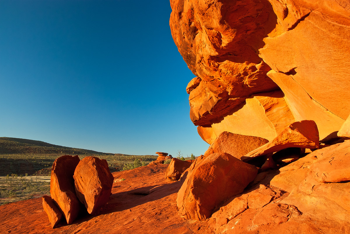
This is another one taken at Kalarrange Lookout, Finke Gorge Nat'l Park, NT/Australia. And again the sky was just "too perfect"......I was hoping for some clouds but it didn't want to happen.......but the setting sun made those rocks glowing red....and I thought the color contrast would be nice and I think it works well here.

Nikon Equipment, 1/25, f11, 16mm, iso 100


Thanks for any comments and thoughts.

Comments

7 comments
Comment posted by Dietrich Gloger on June 5, 2011 at 12:36 PM
The cloudless sky does not really harm here. The color contrast works really well. I think the composition is not only about the place, but also about shapes and form - an abstract image. That's why the blue area and the red work well and clouds are not missed.
Registered on January 26, 2007, 360 Posts, 9876 Comments
Comment posted by Morris McClung on June 5, 2011 at 3:40 PM
I also like the color contrast, beautiful for both the blue and the red/orange. I also think the empty sky balances the rocks. Even a little bit of yin/yang going on in it. Well done.
Registered on May 7, 2007, 670 Posts, 19650 Comments
Comment posted by Wayne Willison on June 5, 2011 at 4:21 PM
This is a real treat of color contrast. Can feel the power of the boulders.
Registered on April 10, 2009, 292 Posts, 3967 Comments
Comment posted by Nick Bristol on June 5, 2011 at 5:30 PM
Bill, The colors here look great together. The blues and red/orange with a bit of green works really well. I like all the shapes and the wonderful texture in the rocks. The larger version shows that very nice. I also like your interesting comp. :toast:

Nick Bristol
Lone Rock, WI
Registered on February 1, 2004, 752 Posts, 14140 Comments
Comment posted by Tony Kuyper on June 5, 2011 at 10:17 PM
The intense colors and contrasts work well, Bill. While the image feels a bit empty, it does have a bit of an abstract quality to it.
Registered on November 1, 2003, 364 Posts, 22328 Comments
Comment posted by Rodney Dugmore on June 9, 2011 at 3:42 AM
Very contrasty colours! The classic colours of Australia.
Nice balance to this. Did you use a polarizer? If so that would explain the darker band Through the sky.
Tusks for sharing.
Registered on January 3, 2004, 76 Posts, 1028 Comments
Comment posted by R.Bill Moser on June 9, 2011 at 3:48 PM
Thanks for your feedbacks. I do appreciate it.
@rodney: Yes I did use a polarizer
Registered on January 29, 2010, 285 Posts, 4281 Comments