Gallery: FloraPosted June 5, 2011128 views22 comments
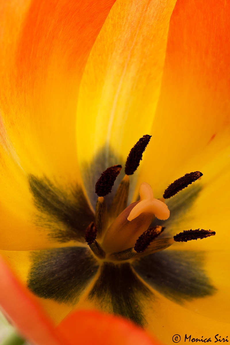
I took this image one month ago in a beautiful garden in countryside during a cloudy afternoon.
40D 60mm
f9,0 1/160
ISO 400
-0,33
Thanks for viewing.
C&C are avery welcome.
Comments
22 comments
Comment posted by Bob&Charly Nelson on June 5, 2011 at 12:51 PM
I think I would crop just enough to get rid of the little triangle in the lower left corner. Other than that Monica, I love this capture. Well done.
Bob
Registered on October 27, 2005, 289 Posts, 4202 Comments
Comment posted by Monica Siri on June 5, 2011 at 1:04 PM
Thanks Robert. That was one of my doubts about this comp. Here a version without the triangle.
Registered on September 20, 2009, 132 Posts, 3764 Comments
Comment posted by Charlie Baugh on June 5, 2011 at 1:29 PM
Hi Monica. When I read Roberts response I felt he was right. Now that I see your repost, I like the original version. That little change caused some significant loss of impact, I think.
Registered on April 18, 2011, 329 Posts, 1985 Comments
Comment posted by Mohammad Hosseini on June 5, 2011 at 1:34 PM
Monica this is great. I like the cropped one as well, but would nice with your signature too!! I am glad I check the larger view. The black color on leaves looks like nice make up on eyes. Well done.
Registered on May 16, 2011, 15 Posts, 301 Comments
Comment posted by Fabio Giarrizzo on June 5, 2011 at 1:43 PM
Nice shot- Great warm colours and excellent treatment of light- I prefer the original version- Well done, Fabio
Registered on December 3, 2010, 90 Posts, 1614 Comments
Comment posted by Pat Sampson on June 5, 2011 at 1:50 PM
Monica,
This has me stumped. First, it's a striking image exactly as posted. Superb comp and rich color. It's the little green corner I can't figure out. I would have agreed with Bob about the crop but now agree with Charlie that it actually weakens the image. You could clone it black or try to make it look like part of the petal or crop a little and also clone a little. I don't know. The more I look at it, the more I think it's perfect as is. The color alone though should keep it from working. I'll be interested in the other suggestions you get. Regardless, this is outstanding photography for my tastes as posted.
pat
Registered on May 19, 2007, 953 Posts, 15989 Comments
Comment posted by Brigitte Lorenz on June 5, 2011 at 2:07 PM
wonderful work, Monica...the colors and DOF are fantastic...I prefer the cropped version
Brigitte
Registered on January 10, 2009, 187 Posts, 1507 Comments
Comment posted by Morris McClung on June 5, 2011 at 3:57 PM
I think I prefer the cropped version slightly, too. Maybe lighten it just a touch? Gorgeous color and backlight. Perfect dof, too.
Registered on May 7, 2007, 670 Posts, 19650 Comments
Comment posted by Chris O'Donoghue on June 5, 2011 at 4:31 PM
This is beautiful! I prefer the original version. It leaves some space around the dark central part of the flower. Though the difference is small, the dark parts are too close to the edge for my liking in the cropped version. While the bottom left corner can be seen as a little distracting, I would try darkening or colouring it ever so slightly rather than cropping it out. As it is, it adds some interest to an otherwise "monotonous" colour scheme (? poor choice of word - but I can't think how to phrase it better.).
I often wonder how far we should go in retouching images. The white patch is part of the flower. Is it an imperfection to be corrected or a dynamic part of the flower to be included? Is this a portrait of the flower? - include the white maybe. Is it a colour study? - then the white is a distraction. I often agonize over these details in my images.
Anyway, a gorgeous image.
Chris
Registered on January 1, 2011, 11 Posts, 37 Comments
Comment posted by scott lanz on June 5, 2011 at 4:48 PM
Striking tulip close up. The color is great. Both versions work for me.
Registered on November 14, 2003, 840 Posts, 12902 Comments
Comment posted by Ramamohan Pai on June 5, 2011 at 7:35 PM
Without the intruding OOF petal portion in the lower left corner, Bob's suggestion is really perfect. Given the fact those things are there, the original one works better - at least that is what I think.
Irrespective this is an awesome capture of the heart of the tulip. Sharp front to back and those dark anthers stand out nicely in the brilliant colors.
Registered on November 1, 2003, 550 Posts, 9037 Comments
Comment posted by Steve Balke on June 5, 2011 at 8:18 PM
Both images provide us with a beautiful views of this tulip, Monica. It seems to me that the triangle you cropped out for the repost shows us a small portion of the stem of the flower. To me, the image is more recognizable as a tulip in the original version and I like knowing that without reading the caption. The repost is more of a macro shot where only the innards of the flower are evident and the tulip (to me anyway) is less recognizable. Although I like both I prefer the original.
Registered on June 18, 2009, 229 Posts, 2915 Comments
Comment posted by Albert Darmo on June 5, 2011 at 10:29 PM
Hi Monica Both images are great, but the second one is better. . the detail and color are marvelous.
Albert Darmo.
Registered on November 25, 2008, 1386 Posts, 11978 Comments
Comment posted by Gary Yeoh on June 6, 2011 at 6:13 AM
Monica:
These are striking images! Very powerful and show the beauty of the flower. Without looking at all the comments or seeing the repost, my immediate reaction was remove the LLC. But seeing the second image, I think it was the right decision to include the curve of the flower outline-making this look more natural rather than a macro shot. You may want to just darken slightly the small bright triangle but keeping the stem untouch.
Registered on September 1, 2009, 588 Posts, 8184 Comments
Comment posted by Miro Susta on June 6, 2011 at 7:13 AM
Superb photo. IMO, the second one is a bit better, but boths are very good. I like the colour palette and the perfect DOF. Well done Monica..
Registered on August 18, 2006, 719 Posts, 3736 Comments
Comment posted by Monica Siri on June 6, 2011 at 11:14 AM
Thank you everybody for your nice comments and useful suggestions.
I like this image but I was undecided on how the photo could work with the stem and I was very interested in your opinions.
Thanks again!!
Registered on September 20, 2009, 132 Posts, 3764 Comments
Comment posted by Bill Fach on June 6, 2011 at 11:55 AM
Monica: Lots of attention being paid to the corner but the overall shot is just excellent. I do prefer the original with its greater room. Even though I know that the green in the corner is the stem I think all I would do there is make the corner all green or even all white with my preference leaning to green. White would probably be too much of an eye magnet. Of course you could do nothing and I would still hang it on my wall. Superior shot.
PS: I edited your title to indicate a repost. You can do that you yourself so that others know to come back and revisit the shot.
Registered on November 1, 2003, 1805 Posts, 26981 Comments
Comment posted by Cheryl Molennor on June 7, 2011 at 9:22 AM
Love it Monica. Great brilliant colors bursting "in your face" LOL
Registered on June 30, 2009, 300 Posts, 5051 Comments
Comment posted by Barbara Graham on June 8, 2011 at 7:56 AM
Monica, beautiful colors and lines and light, wonderful textures and detail in the larger version.
Registered on July 27, 2010, 1310 Posts, 5035 Comments
Comment posted by Giuseppe Guadagno on June 8, 2011 at 9:48 AM
Monica, I really love the angle, in this shot: splendid! My first thought was: pity that hole in the LBC. But after I have seen the repost I think now that the bit of stem shown in that angle is very important for the sensation of depth and movement in the whole image. The perspective starts from long ahead.
Ciao.
Registered on February 3, 2007, 827 Posts, 5052 Comments
Comment posted by John Kerr on June 8, 2011 at 11:18 PM
Beautiful tulip, wonderfull color and detail.
Registered on October 28, 2009, 111 Posts, 1070 Comments
Comment posted by Howard Cheek on June 12, 2011 at 12:20 PM
Love the comp and dark stamen in contrast to the warm orange colors Monica.
I see you fixed it, my first thought when I first pulled it up
Well done!
Registered on July 24, 2008, 1201 Posts, 10758 Comments

Comments
22 commentsBob
This has me stumped. First, it's a striking image exactly as posted. Superb comp and rich color. It's the little green corner I can't figure out. I would have agreed with Bob about the crop but now agree with Charlie that it actually weakens the image. You could clone it black or try to make it look like part of the petal or crop a little and also clone a little. I don't know. The more I look at it, the more I think it's perfect as is. The color alone though should keep it from working. I'll be interested in the other suggestions you get. Regardless, this is outstanding photography for my tastes as posted.
pat
Brigitte
I often wonder how far we should go in retouching images. The white patch is part of the flower. Is it an imperfection to be corrected or a dynamic part of the flower to be included? Is this a portrait of the flower? - include the white maybe. Is it a colour study? - then the white is a distraction. I often agonize over these details in my images.
Anyway, a gorgeous image.
Chris
Irrespective this is an awesome capture of the heart of the tulip. Sharp front to back and those dark anthers stand out nicely in the brilliant colors.
Albert Darmo.
These are striking images! Very powerful and show the beauty of the flower. Without looking at all the comments or seeing the repost, my immediate reaction was remove the LLC. But seeing the second image, I think it was the right decision to include the curve of the flower outline-making this look more natural rather than a macro shot. You may want to just darken slightly the small bright triangle but keeping the stem untouch.
I like this image but I was undecided on how the photo could work with the stem and I was very interested in your opinions.
Thanks again!!
PS: I edited your title to indicate a repost. You can do that you yourself so that others know to come back and revisit the shot.
Ciao.
I see you fixed it, my first thought when I first pulled it up
Well done!