Nature Photographers Network
This is the preserved archive of the original Nature Photographers Network. The community continues at naturephotographers.network.
Rose
‹ PreviousFlora GalleryNext ›

Rose

by John Kerr

Gallery: FloraPosted June 5, 201182 views18 comments
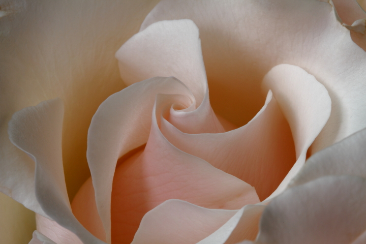
Here's a photograph of a rose I was taking different shots of last weekend. The rose was store boughten and was sidelit by a window. I also converted the shot to a black and white that I will post below and would like your opinions between the two. My black and white skill are abit limited.

Canon 7D, Canon 100mm macro, 1/5sec, f/20, ISO 100, Raw conversion.

Thanks for looking and all C&C welcomed.

John Kerr

Comments

18 comments
Comment posted by John Kerr on June 5, 2011 at 9:23 PM
Here's my black and white version.
Thanks again for looking.
John Kerr
Registered on October 28, 2009, 111 Posts, 1070 Comments
Comment posted by Ramamohan Pai on June 5, 2011 at 9:28 PM
Lovely Swirls :cool: - with the right degree of softness. I like the color version better than the B&W.
Registered on November 1, 2003, 550 Posts, 9037 Comments
Comment posted by Bob&Charly Nelson on June 5, 2011 at 9:42 PM
John, the color version is "top-shelf" in my opinion. I would maybe clean up the top left blemish, and print this large.
Bob
Registered on October 27, 2005, 289 Posts, 4202 Comments
Comment posted by Bruce King on June 5, 2011 at 10:14 PM
Roses are so hard to compose IMO but this is one of the better I've seen. My only minor nit would be the blue hue to the petal edges around the perimeter. They conflict with the beautifully soft pastels. A very nice image regardless.
Registered on January 14, 2010, 276 Posts, 2212 Comments
Comment posted by Miro Susta on June 6, 2011 at 7:22 AM
Nice soft image. If I can express my opinion, I like the colour one. The B&W is nice, but the colours are adding something special to this beautiful rose. The DOF and all details are superb. Well done John. :toast: :toast:
Registered on August 18, 2006, 719 Posts, 3736 Comments
Comment posted by Pat Sampson on June 6, 2011 at 8:08 AM
I think the composition is very strong in this John and while the black and white certainly works for me, I prefer the richness that the color version provides. I like the warmth and it seems more sensuous too me with the color - just more interesting overall. That surprises me because I usually prefer black and white when the comp is this strong and I think you have a good conversion.

pat
Registered on May 19, 2007, 953 Posts, 15989 Comments
Comment posted by Ian Wolfenden on June 6, 2011 at 9:02 AM
I tend to be a colour junkie, John, and I really do prefer the colour version. This is a fine image - a well chosen perspective to get the spiralling petals shown off to best advantage, with the lighting bringing out the petal textures beautifully.
Registered on May 18, 2007, 1108 Posts, 7647 Comments
Comment posted by Bill Fach on June 6, 2011 at 11:50 AM
John: Just superb lighting and the delicate color palette is exceptionally pleasing. The color is definitely my preference although I do like the B&W. I just think the color accentuates the lighting better and its subtlety is a major element in the whole. Really well done.>=))>
Registered on November 1, 2003, 1805 Posts, 26981 Comments
Comment posted by Monica Siri on June 6, 2011 at 4:00 PM
John,
I prefer the color version too. Very delicate and appealing image. :toast:
Registered on September 20, 2009, 132 Posts, 3764 Comments
Comment posted by Patricia Brundage on June 6, 2011 at 4:38 PM
Delicate color and mood, beautiful lines and texture. Much prefer the color version. You chose the perfect rose with a great design in its petals and the best perspective to photograph it to its best. Well done.
Registered on March 23, 2006, 1111 Posts, 6531 Comments
Comment posted by Ken Smith on June 6, 2011 at 10:57 PM
Color! Looks edible! Does this come in white chocolate?
Registered on September 5, 2008, 449 Posts, 2444 Comments
Comment posted by Gary Yeoh on June 7, 2011 at 1:56 AM
John:
Really strong comp with the swirls and light play and shaddow. :toast:

Have a slight preference for the B&W version.
Registered on September 1, 2009, 588 Posts, 8184 Comments
Comment posted by Cheryl Molennor on June 7, 2011 at 9:15 AM
Beautiful light and movement.
Registered on June 30, 2009, 300 Posts, 5051 Comments
Comment posted by Larry Lynch on June 7, 2011 at 10:30 AM
My favorite flower and you did it justice. :toast:
Registered on September 16, 2006, 773 Posts, 9940 Comments
Comment posted by Barbara Graham on June 8, 2011 at 8:15 AM
John, I love your POV and composition. The colors in the color version are soft and beautiful.
Registered on July 27, 2010, 1310 Posts, 5035 Comments
Comment posted by Giuseppe Guadagno on June 8, 2011 at 10:08 AM
This is a sculpture John, not a picture. The soft lights and shades give a multidimensional look to the plastic helix of the rose. The B&W version is nice too, but I miss the soft color hues that cooperate to the three-dimensional sensation.
Take care.
Registered on February 3, 2007, 827 Posts, 5052 Comments
Comment posted by Albert Darmo on June 8, 2011 at 12:09 PM
Hi John :wavey: A very artistic capture, love the lines and pastel color. both compositions are great, but prefer the color version. :smile:
Albert Darmo
Registered on November 25, 2008, 1386 Posts, 11978 Comments
Comment posted by Lucy Aron on June 22, 2011 at 9:49 PM
My bias is usually b&w but the Hues in this shot are so subtle I vote for the color version. Lovely.


lucy
Registered on February 25, 2011, 189 Posts, 1160 Comments