Nature Photographers Network
This is the preserved archive of the original Nature Photographers Network. The community continues at naturephotographers.network.
Beating Heart of Time
‹ PreviousLandscape GalleryNext ›

Beating Heart of Time

by Kane Engelbert

Gallery: LandscapePosted June 7, 20111,525 views26 comments
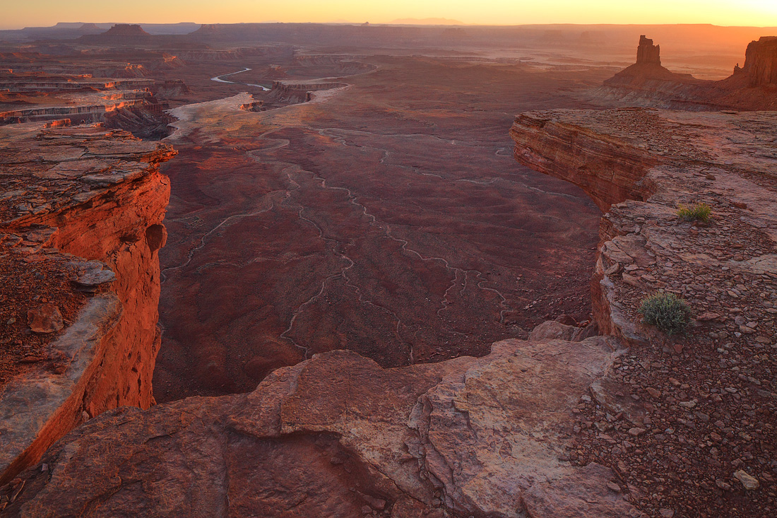
This is my best attempt to make something "new" with the iconic Green River Overlook/Soda Springs Canyon view in Island of the Sky District of Canyonlands.

I used a 24mm tilt shift. Without the tilt, Candlestick Tower would do a serious lean to the right, and look funny.

This photo get's me going due to extreme exposure. There's almost a 3D feel to the contrast shift from the foreground to the background. However, composition speaking, I'm not sure how it will translate to others. There's a lot going on to the left and right (notice a nice "diving board") but, there'as a big gap inbetween. That gap was difficult to make interesting. Thus the title. Almost heart shaped with blood pumping time.

I concentrated (dodge/burn) on the winding, narrow wash's that zigzag outward, to bring life to the otherwise lifeless main subject terrain. Let me know; is this a keeper, or does it make you eye wonder left and right?

Canon 5dII
Canon 24mmTSE

Comments

26 comments
Comment posted by Richard Teller on June 7, 2011 at 11:29 PM
The light is really sweet and looks great.The composition does lead my eye to the right. and makes the image a bit off balance. The one thing that does help some is the way the sun lights things up on the left side.
Registered on August 23, 2010, 1162 Posts, 6692 Comments
Comment posted by Jimmy Gekas on June 7, 2011 at 11:47 PM
This is really nice, Kane. The 3D effect is sweet and I love the arteries running throughout. The golden light has a lava-esque feel to it. Very cool. :toast:
Registered on July 26, 2007, 244 Posts, 2807 Comments
Comment posted by Nicolaus Wegner on June 8, 2011 at 12:09 AM
Translates well for me Kane.

Great shot.
Registered on February 21, 2010, 133 Posts, 1509 Comments
Comment posted by Stan Rose on June 8, 2011 at 12:13 AM
Works for me, Kane--i like the diving board effect! :smile:
Registered on September 15, 2005, 836 Posts, 17099 Comments
Comment posted by Andreas Resch on June 8, 2011 at 1:04 AM
Very nice, Kane. Both light and composition are excellent.
Registered on November 14, 2007, 322 Posts, 6101 Comments
Comment posted by Kyle L. Krause on June 8, 2011 at 1:40 AM
Kane, nice perspective. It definitely keeps me looking Throughout the image. I like it!
Registered on June 15, 2010, 29 Posts, 605 Comments
Comment posted by Stuart Williams on June 8, 2011 at 4:54 AM
the comp works fine for me - the thin gullies hold it together. everything else is interesting and light sweet.
Registered on December 7, 2007, 247 Posts, 4792 Comments
Comment posted by Rodney Dugmore on June 8, 2011 at 5:41 AM
Nice work Kane.
I like this and its beautiful but its true the composition is slightly schizophrenic.
The strongest parts visually are left and right so much so that you could crop it and make two verticals with merit from it.
That said its still has merit most definitely a keeper.

Well done.
Registered on January 3, 2004, 76 Posts, 1028 Comments
Comment posted by INGOMA on June 8, 2011 at 6:46 AM
I just love the perspective and the dry river beds help to lead the eye from foreground to background. Really beautiful image!
Registered on July 2, 2004, 231 Posts, 3110 Comments
Comment posted by Guy Tal on June 8, 2011 at 8:24 AM
Fantastic image, Kane! Beautiful light and composition. I always appreciate seeing new and creative takes on familiar places and this is one of the best I've seen in a while.

Guy
Registered on November 1, 2003, 566 Posts, 15507 Comments
Comment posted by John Williams on June 8, 2011 at 11:01 AM
Don't show this to people who are afraid of heights! This does have a two halves feel, but works well. The light is beautiful.

(Did you use local contrast enhancement on this one? If not, it might be worth playing with to separate the foreground and background even further. e.g.- On the Larger Photo applying Unsharp Mask at an Amount of 30 to 40% with a Radius of 40, then adjust to taste.)
Registered on September 6, 2007, 221 Posts, 5985 Comments
Comment posted by Wayne Willison on June 8, 2011 at 11:19 AM
Making me dizzy. Wow, what a sense of depth here. The sun hitting the cliff edges really makes the comp pop.
Registered on April 10, 2009, 292 Posts, 3967 Comments
Comment posted by Martin W. Quinn on June 8, 2011 at 1:07 PM
This is just excellent in every way. It is great to see new takes on familiar locations.
Registered on November 1, 2003, 28 Posts, 189 Comments
Comment posted by Floris van Breugel on June 8, 2011 at 1:33 PM
This is fascinating, Kane. I really love the viewpoint and composition, and light is perfect. The 3D effect is really neat, though it does play tricks with the mind because of the soft contrast. I think if there were a little more separation between the 'diving board' on the right, and the Candlestick that might have helped. If it were mine I would probably lighten the top plane of 'diving board', and darken the land below, just to create some more cues for the eye to pick up that they are indeed (very) separate planes in space.
Registered on December 19, 2008, 306 Posts, 4840 Comments
Comment posted by Hamed Musharbak on June 8, 2011 at 3:16 PM
this is impressive Kane, love it

wonderful comp & light

Hamed
Registered on June 1, 2009, 372 Posts, 2282 Comments
Comment posted by John Mumaw on June 8, 2011 at 8:20 PM
That was a great idea that Floris had. I kept looking for ways you might improve this one, but failed to come up with anything.
Glad you posted this here to receive this feedback. Still think it's an excellent capture!
Registered on September 9, 2005, 62 Posts, 2289 Comments
Comment posted by Barry Vangrov on June 8, 2011 at 8:32 PM
Pretty darn good just as it is. What puts this image over the top for me is the small green bush amidst all of the red rock. Only processing comment I have is maybe try to tone down the sun a bit if possible as it draws my eye away. Really well done.
Registered on September 1, 2009, 148 Posts, 749 Comments
Comment posted by Matt Anderson on June 8, 2011 at 10:06 PM
I'm sure glad I clicked on this image, it's one of those, where the thumbnail doesn't do the image justice. The color and textures are quite nice. So much to visually look at. It's a beauty.
Registered on September 6, 2007, 346 Posts, 2696 Comments
Comment posted by Kah Kit Yoong on June 9, 2011 at 3:50 AM
This is a wonderfully expansive view. The sense of height and grandeur come across very well due to the sweet side lighting.
Registered on September 27, 2006, 636 Posts, 10682 Comments
Comment posted by Marc Adamus on June 9, 2011 at 11:38 AM
This is very, very good Kane. I absolutely love it. The lines below and light on the rocks make it sing!
Registered on September 17, 2005, 780 Posts, 8091 Comments
Comment posted by Eva McDermott on June 9, 2011 at 12:30 PM
Spectacular warm light and depth Kane. Beautiful work.
Registered on January 4, 2009, 1015 Posts, 13229 Comments
Comment posted by Gary McGhee on June 9, 2011 at 1:48 PM
You picked a great spot to take this Kane, great view with some wonderful light.

Gary.
Registered on April 15, 2010, 142 Posts, 2416 Comments
Comment posted by David Edwards on June 9, 2011 at 6:48 PM
Definitely a keeper in my book. Great shot, Kane. I also like the 3D effect of the lighter, close-up fg to the distant, darker view below. The large version really shows this off well. The light striking the side of the cliffs is fabulous, and your dodge/burn processing of the valley below is excellent. Just a wonderful view that really pulls me in.
Registered on December 6, 2008, 142 Posts, 2623 Comments
Comment posted by Morris McClung on June 9, 2011 at 8:52 PM
I think the tonal values and luminosity work better on your website, no real surprise with compression and a slight darkening from uploading here. Or, perhaps it is just the darker background there. At any rate, I still love the comp and light here. Wonderful work!
Registered on May 7, 2007, 670 Posts, 19650 Comments
Comment posted by SandyRichardsBrown on June 16, 2011 at 6:30 AM
Great light and perspective.
Congrats on a fine EP!
Sandy
Registered on November 24, 2003, 3937 Posts, 12909 Comments
Comment posted by Morkel Erasmus on June 17, 2011 at 7:12 PM
this is amazing!!! :toast:
Registered on March 22, 2011, 385 Posts, 2068 Comments