Nature Photographers Network
This is the preserved archive of the original Nature Photographers Network. The community continues at naturephotographers.network.
Spent + REPOST
‹ PreviousFlora GalleryNext ›

Spent + REPOST

by Carol Hyman

Gallery: FloraPosted June 20, 2011558 views11 comments
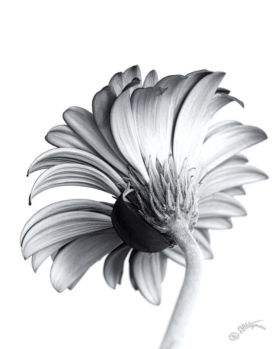
As beautiful as the Gerbera daisies are, they don't last too long. This little guy will soon bend to bite the dust as many of his compatriots already have. Once again I've selected a flower with a wayward petal :smile:

The main problem to solve this morning was finding something to diffuse background shadows and I resolved the problem by tacking a sheet of white construction paper to the bulletin board about 4' behind the subject. A slight bend to the paper solved the shadow problem.

This was shot with a 105mm lens at f/8, .5s, ISO 100, spot meter, -1 EV, manual focus, tripod, and cable release.

The conversion to B/W done with NIK software.

I find the gap in the ray petals appeal, but haven't decided 100% about the bent petal turning out quite so dark. That can always be fixed with a control point, and I would like to hear your thoughts.

Thanks,

Carol

Comments

11 comments
Comment posted by Bob Duff on June 20, 2011 at 6:05 PM
Nice conversion Carol. I like the texture captured on the petals on either side of the "gap". Not crazy about that "black" bent petal though. Although it does portend the ultimate demise.
Registered on April 21, 2010, 160 Posts, 1675 Comments
Comment posted by Pat Sampson on June 20, 2011 at 7:03 PM
Carol,

I like it exactly as posted - black petal and all. Love the pov and for my tastes it's a strong conversion.

pat
Registered on May 19, 2007, 953 Posts, 15989 Comments
Comment posted by Gary Yeoh on June 20, 2011 at 7:58 PM
Carol.
I love the radiating petals and the gap. The petals above and below the gaps are the best part of the image with is strong lines and tonal variation. Not too keen about the OOF petals or the highlighted ones. The bend black petal near the center of the flower really throws a spanner into the works and I am not sure of the foreground OOF stem. A thin border around this would be nice too. Having said all that, I still think there is a lot of potential in this. If you have a chance to re-do this, a stack would certainly help.

BTW I like your logo.
Registered on September 1, 2009, 588 Posts, 8184 Comments
Comment posted by Ramamohan Pai on June 20, 2011 at 8:34 PM
Carol, Pretty cool stuff here. Reminds me of Larry's EPA2010 photo :cool: . I don't think the dark petal sits well there - breaks the harmony for me - even if it did, its way too dark asking for a lot of attention. Secondly the stem being in the beginning of the frame, also needs to be in focus here. The right edge of the stem almost merges into the background.
Registered on November 1, 2003, 550 Posts, 9037 Comments
Comment posted by Carol Hyman on June 20, 2011 at 11:29 PM
A version with a slightly lighter wayward petal :smile:

Carol
Registered on January 18, 2007, 597 Posts, 8062 Comments
Comment posted by Bill Fach on June 20, 2011 at 11:35 PM
Carol: I like the petal and the overall mood and feel of this. Marvelous conversion. I do wish the smaller version had a tiny border around it to separate it from the frame BG but that's a less than 1¢ nit. Really well done.>=))>

Edit: Just saw the repost. I prefer the greater contrast of the original.
Registered on November 1, 2003, 1805 Posts, 26981 Comments
Comment posted by Patricia Brundage on June 21, 2011 at 6:56 AM
Nice image Carol. Rich in shape, tones and highlights. The white background really makes it pop off the page, Good choic for the conversion... would make a great notecard. Love it!
Registered on March 23, 2006, 1111 Posts, 6531 Comments
Comment posted by Miro Susta on June 21, 2011 at 9:21 AM
Very special photo. Well managed B&W conversion. Nicely done Carol. :smile:
Registered on August 18, 2006, 719 Posts, 3736 Comments
Comment posted by Wayne Jones on June 21, 2011 at 5:20 PM
Wonderful study of texture, form and tones in a subject usually dominated by colors.
Overall, I like the original, but the darkness of that stray petal kind of throws me. If you could come up with a compromise between the two versions, that would do the trick for me.
Registered on April 18, 2007, 953 Posts, 6435 Comments
Comment posted by Carol Hyman on June 21, 2011 at 7:09 PM
My only comment is ARGH! Not sure which is worse--the heat or reprocessing. This time I went back to square one in an attempt to find something 1/2 way in between the first attempt and the second. That wayward leaf is a tad lighter; it looks more natural that my second attempt so I'll post it and review it after my posting.

Thank you all for your comments. I do realize few of you are into black and white :smile:

Thanks,

Carol
Registered on January 18, 2007, 597 Posts, 8062 Comments
Comment posted by Albert Darmo on June 21, 2011 at 9:38 PM
Hi Carol :wavey: When i look at this work, i think of clouds in the sky, how the light changes the lines and mood of the image. I'm with Pat.... i like the first version, It draws the attention :cool: :smile:
Albert Darmo
Registered on November 25, 2008, 1386 Posts, 11978 Comments