Gallery: LandscapePosted June 23, 2011263 views14 comments
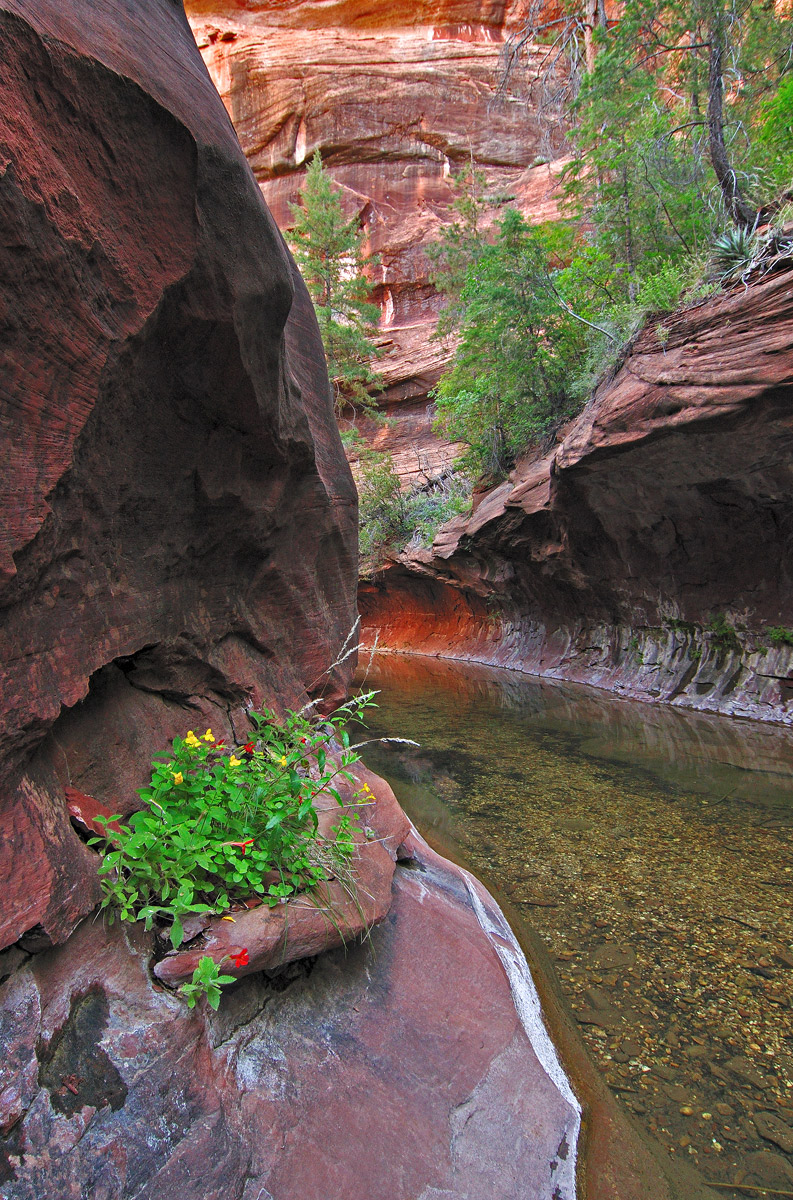
Some sections of West Fork of Oak Creek are similar to the Zion Subway. This group of flowers added some color to the view. A very slight breeze created some motion in the flowers and grass stems, hence the slight increase in iso. As always, any critique and suggestion are welcome. Larger view provided.
Nikon D90, Tokina 12-24 @f/11, 19mm, 1/3sec, ISO 640
Comment posted by Mark Seaver on June 23, 2011 at 11:19 AM
I like this. The soft lighting really brings out the textures and subtle color shifts. I feel like the flower clump in the foreground may be slightly over saturated and I would like to see them closer to the bottom of the frame.
Registered on January 23, 2011, 1103 Posts, 17270 Comments
Comment posted by Michael J Greene, on June 23, 2011 at 11:56 AM
Doug,
Always refreshing to see new images from this Oak Creek. It certainly isn't an easy place to capture. Personally, I favor a crop of the entire top half of the image (actually about the top 40%). Also, I can understand what Mark is saying about the flowers being over saturated. I think maybe the surrounding rocks just need more contrast/punch to balance it better. Nice work!
Michael
Registered on June 18, 2009, 86 Posts, 2317 Comments
Comment posted by Pedro Bento on June 23, 2011 at 4:29 PM
As you're working with a wide angle I'll try to go near that flowers and give a little inclination to the right to get the entire distant tree in the frame.
PB
Registered on September 2, 2007, 45 Posts, 761 Comments
Comment posted by Phil Pogledich on June 23, 2011 at 6:45 PM
This generally works very well for me as posted. Maybe the saturation of the foreground plant is a bit strong, but that's a very minor nit. I like the composition and don't feel like a crop is necessary . . .
Registered on August 24, 2009, 123 Posts, 3099 Comments
Comment posted by John Mumaw on June 23, 2011 at 7:27 PM
Beautiful scene well captured, Doug. Doing a back to back comparison of this and the horizontal version almost makes me feel as if I'm seeing two different scenes. I prefer this version very much, but think that cropping the top down to the top of of the opposing wall just above the yucca eliminates the distraction that is the brighter canyon wall in the background.
Registered on September 9, 2005, 62 Posts, 2289 Comments
Comment posted by Tony Kuyper on June 23, 2011 at 9:32 PM
Very nicely done, Doug. The plant/flowers are a perfect foreground element and a nice staging area for launching into the rest of the scene.
Registered on November 1, 2003, 364 Posts, 22328 Comments
Comment posted by Sarah Marino on June 23, 2011 at 10:49 PM
Hi Doug - I like this a lot. The little patch of flowers helps ground the front elements and the river is a nice leading line to the background interest. You have been doing a great job in capturing this creek.
Registered on November 10, 2008, 23 Posts, 393 Comments
Comment posted by Lon Overacker on June 24, 2011 at 1:47 AM
Doug,
Beautiful! Excellent comp and yes, it certainly does have a Narrows look to it.
Not really a nit, but I'm kinda wishing you could have moved to the right a little and got that bg pine a little more of a view. but then I expect you might have had to get your feet wet! Nice rich colors throughout, but not over done. Excellent.
Lon
Registered on November 24, 2006, 521 Posts, 19147 Comments
Comment posted by Doug Koepsel on June 24, 2011 at 10:24 AM
Many thanks for the suggestions. The saturation level is more than I normally use, so will reduce it a notch or two. Will likely crop off the top section of brighter eye-grabbing rock.
Registered on April 1, 2010, 196 Posts, 1592 Comments
Comment posted by Nick Bristol on June 24, 2011 at 12:04 PM
Very nice Doug. An interesting comp and view that works very well for me. The colors also look nice on my monitor. I like just a bit of the bottom cropped out and also the brighter part at the top, which it sounds like you are leaning towards. I like this very much. I also looked at the other ones in the link you gave. The last one with the green leaves against the sandstone wall was a favorite for me. Nice work!
Nick Bristol
Lone Rock, WI
Registered on February 1, 2004, 752 Posts, 14140 Comments
Comment posted by John Mumaw on June 24, 2011 at 7:17 PM
Like Nick, I find the saturation to be just fine, although I might tone it down just a bit in the reddish 'tunnel' near dead center.
Registered on September 9, 2005, 62 Posts, 2289 Comments
Comment posted by R.Bill Moser on June 25, 2011 at 5:45 AM
I love this composition a lot. I don't think a crop is necessary.....maybe the flowers in the foreground a bit strong in saturation but that's minor. Beautiful soft light. I like this one here.
Registered on January 29, 2010, 285 Posts, 4281 Comments
Comment posted by John Williams on June 26, 2011 at 9:19 PM
Your photos make me wish I had been a photographer all those years I lived in AZ. I love the pop the vegetation gives the foreground.
Registered on September 6, 2007, 221 Posts, 5985 Comments
Comment posted by Doug Koepsel on June 26, 2011 at 11:27 PM
Repost incorporating some of your suggestions. Thank you for the input.
Registered on April 1, 2010, 196 Posts, 1592 Comments

Comments
14 commentsAlways refreshing to see new images from this Oak Creek. It certainly isn't an easy place to capture. Personally, I favor a crop of the entire top half of the image (actually about the top 40%). Also, I can understand what Mark is saying about the flowers being over saturated. I think maybe the surrounding rocks just need more contrast/punch to balance it better. Nice work!
Michael
PB
Beautiful! Excellent comp and yes, it certainly does have a Narrows look to it.
Not really a nit, but I'm kinda wishing you could have moved to the right a little and got that bg pine a little more of a view. but then I expect you might have had to get your feet wet!
Lon
Nick Bristol
Lone Rock, WI