Gallery: LandscapePosted June 25, 2011140 views10 comments
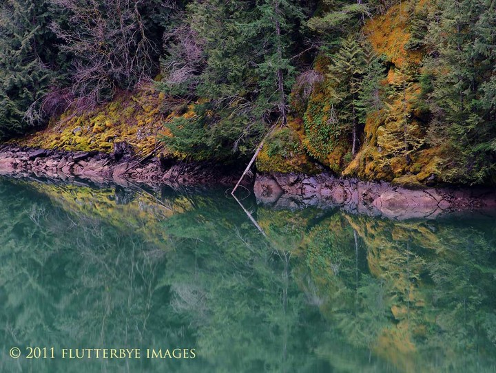
Glacier flour filled waters of the upper Skagit River in WA.
Comments
10 comments
Comment posted by Anand Narayanan on June 25, 2011 at 11:10 PM
A very pleasing and peaceful scene. I love that the bank is at an incline to you and that little tree sticking out of the yellow moss anchors the scene nicely.
Registered on October 25, 2009, 110 Posts, 835 Comments
Comment posted by Lon Overacker on June 26, 2011 at 1:45 PM
Timothy,
This is quite nice. That rock shoreline really grabs one's attention - it certainly does even in the thumbnail. I like the subtle graphics and the lines here make for a interesting composition. I also like the hues of colors from the glacial water to the mossy greens on the shore. There is one color though that I would consider tweaking, and that's magenta. It's most notable in the bare trees in the UL and also in the line of rock. I might usually take a hue/sat adjustment layer and back off the magenta about 25 pts or so. But then, that's just my observation and opinion. I think the image is well seen and captured.
Lon
Registered on November 24, 2006, 521 Posts, 19147 Comments
Comment posted by Mark Seaver on June 26, 2011 at 8:07 PM
You've captured a lovely scene with nice soft light on the sloping banks. The magenta in the shoreline and trees is decidedly unreal.
Registered on January 23, 2011, 1103 Posts, 17270 Comments
Comment posted by Tony Kuyper on June 26, 2011 at 10:33 PM
I like the way the line of dirt/rocks separates the object and the reflection. There are some really wonderful colors in here, though I'm on the laptop, and it's sometimes hard to know for sure how accurate they are.
Registered on November 1, 2003, 364 Posts, 22328 Comments
Comment posted by Timothy F. Hale on June 27, 2011 at 12:44 AM
Registered on December 10, 2003, 282 Posts, 405 Comments
Comment posted by Timothy F. Hale on June 27, 2011 at 12:45 AM
I removed some of the magenta. is the redo any better?
Tim
Registered on December 10, 2003, 282 Posts, 405 Comments
Comment posted by Lon Overacker on June 27, 2011 at 1:00 AM
Much better Tim. I'd even go as far to say that you could push the master saturation up a notch or two while leaving the Magenta behind. Looks much better though from a color point of view. thanks for the repost. I'll edit the title for you indicated a repost, that way folks will know you made a change.
Lon
Registered on November 24, 2006, 521 Posts, 19147 Comments
Comment posted by Kah Kit Yoong on June 27, 2011 at 2:47 AM
Lovely textures and colours Tim. The second post looks improved with the magenta reduced.
Registered on September 27, 2006, 636 Posts, 10682 Comments
Comment posted by Bill Chambers on June 27, 2011 at 12:43 PM
The repost is much, much better Tim. The small, dark alcove in the center just draws me right in, wishing to explore further. Also, love the overall mood in this, a hauntingly beautiful place.
Registered on April 10, 2005, 753 Posts, 21216 Comments
Comment posted by John Williams on June 28, 2011 at 9:05 PM
This is nice! I love the range of color you captured and the way it is laid out in the photo, especially in the repost. The diagonal through is very strong too. I really like the far shore, and would play with a 2x3 crop removing some of the bottom. Well done!
Registered on September 6, 2007, 221 Posts, 5985 Comments

Comments
10 commentsThis is quite nice. That rock shoreline really grabs one's attention - it certainly does even in the thumbnail. I like the subtle graphics and the lines here make for a interesting composition. I also like the hues of colors from the glacial water to the mossy greens on the shore. There is one color though that I would consider tweaking, and that's magenta. It's most notable in the bare trees in the UL and also in the line of rock. I might usually take a hue/sat adjustment layer and back off the magenta about 25 pts or so. But then, that's just my observation and opinion. I think the image is well seen and captured.
Lon
Tim
Lon