Nature Photographers Network
This is the preserved archive of the original Nature Photographers Network. The community continues at naturephotographers.network.
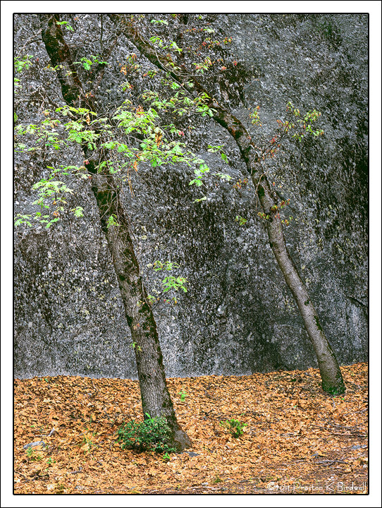
Oaks at Swan Slab
‹ PreviousLandscape GalleryNext ›

Oaks at Swan Slab

by Preston Birdwell

Gallery: LandscapePosted June 29, 2011276 views12 comments
After the wet and breezy session at Lower Yosemite Falls in May, Lon, Harley, and I wandered over to Swan Slab. I've always been intrigued by the black oaks that grow adjacent to this granite wall, and with the nice subdued light, I wanted to see if I could put something together. This is the result.

This particular image was very difficult to sharpen properly in order to keep the gound litter from looking like a pixelated mess on the Web. I used TK's sharpening action and painted some black on the mask to reduce the level of sharpening in the ground litter. I think it worked, but would like your opinion.

Other comments about this image are always welcome.

Tachihara 4x5
210mm Schneider Symmar-S
Velvia 100

Many thanks for taking a look-see. :smile:

--P

Comments

12 comments
Comment posted by Harley Goldman on June 29, 2011 at 6:06 PM
This works nicely, Preston. I really like the mix of the gold and green, with the background and graphic trunk lines.
Registered on November 19, 2003, 586 Posts, 11271 Comments
Comment posted by Richard Teller on June 29, 2011 at 6:13 PM
This has a very painterly look. Nice combination of colors and comp.
Registered on August 23, 2010, 1162 Posts, 6692 Comments
Comment posted by Dan Baumbach on June 29, 2011 at 8:19 PM
Looks great to me. Lovely image, Preston.

- Dan
Registered on November 1, 2003, 473 Posts, 7980 Comments
Comment posted by Lon Overacker on June 29, 2011 at 9:32 PM
Preston,

This came out great. I think the simple composition works very well here - even considering the 2, even-numbered trunks. In other words, some times I think a comp can become split because we don't know which element is important. But the story here is more about these oaks, where they are growing, near the granite, etc. etc. I think the colors/saturation are spot on.

My only suggestion/nit is that at least to me this seems a tad on the bright side. I think mainly in the leaves, but also you might consider a slight burn of the very bottom just to help keep the eye in the frame. Both of these are of course minor points. I really like the setup. this is also quite uniquely, Yosemite.

Lon
Registered on November 24, 2006, 521 Posts, 19147 Comments
Comment posted by Rudy Ruberti on June 29, 2011 at 10:40 PM
Very nice scene Preston. I like the similar texture and tones of trees and granite wall, as well as the contrast between the new and old leaves.
Registered on October 28, 2008, 179 Posts, 1875 Comments
Comment posted by Tony Kuyper on June 30, 2011 at 11:41 AM
Just have my laptop at the moment, Preston, but I really like the colors and comp. The subtle difference between the trunks and the granite and the stark difference between the leaves and the granite makes for some nice contrasts that work well.
Registered on November 1, 2003, 364 Posts, 22328 Comments
Comment posted by Nick Bristol on June 30, 2011 at 3:34 PM
This is very interesting to look at Preston, and I like it very much. As Richard mentioned this seems to have the feel of a painting which I really enjoy here. This is wonderful! I don't think I could have made this work anywhere near this well.

Nick Bristol
Lone Rock, WI
Registered on February 1, 2004, 752 Posts, 14140 Comments
Comment posted by Bill Chambers on June 30, 2011 at 3:35 PM
Oh, this is wonderful. Great elements and a superb composition. Beautiful work!
Registered on April 10, 2005, 753 Posts, 21216 Comments
Comment posted by Michael J Greene, on June 30, 2011 at 4:03 PM
Simple, pleasing composition. I could see adding some vignetting in the corners. Also, the web version looks over sharpened on my two monitors. It could just be the subject matter though. Great color and texture contrasts.

Michael
Registered on June 18, 2009, 86 Posts, 2317 Comments
Comment posted by Paul Duval on June 30, 2011 at 8:16 PM
Ditto, Ditto, Ditto Preston,

Great granite and Oaks study. The Oaks want to blend into the speckly granite but you pulled em out. I could see where the leaf litter might become a mess with over sharpening, but you controlled that excellently. Just a very nice image.

Paul
Registered on June 30, 2009, 508 Posts, 1907 Comments
Comment posted by Youssef Ismail on June 30, 2011 at 9:17 PM
Preston,

I like the color combinations here with the yellow/orange of the ground leaves with the green leaves on the tree. It makes it elusive in pinning down a time of the year.
Registered on November 1, 2003, 474 Posts, 5555 Comments
Comment posted by Preston Birdwell on July 3, 2011 at 12:25 AM
Thanks to all for your comments on this image!

I made a print of it the other day and followed Lon's suggestion to darken it just a bit. It looks really nice.

I always appreciate the helpful suggestions I receive here at NPN!

Cheers,

--P
Registered on November 1, 2003, 471 Posts, 5188 Comments