Nature Photographers Network
This is the preserved archive of the original Nature Photographers Network. The community continues at naturephotographers.network.
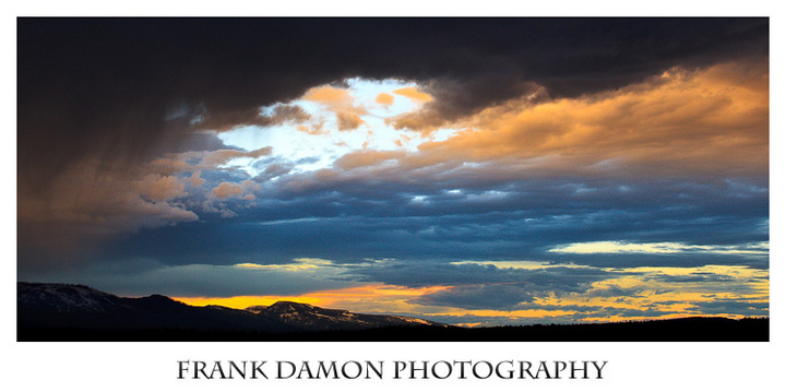
Teton Sunset
‹ PreviousLandscape GalleryNext ›

Teton Sunset

by Frank Damon

Gallery: LandscapePosted June 30, 2011194 views5 comments
I took this image last week in the Grand Tetons. I cropped it into a pano as there was too much negative space both high and low. I did all the post in Lightroom, which included playing with contrast, luminosity, saturation and dodging.

I would welcome any and all comments.

Many thanks.

Frank

Comments

5 comments
Comment posted by Michael J Greene, on June 30, 2011 at 3:58 PM
Gorgeous sky Frank. I personally could do without the Frank Damon Photography label - it is large and distracting. Also, the colors look slightly unnatural, especially the oranges along the horizon. Although I've seen lots of unnatural looking color that was completely natural in nature....I'd like to see this one large.

Michael
Registered on June 18, 2009, 86 Posts, 2317 Comments
Comment posted by Jake Case on June 30, 2011 at 4:23 PM
Frank, I think the composition and drama are wonderful here. The pano crop was a great choice, but of course may limit your printing ability depending on what camera you are using. Michael mentioned the color balance, which to be honest I do not have a problem with, but I would like to mention that Lightroom's color balance sliders are nowhere as exact as using say Photoshop CS5. The green/magenta slider seems fine, but the temperature slider does not seem to give very good control over blues, yellows, cyans and reds. On my photos I try to get the color balance close on Lightroom, but I always tweak it in Photoshop. Of course, if Lightroom is the best program you have, so be it. Like I said, in this instance I think the colors are a non-issue, but it is something to consider. My only real nit is the big bright patch of sky, which I think gathers to much attention from the eye. You might try burning it down some, but maybe it is what it is. However, I really like this image.
:toast:
Registered on December 13, 2010, 38 Posts, 167 Comments
Comment posted by Gary Crabbe on July 1, 2011 at 12:19 AM
I love the pano crop you've presented. I'd say I agree about the colors being just a tad too saturated, but not by much; perhaps just a few points.Overall I think this would make a great huge print.
Registered on November 1, 2003, 182 Posts, 1840 Comments
Comment posted by Mark Metternich on July 2, 2011 at 8:57 PM
I think this looks great Frank. :toast:

My only suggestion is to see just a little more land.
Registered on June 19, 2009, 276 Posts, 6240 Comments
Comment posted by John Williams on July 4, 2011 at 11:08 AM
Great mix of light here Frank, and I think the pano treatment works well.

When viewing a sunrise/sunset, I find my eye focuses on the warmer colors. When I try to bring out these colors in processing, I find it's easy to overdo the cool tones trying to find the warm tones my eye saw. In this photo, you might try selectively dropping the blue and/or cyan saturation just a touch. I think the warmer tones are perfect.

Feel free to jump in and comment on other photos. It's a great way to welcome any and all comments. For me, I find it really helps with my own photography to analyze what I like and what I would change in another photographer's photo.

:toast:
Registered on September 6, 2007, 221 Posts, 5985 Comments