Nature Photographers Network
This is the preserved archive of the original Nature Photographers Network. The community continues at naturephotographers.network.
Pastel Dawn *w/repost
‹ PreviousLandscape GalleryNext ›

Pastel Dawn *w/repost

by David Edwards

Gallery: LandscapePosted July 6, 201190 views7 comments
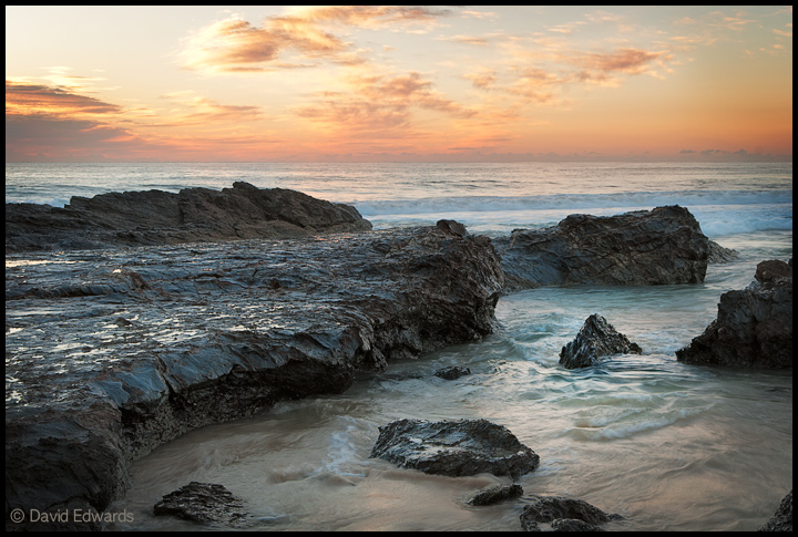
I've had this image in my library for a while not sure if I liked it or not, but I keep coming back to it. I like it's quiet mood and pastel color. Nothing to rave about, but would like your impressions.

Dawn at Currumbin Beach, Queensland.

D80, 35mm lens, f/11, 1/8sec, ISO 100. 2 shot blend for DR.

Many thanks for your c&c.
Dave.

Comments

7 comments
Comment posted by Tony Kuyper on July 6, 2011 at 2:42 PM
Nice light and presentation looks good. Would maybe crop or clone the rock in the LRC.
Registered on November 1, 2003, 364 Posts, 22328 Comments
Comment posted by Nick Bristol on July 6, 2011 at 5:39 PM
This does have a nice mood to it David. I also like the soft feel of the pastel colors. I think it is quite nice and could see sitting there enjoying the sound and beautiful sky.

Nick Bristol
Lone Rock, WI
Registered on February 1, 2004, 752 Posts, 14140 Comments
Comment posted by Brian Schrayer on July 6, 2011 at 8:58 PM
This is a beautiful seascape, David. The composition and lighting are fantastic. This evokes a peaceful feeling and makes me want to linger in the scene for a while.
Registered on May 28, 2004, 114 Posts, 2890 Comments
Comment posted by Mark Metternich on July 7, 2011 at 7:55 PM
Nice David. Straightforward seascape.

I know this may be a browser issue but on FIREFOX with a wide gamut, calibrated monitor it is understated in saturation.
Registered on June 19, 2009, 276 Posts, 6240 Comments
Comment posted by David Edwards on July 8, 2011 at 7:51 PM
Thanks for your feedback guy's. I've done some extra processing based on your suggestions - increased the saturation and eliminated the rock in the LRC. Cheers!
Registered on December 6, 2008, 142 Posts, 2623 Comments
Comment posted by Lon Overacker on July 9, 2011 at 12:45 AM
David,

A beautiful seascape. Nicely proportion composition, good balance throughout. The colors are terrific and I do like the repost. I might back off the cyan saturation a little, but then in light of the recent topics about colors, browsers, etc., I'm wondering myself and even making comments about colors now... :wink: But no matter, this is still a wonderful scene and I'm sure a killer print.

Lon
Registered on November 24, 2006, 521 Posts, 19147 Comments
Comment posted by Jay Levin on July 22, 2011 at 6:33 PM
The repost is very nicely done, David. The image has more snap to it and is very striking. In terms of processing, some of the dark areas have little or no detail. Blending with more than 2 exposures or a standard HDR would deal with this, provided that you regarded this as an issue. A matter of artistic taste.
Registered on April 24, 2009, 21 Posts, 184 Comments