Gallery: LandscapePosted July 15, 2011297 views30 comments
I could crop the left side, but ill wait to see if a consensus develops...
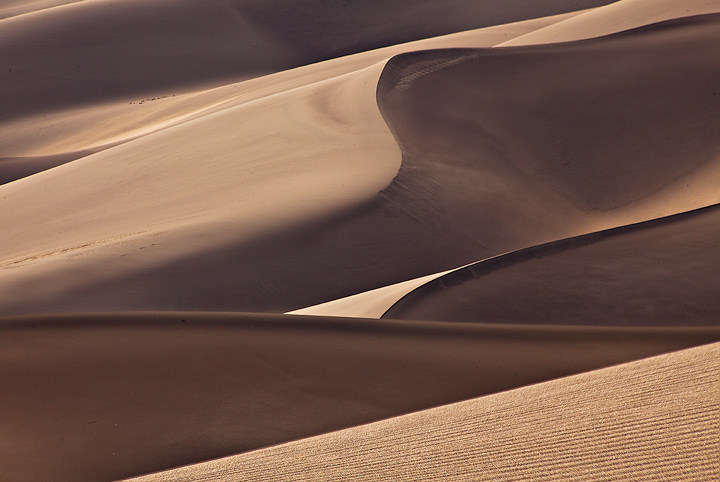
Sand Dunes last Saturday, before the wind got real nasty
5Dmkii; 70-300; focus blend at f/16
C&C Welcome! any ideas on what the 'prints' are in my post below??
Comments
30 comments
Comment posted by Nicolaus Wegner on July 15, 2011 at 9:40 AM
Crop or no crop, this is a pleasant scene Stan. Has a very soft and velvety feel to it. Not the cheese mind you...the soft fluffy stuff.
Onto critique. The footprints are distracting on the ridge up there...seems weird as they sort of disappear..cloning mistake or wind effect on the dune..not sure? And you have dust spots everywhere.
Altogether another promising dune shot from you. Nice work.
Registered on February 21, 2010, 133 Posts, 1509 Comments
Comment posted by Charlie Baugh on July 15, 2011 at 10:18 AM
Composition as posted is just great IMO. This scene as presented has such a pleasing color and smooth texture, Especially nice is the lip edge on some of the dunes.
Registered on April 18, 2011, 329 Posts, 1985 Comments
Comment posted by Robert Dayton on July 15, 2011 at 10:28 AM
Great lines and contours. I like the fg texture too. Good tonal variations
between light and dark. Whatever you would gain by cropping on the
left, I believe that you would lose by whacking off some of the good diagonal
lines and tonal ranges.
Registered on November 11, 2008, 281 Posts, 3958 Comments
Comment posted by Scott Snyder on July 15, 2011 at 10:33 AM
Very nice quiet scene. love the mixture of textured fg and velvety soft dunes. The left footprints are a little distraction, but I'd rather have them than lose the left.
Registered on November 11, 2009, 45 Posts, 161 Comments
Comment posted by Nick Bristol on July 15, 2011 at 11:03 AM
This is great Stan! I love color and the feel and texture is wonderful. Great comp with all the interesting lines. I would not crop imo. The diagonal foreground looks like corduroy! Nice work Stan.
Nick Bristol
Lone Rock, WI
Registered on February 1, 2004, 752 Posts, 14140 Comments
Comment posted by Gary McGhee on July 15, 2011 at 11:13 AM
I think a slight crop to eliminate the little dune line/triangle at the very top left would improve this Stan, that aside this looks good. I like all the lines and curves and your processing is top notch as usual.
Gary.
Registered on April 15, 2010, 142 Posts, 2416 Comments
Comment posted by Phil Pogledich on July 15, 2011 at 12:13 PM
This looks great and I'm not inclined to suggest a crop or any other edits for that matter (aside from some dust spot cleanup, though only a couple are noticeable to me). Perfect as-is.
Registered on August 24, 2009, 123 Posts, 3099 Comments
Comment posted by Richard Siggins on July 15, 2011 at 12:13 PM
I agree with Gary on cropping off the triangle in the UL corner. Other than that I wouldn't crop any of it. It works nicely just as it is. Great flowing texture and color. The footprints don't bother me at all.
Registered on October 11, 2007, 115 Posts, 223 Comments
Comment posted by Bill Maile on July 15, 2011 at 1:47 PM
Dunes, I luv 'em, they're so... well... sandy! Nice lines in 'em Stan!
Registered on March 2, 2009, 984 Posts, 2518 Comments
Comment posted by Richard Teller on July 15, 2011 at 5:59 PM
The texture, lines and shadows are very good. The thing I like about the image most is the color. It is a nice variation of the orange. red dunes that are usually posted. Great image.
Registered on August 23, 2010, 1162 Posts, 6692 Comments
Comment posted by Mark Metternich on July 15, 2011 at 6:05 PM
Stan I think this is really cool!
I would clone the small distracting elements and try to come up with a worse title.
Registered on June 19, 2009, 276 Posts, 6240 Comments
Comment posted by Harley Goldman on July 15, 2011 at 6:20 PM
Fine abstract, Stan. Great lines and shadows. I really like it. It also might be fun to try B&W and go high contrast and see what you get.
Registered on November 19, 2003, 586 Posts, 11271 Comments
Comment posted by Morris McClung on July 15, 2011 at 6:25 PM
Yep, crop it! But, this is pure art, Stan!
Registered on May 7, 2007, 670 Posts, 19650 Comments
Comment posted by Stan Rose on July 15, 2011 at 7:27 PM
Thanks folks! I didnt even notice the dust specks until now--those things are hard to avoid in 40 mph winds when your changing lenses--sorry bout that.
No footprints here though This is looking out over sand that probably hasn't been walked on in weeks--if not longer--and everything would have been clear by now. There's a bunch of little ripples/waves along and under the dune-crest if that's what you are referring to.
Mark, i changed the title for you.
Registered on September 15, 2005, 836 Posts, 17099 Comments
Comment posted by Stan Rose on July 15, 2011 at 7:44 PM
OK--i went back to the RAW and i think i found what Nicolaus was referring to. The stuff on the lhs is definitely not prints--just ripples--but the center stuff sure looks like prints, but they dont look human to me. Dont really look like deer/elk or coyote either--so im stumped! Any ideas???
100% crop, straight from the RAW:
Registered on September 15, 2005, 836 Posts, 17099 Comments
Comment posted by Art Escobado on July 15, 2011 at 9:05 PM
I like this dune abstract alot!
Registered on January 7, 2007, 0 Posts, 775 Comments
Comment posted by Zack Clothier on July 15, 2011 at 10:58 PM
Awesome Stan! Great lines, I wouldn't crop a thing.
Registered on January 28, 2010, 343 Posts, 2257 Comments
Comment posted by Nancy Lea Sandy on July 15, 2011 at 11:03 PM
I vote no crop. This is like rich chocolate or silk...too decadent for a mere photo. wonderful abstract
Registered on January 24, 2011, 576 Posts, 6942 Comments
Comment posted by John Fan on July 15, 2011 at 11:24 PM
I like the lines and texture. Maybe some darkening of UL corner will do. Cropping will make the S-curve too close to the upper boarder.
Registered on August 24, 2010, 135 Posts, 489 Comments
Comment posted by Mark Metternich on July 16, 2011 at 2:39 AM
Footprints. You should have gone out there and smoothed those by hand!
Registered on June 19, 2009, 276 Posts, 6240 Comments
Comment posted by R.Bill Moser on July 16, 2011 at 2:54 AM
Excellent photograph
Registered on January 29, 2010, 285 Posts, 4281 Comments
Comment posted by Tony Kuyper on July 16, 2011 at 10:03 AM
I like it as is, Stan, though a hand crop of the left looks good too. Wonderful textures and forms.
Registered on November 1, 2003, 364 Posts, 22328 Comments
Comment posted by Eva McDermott on July 16, 2011 at 11:51 AM
I like it as is Stan with the multiple multiple diagonal lines. Love the textures and lines. I also like Harley's comment on trying a high contrast B&W as well.
Registered on January 4, 2009, 1015 Posts, 13229 Comments
Comment posted by Doug Koepsel on July 16, 2011 at 12:37 PM
Stan, I think that the proposed crop to eliminate the ulc and darker wedge 1/3 down the left side would work well to simplify the image, it would eliminate most of the disturbed sand middle left edge, and thus enhance the abstract.
Registered on April 1, 2010, 196 Posts, 1592 Comments
Comment posted by Stan Rose on July 16, 2011 at 1:32 PM
Thanks, folks--dont crop is in the lead but i might do it anyways...
Mark--youre probably right, since theyre too big for coyote and not spaced enough for deer, but the close spacing is odd. Looks like the dune crest sheltered it from the wind so it might have been there a while. The sand was a lot looser than usual because it was such a dry Spring.
Registered on September 15, 2005, 836 Posts, 17099 Comments
Comment posted by Mark Seaver on July 16, 2011 at 2:52 PM
The sensual detail in this is fabulous. I wouldn't crop it a bit. I like the diagonal eye movement from LRC to ULC across the sunlit ridges.
Registered on January 23, 2011, 1103 Posts, 17270 Comments
Comment posted by Chris Chamberlain on July 16, 2011 at 4:52 PM
Really nice lines, texture, and form. Sounds redundant, but it is what it is. Wish I could offer some new and articulate comments, but I think that sums it up. I WILL come and see these dunes one day. hope we can get together then.
Chris
Registered on March 13, 2007, 500 Posts, 8365 Comments
Comment posted by John Williams on July 16, 2011 at 8:23 PM
Beautiful lines Stan. I vote to leave as is. (The prints were obviously made by a rabbit missing forelimbs.)
Registered on September 6, 2007, 221 Posts, 5985 Comments
Comment posted by Hamed Musharbak on July 17, 2011 at 3:28 PM
this is great
wonderful light Stan
Registered on June 1, 2009, 372 Posts, 2282 Comments
Comment posted by Dean Sauskojus on July 18, 2011 at 11:58 PM
Looks like Cat tracks as in Caterpillar. Lets hope not. Love the lines, love the lines. I vote no crop. Great job Stan!
Registered on September 29, 2009, 137 Posts, 2659 Comments


Comments
30 commentsOnto critique. The footprints are distracting on the ridge up there...seems weird as they sort of disappear..cloning mistake or wind effect on the dune..not sure? And you have dust spots everywhere.
Altogether another promising dune shot from you. Nice work.
between light and dark. Whatever you would gain by cropping on the
left, I believe that you would lose by whacking off some of the good diagonal
lines and tonal ranges.
Nick Bristol
Lone Rock, WI
Gary.
I would clone the small distracting elements and try to come up with a worse title.
No footprints here though
Mark, i changed the title for you.
100% crop, straight from the RAW:
Mark--youre probably right, since theyre too big for coyote and not spaced enough for deer, but the close spacing is odd. Looks like the dune crest sheltered it from the wind so it might have been there a while. The sand was a lot looser than usual because it was such a dry Spring.
Chris
wonderful light Stan