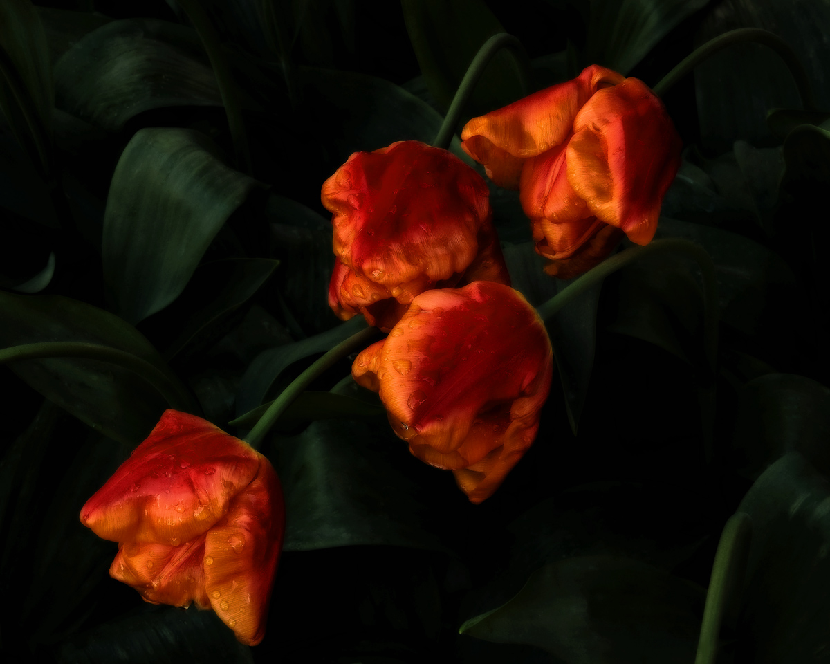
Orange Monarch Baroque
by Bruce King
This is a rework of a previous post. The original is still in my gallery if you wish to compare. If you're using IE this probably looks oversaturated, the reds especially. If you're on Firefox or another color managed browser and it looks overdone please let me know. I'm still tweaking calibration targets on the new monitor.
Larger version included, thanks for looking.

Comments
11 commentspat
Bob
Carolyn-I agree but more room at the bottom would have meant a large, OOF bloom would have been only partially in the frame. I felt it was too big an area to clone out. Maybe I should try the Content Aware Fill tool in CS5?
Albert Darmo
Canada