Nature Photographers Network
This is the preserved archive of the original Nature Photographers Network. The community continues at naturephotographers.network.
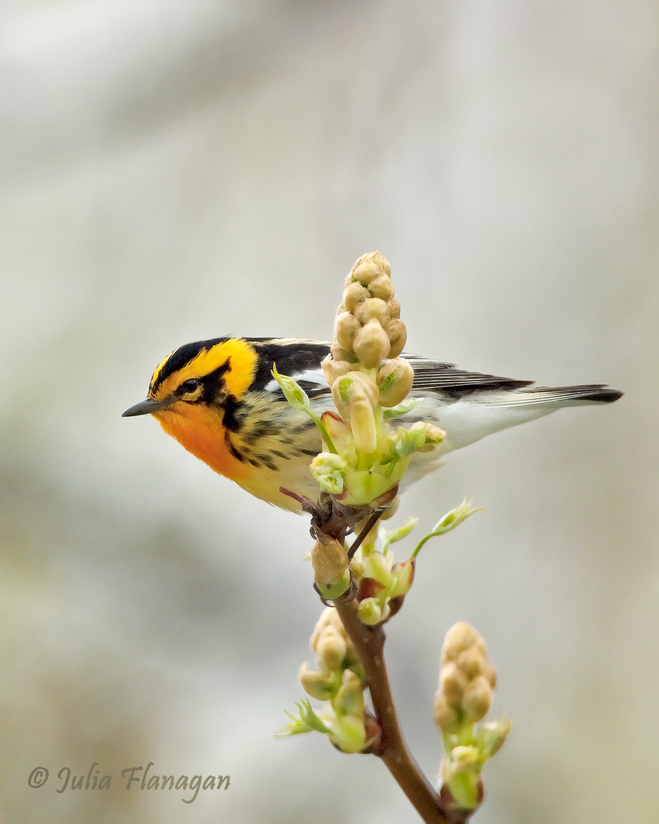
Blackburnian Warbler + repost
‹ PreviousAvian GalleryNext ›

Blackburnian Warbler + repost

by Julia Flanagan

Gallery: AvianPosted July 23, 2011370 views15 comments
Hi Folks,

Here's a warbler from this past spring's migration. The high key bg is unusual for me to shoot so I would appreciate feedback on it and anything else that you would find helpful.

Your critique is very welcome.

Nikon D2X, Nikkor 300mm f2.8, TC-14E, 1/1000s, f5. Processed in CS2, Cropped to vertical, 45% of original shown.

Comments

15 comments
Comment posted by John Robinson on July 23, 2011 at 5:45 PM
Looks fine to me Julia. Might even take a landscape crop too as you have the canvas.?
Nice as is though.
JohnR
Registered on March 2, 2008, 535 Posts, 2453 Comments
Comment posted by Mia McPherson on July 23, 2011 at 6:30 PM
This is a lovely setting Julia, I wouldn't really consider this a high key background, just light in tone. I like the pose of the bird , the eye contact and the colors of the bird. There is noise creeping into the larger version most noticeable in the darks and the branch stem/lower flowers. Some of that may be due to the large crop. I'd work on the straight line high contrast areas of the edge of the tail and wings. Perhaps a landscape crop would be less of a crop and the noise wouldn't be as evident. I think this image is worthy of reworking. Nice work getting the warbler so out in the open.
Registered on June 25, 2007, 491 Posts, 12566 Comments
Comment posted by Julia Flanagan on July 23, 2011 at 7:05 PM
Mia- thanks for the comment. I can do the noise reduction you mention. The reason I went vertical is because of an oof twig just to the left of this crop, and I avoid cloning whenever possible. But I will consider it here. I'm wondering what you would suggest for the "straight line high contrast areas of the edge of the tail and wings"?
Registered on November 13, 2003, 59 Posts, 986 Comments
Comment posted by Cheryl Molennor on July 23, 2011 at 7:57 PM
What a pretty warbler. Ive never seen one but am hopeful with next yrs migration I love the head turn and eye contact. I like the perch too.
Registered on June 30, 2009, 300 Posts, 5051 Comments
Comment posted by Mia McPherson on July 23, 2011 at 8:03 PM
Julia,

I understand about the OOF twig to the left of this crop, that is a problem. I avoid cloning whenever possible too.

Regarding the high contrast straightline areas I mentioned: After masking the bird and other features that will be sharpned I go back and remove (subtract) the high contrast straightline areas from the sharpening mask and then sharpen. When you sharpen those areas it causes the zig zag lines and usually those areas appear sharp anyway. Then those areas look more natural.
Registered on June 25, 2007, 491 Posts, 12566 Comments
Comment posted by Brian Gatlin on July 23, 2011 at 8:42 PM
really a beauty, Julia! nice that you had dof for the bird and the great perch. the setting here is really nice. I try to avoid cloning too but would still consider it for this because it's such a great looking bird.
Registered on March 21, 2009, 202 Posts, 4187 Comments
Comment posted by Richard Ditch on July 23, 2011 at 8:43 PM
Nice warbler and setting. I too would like to see this as a horizontal composition.
Registered on November 1, 2003, 1031 Posts, 12705 Comments
Comment posted by Ray Whitt on July 24, 2011 at 9:33 AM
Excellent shot Julia, love the perch and the smooth creamy background. The warbler looks wonderful.

Ray
Registered on May 27, 2011, 92 Posts, 2619 Comments
Comment posted by Sharon Hallowell on July 24, 2011 at 11:39 AM
Nice setting and colors. Agree with the crop suggestion. Nice to see one of these! Sharon
Registered on November 1, 2003, 392 Posts, 4810 Comments
Comment posted by Luke Ormand on July 24, 2011 at 4:06 PM
Would have liked a vertical comp. to compliment the perch but the colors and details on this bird in breeding plumage are wonderful
Registered on February 4, 2009, 1093 Posts, 7035 Comments
Comment posted by Ken Archer on July 24, 2011 at 7:57 PM
He's a beauty Julia!!! Excellent detail, love that perch too. Sweet Photo :toast:

Ken Archer
Registered on October 28, 2004, 222 Posts, 6683 Comments
Comment posted by Ron Dudley on July 24, 2011 at 8:45 PM
Julia, lovely bird, perch and background (which I don't see as high-key either). If the lower part of the very nice perch were sharp I'd be torn about whether to go horizontal or vertical with the crop but since it isn't I'd go horizontal and clone if I had too, I think... Try Mia's little trick for the straight line, high contrast areas. It usually works!
Registered on March 30, 2007, 437 Posts, 10915 Comments
Comment posted by Dennis Plank on July 24, 2011 at 10:17 PM
The bg works fine in this image, for me, Julia. It's a bit bright, but not glaring and the bird is colorful enough to stand out well against it. It has a mottled appearance that gives it some nice structure. The perch is super.

Well done.
:toast:
Registered on January 28, 2008, 1767 Posts, 23192 Comments
Comment posted by Julia Flanagan on July 24, 2011 at 10:56 PM
Thanks everyone for your comments. In response, I'm posting a horizontal composition. The oof twig I was unable to avoid with this comp was cloned out. Let me know how they compare in your mind's eye. - Oh and I selectively sharpened one round bird+twig then two rounds bird+twig with the lines of the wing and tail deselected. Seems to have gotten rid of most of the issues with the jagged lines that should be straight. This comp is about 55% of full frame.
Registered on November 13, 2003, 59 Posts, 986 Comments
Comment posted by Angela McCain on July 24, 2011 at 11:00 PM
I think I like the horizontal post better, but certainly wish I could have seen the larger version in this comp. Great work on the bird with fantastic detail and color.
Registered on April 19, 2009, 367 Posts, 3589 Comments