Nature Photographers Network
This is the preserved archive of the original Nature Photographers Network. The community continues at naturephotographers.network.
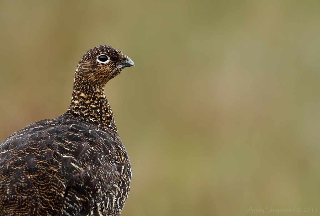
Red Grouse
‹ PreviousRegional: UKNP GalleryNext ›

Red Grouse

by Andy Shepherd

Gallery: Regional: UKNPPosted July 26, 2011116 views9 comments

One last Red Grouse from me, this one came a little too close so I have cropped in to make a portrait.

1/800th @ f6.3 -1/3rd iso800 ( 80% of FF and two dust spots removed )

Please view the large version

Thanks for the feedback on my Heron image and thanks for looking.

Andy... :smile:

Comments

9 comments
Comment posted by Phil Shaw on July 26, 2011 at 10:23 AM
Thought the composition looked a little too contrived (for my unrefined tastes at least) when I first looked at it, but on reading the circumstances, this was probably the best single frame option available to you. In similar circumstances with co-operative subjects that are too close, I've shot multiple images and then stitched them together afterwards. Don't know if that was an possibilty in this case. Photography: its always about compromises.
Registered on July 25, 2005, 26 Posts, 110 Comments
Comment posted by Philip Hodgkins on July 26, 2011 at 10:48 AM
I like this, although I would like it better if there was less room on the right.
Registered on July 24, 2006, 2741 Posts, 12349 Comments
Comment posted by keith mitchell on July 26, 2011 at 12:36 PM
Andy we can't complain if there to close but i know what you mean but you have got some great detail and a smashing bg.

Keith. :smile:
Registered on July 12, 2008, 127 Posts, 1735 Comments
Comment posted by Simon Litten on July 26, 2011 at 1:54 PM
Good composition and that eye draws you in :toast:
Nice one.

Simon
Registered on June 22, 2006, 24 Posts, 275 Comments
Comment posted by Phil Ellard on July 26, 2011 at 2:45 PM
A good job on the comp. works really well, stunning BG
Registered on December 17, 2010, 60 Posts, 634 Comments
Comment posted by Graham Goddard on July 26, 2011 at 5:01 PM
Like it a lot Andy - the space isn't a problem for me and the BG is super :wavey:
Registered on November 21, 2008, 66 Posts, 253 Comments
Comment posted by David Sewell on July 27, 2011 at 8:15 AM
Hi Andy,

I'm in the camp that thinks there is a little too much space on the right. I think I would crop a lot of that off and turn it into a portrait format. You seem to have enough quality available to do it.

David
Registered on September 10, 2008, 63 Posts, 801 Comments
Comment posted by Mike Smith on July 27, 2011 at 8:26 AM
Sorry, this is falling into the confused image camp for me. The format is wrong for editorial work, it needed to be portrait format and use the OOF area as title space, and the current landscape crop has too much dead space for a simple portrait.

Not sure why you didn't shoot as Portrait orientation here given the room on the right, or have you extended the canvas? :confused:
Registered on September 16, 2005, 12 Posts, 46 Comments
Comment posted by Andy Shepherd on July 27, 2011 at 12:55 PM

Some interesting comments re the comp, personally I thought it was just about right, but it's always good to hear other peoples views on how they would have gone about composing the shot.

Cheers guys and thanks for the feedback :toast:

Andy... :smile:
Registered on September 24, 2006, 123 Posts, 1254 Comments