Nature Photographers Network
This is the preserved archive of the original Nature Photographers Network. The community continues at naturephotographers.network.
From Shadow to Light IV
‹ PreviousLandscape GalleryNext ›

From Shadow to Light IV

by Jorne de Bruin

Gallery: LandscapePosted July 29, 2011203 views12 comments
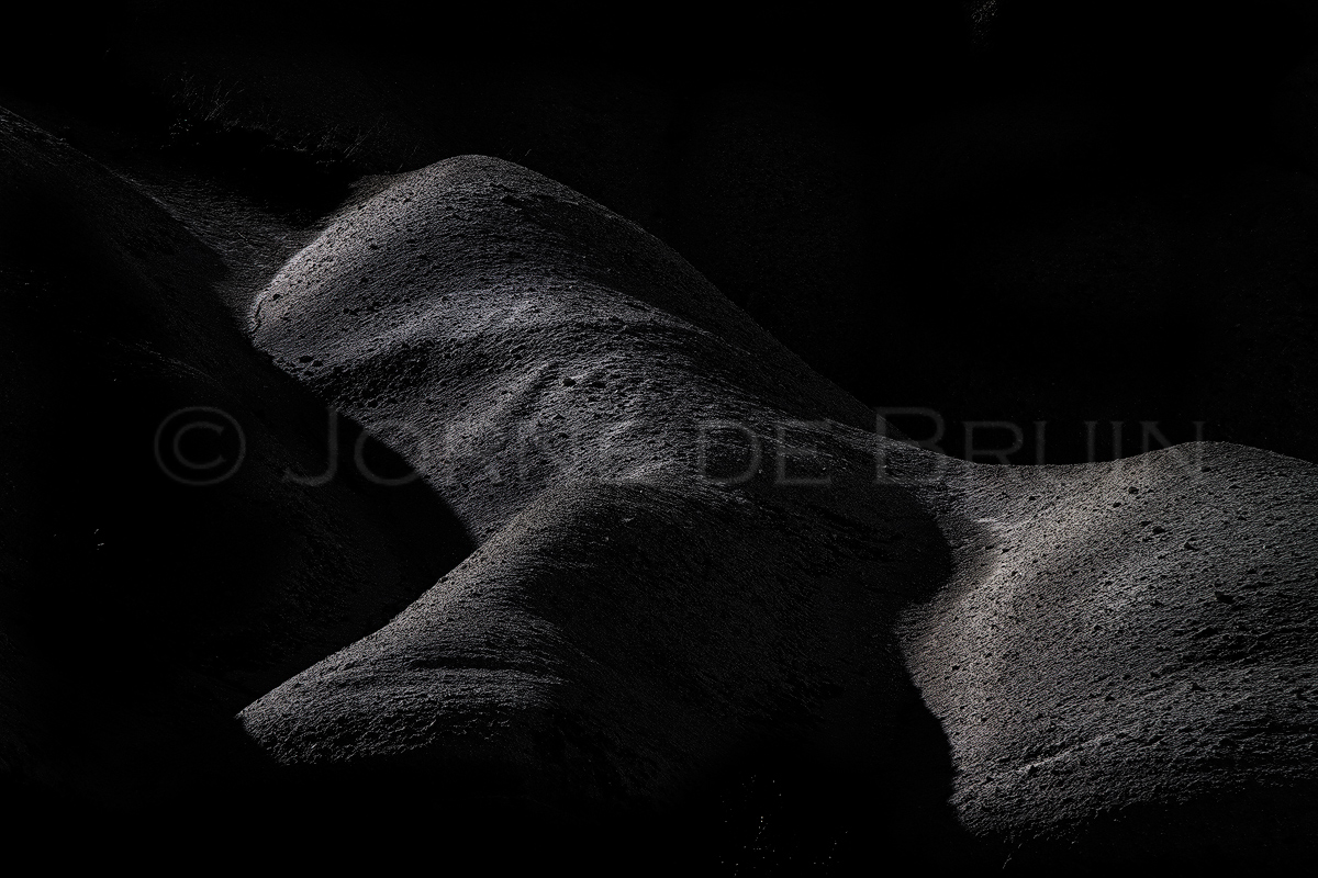
Another abstract rock shape in darkness similar to my previous postings, I just keep 'stumbling' on these the further I get through my Cappadocia images. All those erdoded rocks and canyons just lend themselves so well for these types of images! I know this is not for everyone but I'm getting quite fond of these images. C&C appreciated!

Canon 7d, 200mm

Comments

12 comments
Comment posted by Stuart Williams on July 29, 2011 at 10:28 AM
great light and form. could be sensual image of a horse's torso. comp is one of the keys to such images, IMO, and this leaves me a touch unsatisfied - feel that it is pulling off to the right.
Registered on December 7, 2007, 247 Posts, 4792 Comments
Comment posted by Phil Pogledich on July 29, 2011 at 12:30 PM
Very interesting image and I think it's relatively successful. The subtle light really accentuates the landscape features in a pleasant and slightly seductive way. I could see going with a slightly tighter crop from the top and LHS.
Registered on August 24, 2009, 123 Posts, 3099 Comments
Comment posted by Jorne de Bruin on July 29, 2011 at 5:38 PM
Thanks for the feedback guys, been staring at this so long that I really needed some outside input, how about this crop?
Registered on June 26, 2008, 178 Posts, 2136 Comments
Comment posted by Richard Teller on July 29, 2011 at 5:55 PM
I like the second image much better. The first one left me a little ambivalent. The second one makes the form and light jump out of the image.
Registered on August 23, 2010, 1162 Posts, 6692 Comments
Comment posted by David Edwards on July 29, 2011 at 6:50 PM
Very engaging work, Jome. I'm not too sure about the complete blackness, but I do appreciate the form and texture you have accentuated. The grittiness of the details is a nice contrast to the smooth dark areas. A lovely abstract form. The cropped version seems better balanced to me.
Registered on December 6, 2008, 142 Posts, 2623 Comments
Comment posted by Jorne de Bruin on July 29, 2011 at 6:54 PM
Thanks! I have to say I ahd to thinki about the complete darkness, but the details on the other parts of the scene where not very engaging. Still, I see how it might be a little much :wink:
Registered on June 26, 2008, 178 Posts, 2136 Comments
Comment posted by Phil Pogledich on July 29, 2011 at 7:03 PM
I do prefer the crop . . . I think you got it just right. On the darkness, for me that's what makes this such a unique and interesting image. I think it's an issue where you'll get different opinions and you have to go with whatever works best for you. You know, all that personal artistic vision stuff.
Registered on August 24, 2009, 123 Posts, 3099 Comments
Comment posted by Brian Schrayer on July 29, 2011 at 9:06 PM
I like this a lot. My initial reaction was that I would like to see the lighter areas a little brighter but when I looked at the larger image it worked as presented. There is a lot of tension with this as I keep wanting to see further into the shadows but the mystery is what makes this strong. Great work!!
Registered on May 28, 2004, 114 Posts, 2890 Comments
Comment posted by Stuart Williams on July 30, 2011 at 1:54 AM
crop certainly works better, IMO!
Registered on December 7, 2007, 247 Posts, 4792 Comments
Comment posted by Anthony Vincent on July 31, 2011 at 9:55 PM
This is cool Jorne

If you look at the thumb it appears to be a giant sperm whale feeding in the deep
Very neat
Registered on February 5, 2009, 199 Posts, 2775 Comments
Comment posted by Sarah Marino on August 1, 2011 at 7:26 PM
Jorne - I really like this study in shapes and light. I like your choice of composition and processing a lot.
Registered on November 10, 2008, 23 Posts, 393 Comments
Comment posted by Floris van Breugel on August 1, 2011 at 10:36 PM
I like the evocative feeling of this image, which is emphasized by the black and white conversion. I do wonder if including more on the right would have helped create more interest?
Registered on December 19, 2008, 306 Posts, 4840 Comments