Nature Photographers Network
This is the preserved archive of the original Nature Photographers Network. The community continues at naturephotographers.network.
Fiery Furnace and Repost
‹ PreviousLandscape GalleryNext ›

Fiery Furnace and Repost

by Richard Teller

Gallery: LandscapePosted August 1, 2011322 views16 comments
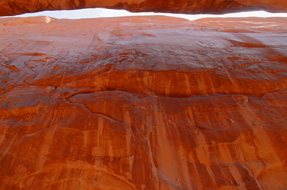
When we were in Arches National Park I hiked the Fiery Furnace. Great hike with all kinds of neat formations. This is a rock wall near one of the arches on the hike. I kind of like the image, but I am not sure if it will appeal to anyone else. I would appreciate your comments.

Canon 30D
Sigma 17-70
Aperture Priority
Shutter 1/90
Aperture f9.5
ISO 400
17mm

Comments

16 comments
Comment posted by Kent Mearig on August 1, 2011 at 3:28 PM
The Fiery Furnace was my favorite place in the Moab area during my first visit to Southern Utah. While I can see the novelty in including the sliver of sky in this photo, it has resulted in a rather large area where the light/color is considerably less appealing than what shows up at the bottom. As a result, a careful black and white conversion might be the best way to pull the concept off.
Registered on September 4, 2006, 237 Posts, 4748 Comments
Comment posted by Verdon on August 1, 2011 at 3:35 PM
interesting point of view, love the patterns on the rock, the sky seems to me over bright what is taking out beauty from the arch, have you try take shots with different exposure?! :wavey:
Registered on June 10, 2011, 147 Posts, 1444 Comments
Comment posted by Ian Cameron on August 1, 2011 at 3:40 PM
Well it really appeals to me as it stands I love the rich colour and the white stripe of sky I find it both artistic original and memorable. Very well done.
Registered on August 6, 2004, 1125 Posts, 3318 Comments
Comment posted by Alex Mody on August 1, 2011 at 6:10 PM
Gotta love that reflected light!
Registered on December 25, 2007, 163 Posts, 1896 Comments
Comment posted by Tony Kuyper on August 1, 2011 at 6:11 PM
Ultimate slot, Richard. Very interesting perspective on this place.
Registered on November 1, 2003, 364 Posts, 22328 Comments
Comment posted by Rudy Ruberti on August 1, 2011 at 7:01 PM
I was just at Arches but didn't make it to Fiery Furnace. Looking at this makes me want to go back and see this area. Nicely done.
Registered on October 28, 2008, 179 Posts, 1875 Comments
Comment posted by Sarah Marino on August 1, 2011 at 7:36 PM
Hi Richard - I really like the details and colors of the wall here but find the brightness at the top to be competing for my interest. I think you could have another option with a crop right below the bright part at the top.
Registered on November 10, 2008, 23 Posts, 393 Comments
Comment posted by Chris Chamberlain on August 1, 2011 at 8:11 PM
Great color, and perspective. I think it works, and I like it.

Chris
Registered on March 13, 2007, 500 Posts, 8365 Comments
Comment posted by Dean Sauskojus on August 1, 2011 at 8:51 PM
Interesting image. I like the lines in the rock and the inclusion of the slit at the top. Very nice Richard.
Registered on September 29, 2009, 137 Posts, 2659 Comments
Comment posted by Floris van Breugel on August 1, 2011 at 10:16 PM
Intriguing concept, Richard, I like the idea. I agree with Kent, a black and white would be worth trying out, though it's hard giving up that wonderful golden glow.
Registered on December 19, 2008, 306 Posts, 4840 Comments
Comment posted by Kah Kit Yoong on August 2, 2011 at 1:16 AM
I think an intense band of blue sky would have been the ticket but overall it still works pretty well with the white sky. Well seen.
Registered on September 27, 2006, 636 Posts, 10682 Comments
Comment posted by Stuart Williams on August 2, 2011 at 2:54 AM
i like the concept but think you might have pointed the camera slightly further up (i.e., the strips would have been lower in the frame). i also would have been interested to see the stripe in intense blue! i reflected colour is gorgeous and i'd be working to keep it!
Registered on December 7, 2007, 247 Posts, 4792 Comments
Comment posted by Morris McClung on August 2, 2011 at 6:06 PM
This gives a great sense of scale to the canyon.
Registered on May 7, 2007, 670 Posts, 19650 Comments
Comment posted by Eva McDermott on August 2, 2011 at 6:41 PM
Love the rich color Richard. I like it as is especially the light on the canyon wall. I think a lower sky sliver would draw attention away from the beautiful desert varnish. Beautiful!
Registered on January 4, 2009, 1015 Posts, 13229 Comments
Comment posted by Svein-Frode on August 3, 2011 at 8:47 AM
I like the idea, but the crop from the top feels a bit too tight.
Registered on November 13, 2003, 9 Posts, 277 Comments
Comment posted by Richard Teller on August 3, 2011 at 10:42 AM
Thanks for all of the comments and input. I darkened the top part of the wall slightly. It looked at the image without the sliver of sky but it took away the sense of place, at least to me. Again all comments are more then welcome.
Registered on August 23, 2010, 1162 Posts, 6692 Comments