Nature Photographers Network
This is the preserved archive of the original Nature Photographers Network. The community continues at naturephotographers.network.
Anticipation
‹ PreviousLandscape GalleryNext ›

Anticipation

by Joseph Balcken

Gallery: LandscapePosted August 5, 2011464 views16 comments
Larger version included.

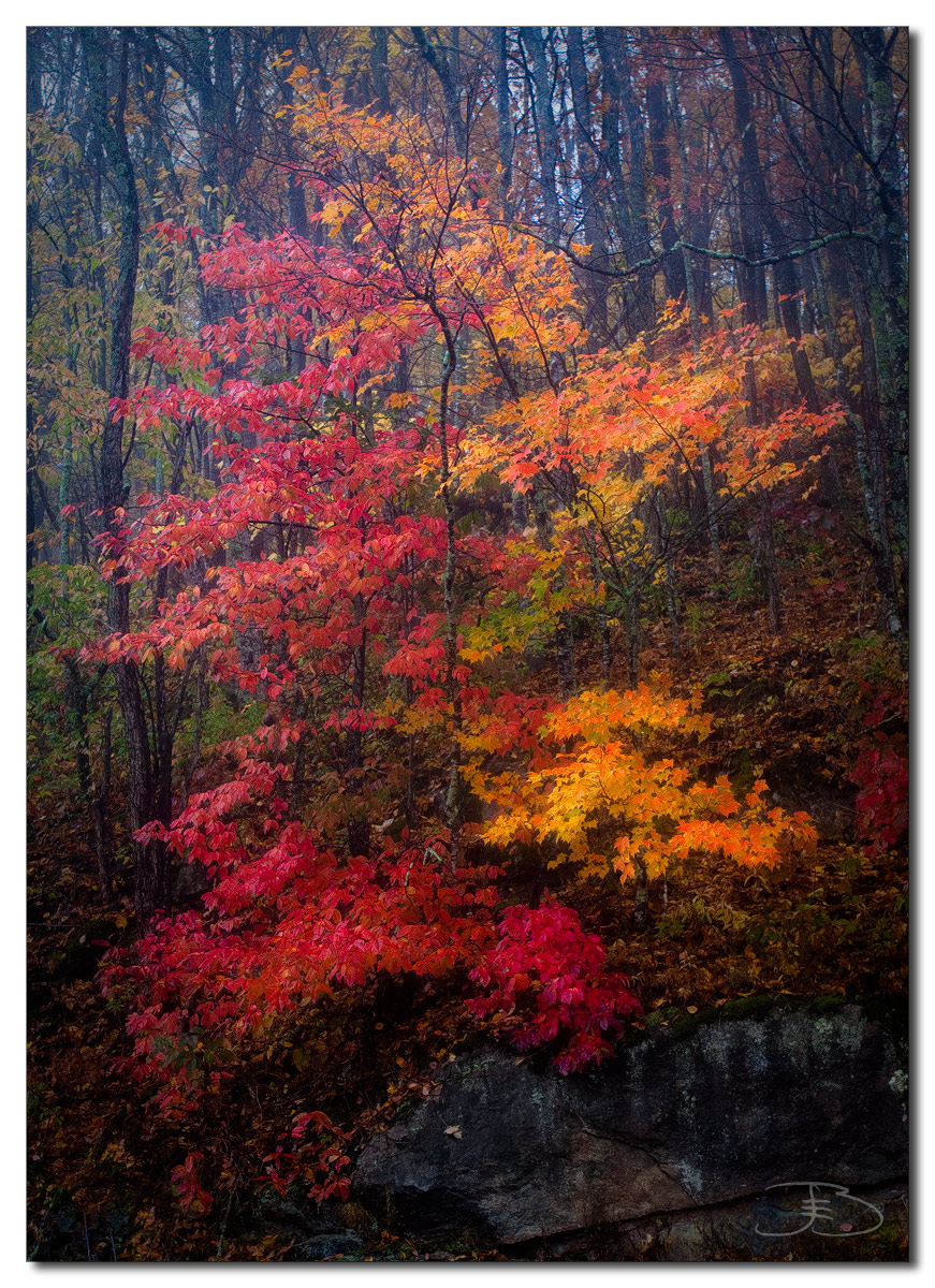
I'm looking forward to fall this year in the Smokies. I tried to process this one last autumn and was never happy with the results. It took a little time and experience to finally feel that I got it somewhat right. It was foggy and rainy. I processed it a bit dark to have the tree stand out more. No wine this time, only a couple beers :wink:.

C&C are welcomed and put to use.

50D, 17-40 f4L, CPL

Comments

16 comments
Comment posted by Ed Lowe on August 5, 2011 at 10:30 PM
I can only hope that the fall colors are that gorgeous this year, Joesph. Very beautifully done.

Ed
Registered on February 7, 2004, 414 Posts, 7115 Comments
Comment posted by Youssef Ismail on August 5, 2011 at 10:50 PM
Very vivid! The foggy atmosphere helps the colors stand out well. On screen I think the darkness helps, but in a print it might not.
Registered on November 1, 2003, 474 Posts, 5555 Comments
Comment posted by Robert Dayton on August 5, 2011 at 11:25 PM
Well composed, Joseph. I like the colors and even lighting.
I really like the larger version. This encourages me to
make a trip to the Smokies for fall color some time.
Registered on November 11, 2008, 281 Posts, 3958 Comments
Comment posted by Anders Engström on August 6, 2011 at 6:00 AM
Hello Joseph, nice image with good composition and beautiful colors. I like the subtle softening effect

//Anders
Registered on September 21, 2010, 21 Posts, 83 Comments
Comment posted by R.Bill Moser on August 6, 2011 at 1:53 PM
I love the colors here. Nice fall colors.
Registered on January 29, 2010, 285 Posts, 4281 Comments
Comment posted by David Edwards on August 6, 2011 at 6:56 PM
Wonderful color and mood. Love the foggy atmosphere.
Registered on December 6, 2008, 142 Posts, 2623 Comments
Comment posted by Dennis Harding on August 6, 2011 at 8:59 PM
This is a nice comp with beautiful warm autumn colors. I believe that your image could be improved by adding a little more depth and contrast to the top half of the image and also slightly lighten the bottom half.
Registered on January 19, 2011, 33 Posts, 408 Comments
Comment posted by Brian Schrayer on August 6, 2011 at 9:08 PM
Beautiful autumn color here and well composed. I think this would benefit from a vignette in the top corners (I wouldn't darken the bottom corners any more. If you added the vignette with a layer mask you could paint the effect out of the bottom of the frame.).
Registered on May 28, 2004, 114 Posts, 2890 Comments
Comment posted by Jared Atencio on August 7, 2011 at 11:06 AM
I'm really liking this Joseph-love the division of the reds and yellows and the comp works very well here. This one really must be viewed large to see the detail and sharpness that is lost in the smaller version. I also like the choice for the darker processing, nice work :toast:
Registered on June 23, 2009, 21 Posts, 422 Comments
Comment posted by Richard Hartmann on August 7, 2011 at 1:59 PM
Pretty forest abstract
I would have shot those colors, too. Nice work all around and I love the mood.
Although I like the misty fog, I am wondering if a levels adjustment could make for an additional photo with a different mood.
Registered on January 15, 2009, 13 Posts, 772 Comments
Comment posted by INGOMA on August 7, 2011 at 3:23 PM
This is stunning, Jospeh. I love the colors and how the two trees combine for this beautiful scene.
Registered on July 2, 2004, 231 Posts, 3110 Comments
Comment posted by Svein-Frode on August 7, 2011 at 5:48 PM
Lovely image with a melancholic mood. Not much to improve IMHO.
Registered on November 13, 2003, 9 Posts, 277 Comments
Comment posted by Rodney Dugmore on August 8, 2011 at 3:24 AM
Stunning colours and mood.
Lovely
Registered on January 3, 2004, 76 Posts, 1028 Comments
Comment posted by Harley Goldman on August 9, 2011 at 6:25 PM
Beautiful colors and scene! It looks kind of Orton on the small version, but much sharper and cleaner on the large.
Registered on November 19, 2003, 586 Posts, 11271 Comments
Comment posted by Joseph Balcken on August 9, 2011 at 9:16 PM
Thanks for the feedback, everyone. It will be hard to evaluate at this size, but I incorporated some of the suggestions into this version. Any preferences?
Registered on November 29, 2009, 48 Posts, 249 Comments
Comment posted by Morris McClung on August 9, 2011 at 11:13 PM
The colors make this a very strong image!
Registered on May 7, 2007, 670 Posts, 19650 Comments