Nature Photographers Network
This is the preserved archive of the original Nature Photographers Network. The community continues at naturephotographers.network.
Wild B&W
‹ PreviousWildlife GalleryNext ›

Wild B&W

by Vincent Grafhorst

Gallery: WildlifePosted August 18, 2011301 views12 comments
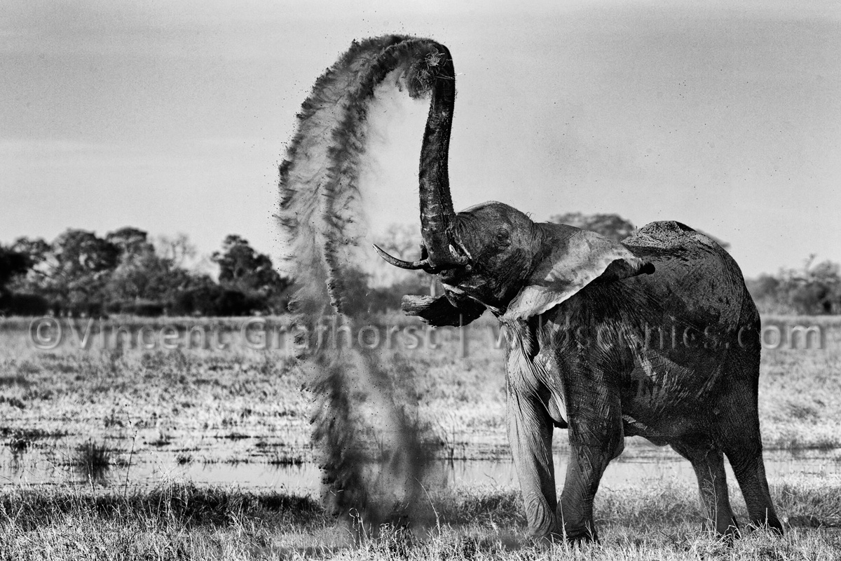
I was about to reprocess this elephant image as per suggestions on my previous post when I suddenly realised this might be an ideal candidate for a B&W conversion. So I gave that a quick try and came out with this wild looking contrasty B&W. I liked it such that I even forgot about what I set out to do in the first place (for now that is; in other words your opinion could change my mind :biggrin:.)

For techs etc see my previous post.
Comments

12 comments
Comment posted by John Tobias on August 18, 2011 at 3:39 PM
Sorry Vincent, but the color version is best IMHO.
Registered on September 12, 2009, 2120 Posts, 6455 Comments
Comment posted by Carol Nichols on August 18, 2011 at 5:08 PM
Yeah, me too Vincent. Sorry.
Registered on November 7, 2007, 161 Posts, 1420 Comments
Comment posted by Andrew Sentipal on August 18, 2011 at 8:24 PM
Amazing shot. I love the action and that you have plenty of environment included in the front of the elephant. I have to now check the color version. Well done !!!

Andrew :toast:
Registered on February 16, 2008, 200 Posts, 317 Comments
Comment posted by Phillip Noll on August 18, 2011 at 8:51 PM
I kinda like the B&W version! Too bad there weren't any clouds in the sky! But, you take what you can and I love the dust throwing!! :toast:
Registered on November 17, 2003, 207 Posts, 1083 Comments
Comment posted by Ajit Huilgol on August 18, 2011 at 11:21 PM
I think the brightening of the left side of the elephant is even more pronounced than in the colour version, and looks even more unnatural, Vincent.
Registered on December 19, 2008, 302 Posts, 2055 Comments
Comment posted by Vincent Grafhorst on August 18, 2011 at 11:57 PM
Ajit, you said:
I think the brightening of the left side of the elephant is even more pronounced than in the colour version, and looks even more unnatural
.
I respectfully disagree that it does look more pronounced but most importantly it is the artistic B&W media particularly that allows a less 'realistic' look. Art is not about realism at all so nor does wildlife photography have to be, although it is often expected to be for some obscure reasons. :wink:
Registered on February 24, 2006, 504 Posts, 7203 Comments
Comment posted by Anand Narayanan on August 19, 2011 at 1:45 AM
Another vote for the BW ! Its got a little more "steel" to it, whatever that means :biggrin:

This is a purely subjective.. would like to see a little less contrast in certain regions ( for instance below the eye to the start of the ear).
Registered on October 25, 2009, 110 Posts, 835 Comments
Comment posted by Johan Malmros on August 19, 2011 at 12:49 PM
Like it Vincent, but I think it would improve if you could tone down the trees and some of the stuff in the water a bit on the left. Aim for the looks on the right side of the elephant and I think it would make the animal stand out more and the image less cluttered. (Not the foreground grass though - That's nice as is).

I might be wrong though, but if you want to experiment give it a try.
Registered on January 6, 2011, 20 Posts, 154 Comments
Comment posted by Clinton Bauder on August 19, 2011 at 2:14 PM
Hmm. Well I think the elephant looks better but the star of the photo is the dust trail and I think it really loses something in the conversion. Somehow it doesn't have the feeling of fine, soft dust in this version. Looks too harsh I think so I'm going to vote for the color version. Harsh shadows on the elephant or not it's still a great shot.

Clinton
Registered on December 8, 2009, 31 Posts, 231 Comments
Comment posted by Robert Bunch on August 20, 2011 at 9:21 AM
I like them both but prefer the color version. I would suggest that you get the clone tool going and remove all of the dust and dust spots and "clean" it up a little bit! :jump: Just kidding. Couldn't help myself
Registered on May 18, 2004, 124 Posts, 2503 Comments
Comment posted by Howard Cheek on August 22, 2011 at 9:14 AM
Looks great in B&W as well, I like the amount of contrast you used here.
Thank you for your comments on my baby zebra BTW.
Well done :toast:
Registered on July 24, 2008, 1201 Posts, 10758 Comments
Comment posted by James Campbell on August 24, 2011 at 4:46 AM
I am going with the BW version - the high contrast is great and in all a more pleasing version to my eye..
Registered on January 12, 2009, 48 Posts, 377 Comments
