Nature Photographers Network
This is the preserved archive of the original Nature Photographers Network. The community continues at naturephotographers.network.
Alpine Lily +alt crop
‹ PreviousFlora GalleryNext ›

Alpine Lily +alt crop

by Lon Overacker

Gallery: FloraPosted August 24, 2011203 views16 comments
Twice in less than a week, most definitely a record for me.

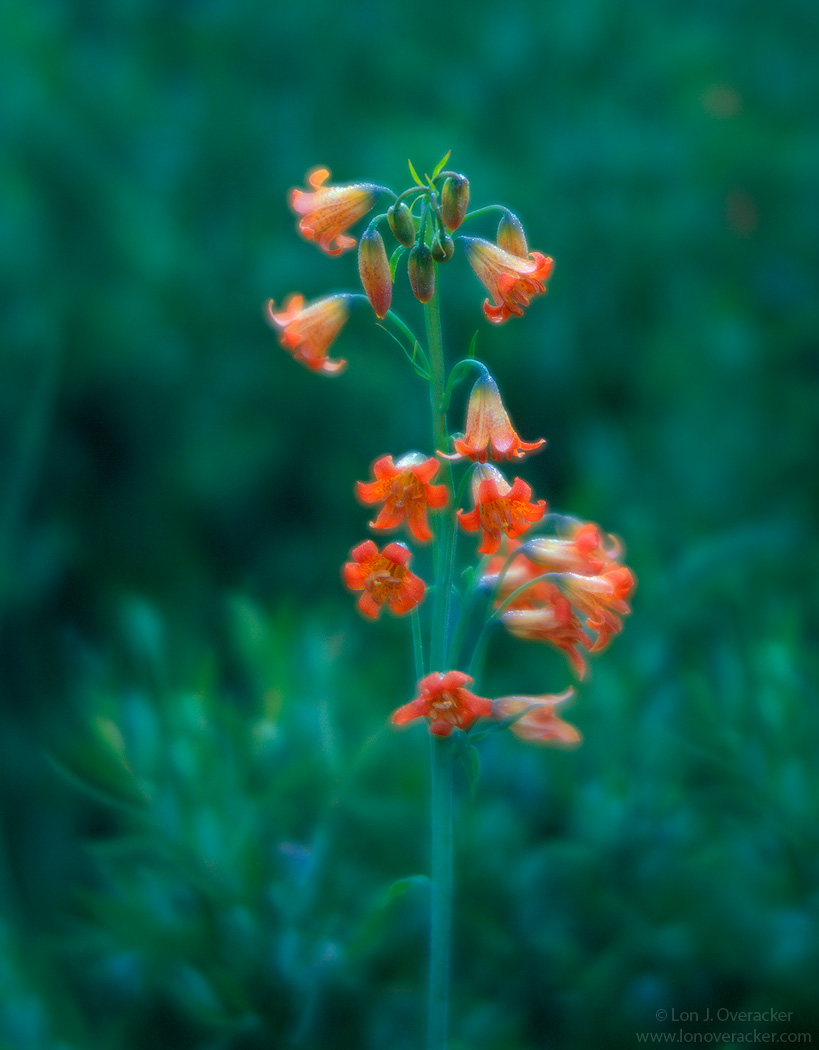
I'm pretty sure this is an alpine lily, but if anyone here can correct the ID, that would be great. This was also captured on my recent trip to the Sierra and the Sonora Pass. This just down the hill by our campsite. This puppy was at least 3 feet tall - maybe even higher. all I know is that I had this set up with my tripod fully extended and I was standing up - not belly scrunching on the ground!

This is much less artistic than my previous lupine image, but you might notice a bit of a glow. This is not due to any processing, but because I used a vintage (1920's?) soft focus lens on the 4x5 and it has beautiful bokeh.

I had so much fun with this stalk of lily and another one close by. I exposed 8 sheets of 4x5 film, which is unheard of for a single subject. I photographed one day in the evening, another in the morning and both during dead calm that allowed 1/2 second or slower exposures.

I would love some feedback here; color, processing and of course the image in general.

4x5, Verito soft focus lens, Velvia 100F, f/5.6 @ 1/2s.

Thanks! And thank you very much for the comments and feedback on the previous posting.

Lon

Comments

16 comments
Comment posted by Morris McClung on August 24, 2011 at 10:20 AM
I love the color in this, of course it's Velvia, so who wouldn't love it? :biggrin: I like the dreamy effect your old lens produced, too. Very artistic!
Registered on May 7, 2007, 670 Posts, 19650 Comments
Comment posted by Nancy Lea Sandy on August 24, 2011 at 11:18 AM
The softness you captured is interesting, like a water-color or oil pastel. Beautiful colors--the orange is really nice with all that blue-green.
Registered on January 24, 2011, 576 Posts, 6942 Comments
Comment posted by Harley Goldman on August 24, 2011 at 12:12 PM
Sweet glow! That makes the image for me. Where did you get such a cool lens??? :biggrin: I might prefer a bit of a crop at the top.
Registered on November 19, 2003, 586 Posts, 11271 Comments
Comment posted by Wayne Willison on August 24, 2011 at 2:20 PM
What I love here is the color combinations, and also the sense of flow from the hanging buds. That soft lens is remarkable for flora. I used to pop on a soft filter over my hassleblad 150 and this reminds me of its effects. For my bit in constructive feedback - I'd like to see more of the plant and less of the surroundings. I can't get enough of those thought evoking flowers.
Registered on April 10, 2009, 292 Posts, 3967 Comments
Comment posted by David W. Kelly on August 24, 2011 at 3:22 PM
Beautiful image Lon and the glow really creates a very nice mood.
Registered on October 7, 2005, 883 Posts, 6590 Comments
Comment posted by Lon Overacker on August 24, 2011 at 3:27 PM
Thanks for the comments folks!

Here's another cropped version. This is actually a different exposure and on Velvia 50, not 100F. Same exact capture, but this one is cropped. Hopefully this is what Wayne is talking about.

Is it just me, or is the orange too red and the greens too blue?

Oh, and the lens was courtesy of Mr. Harley. The rental fee was a bit steep, but we worked it out. Thanks buddy!

Lon
Registered on November 24, 2006, 521 Posts, 19147 Comments
Comment posted by Bill Fach on August 24, 2011 at 4:33 PM
Lon: LOL regarding your profligacy with your film. I'd have probably shot 50 frames in the time you used for a couple. But then of course my eyes would fall out sometime when editing at the computer. The softness works really well for me but one does have to view the larger image to appreciate the effect fully. Hope you get addicted to Flora. :wink: >=))>
Registered on November 1, 2003, 1805 Posts, 26981 Comments
Comment posted by Ramamohan Pai on August 24, 2011 at 5:59 PM
Not a plant/flower I have seen before, Lon :smile: - very creative use of the soft filter here. No nits from me, love the textured background and when you have reds/oranges on green, its always a winning combination :toast:
Registered on November 1, 2003, 550 Posts, 9037 Comments
Comment posted by Pat Sampson on August 24, 2011 at 6:47 PM
I guess to say it has beautiful bokeh. I prefer the first image. Both are beautiful but for my tastes as the subject becomes larger in the frame I probably want a little more dof and sharpness - not much but some. However, the first is perfect for me in that regard. Also the space seems to me to support the color balance better - again in the first I think it's perfect. Love the mood. Very fine...

pat
Registered on May 19, 2007, 953 Posts, 15989 Comments
Comment posted by Gary Yeoh on August 24, 2011 at 8:09 PM
Lon:
I like both images with a slight preference for the first. The bokeh is so nice that I like to savour it in the first image. The color combination is perfect. The orange may be a little red and the green is greener but this is the beautiful of the Velvia. The soft glow is like an Orton effect. Fabulous images.
Registered on September 1, 2009, 588 Posts, 8184 Comments
Comment posted by Anne K. Rusk on August 24, 2011 at 10:28 PM
Lon, I think this may be a Scarlet Fritillary... I am trying to read through the Audobon Wildflower book to learn more about what I see out there! The Alpine Lillies I know of (and have read about) aren't terribly tall.
Wonderful image! I like the room in the first best of the two. The bokeh is so good, I like to leave it in. Not to mention, I feel glow like this needs somewhere to go, so the tighter crop is to restrictive for me. I think the colors play off each other so nicely I wouldn't change them at all. I hope to see you here often!
Registered on October 10, 2010, 65 Posts, 904 Comments
Comment posted by Lon Overacker on August 24, 2011 at 11:44 PM
I just want to thank everyone for their thoughtful comments. You guys are awesome! Prolific, knowledgeable and helpful. Heck, the last I ever thought about cramming was 30 years ago in college. :biggrin:

Thanks again,
Lon
Registered on November 24, 2006, 521 Posts, 19147 Comments
Comment posted by Ian Wolfenden on August 25, 2011 at 11:50 AM
The colour combination is striking, Lon, and the effect of the bg flowers, seemingly swimming in a sea of blue-green, is entrancing to my eye ! I find the repost too truncated and much prefer the original. Re your query on the colours I think you will have guessed my answer !
Registered on May 18, 2007, 1108 Posts, 7647 Comments
Comment posted by Andreas Resch on August 25, 2011 at 2:56 PM
Lovely shot and a nice alternative to what you usually do. I like the soft look here and the colors are just fine.
Registered on November 14, 2007, 322 Posts, 6101 Comments
Comment posted by Craig Myers on August 25, 2011 at 3:04 PM
That glow and those colors are very sweet, indeed. I like that there is just enough structure and pleasing light in the background to add a sense of location and that the flowers are not simply floating against a featureless blur of green. Really nice image.
Registered on September 1, 2008, 85 Posts, 757 Comments
Comment posted by Robert Dayton on August 27, 2011 at 9:54 PM
Nice, Lon. Red and green go so well together. I like your lens choice
which gives the image an ethereal mood.
Registered on November 11, 2008, 281 Posts, 3958 Comments