Gallery: FloraPosted August 24, 201184 views16 comments
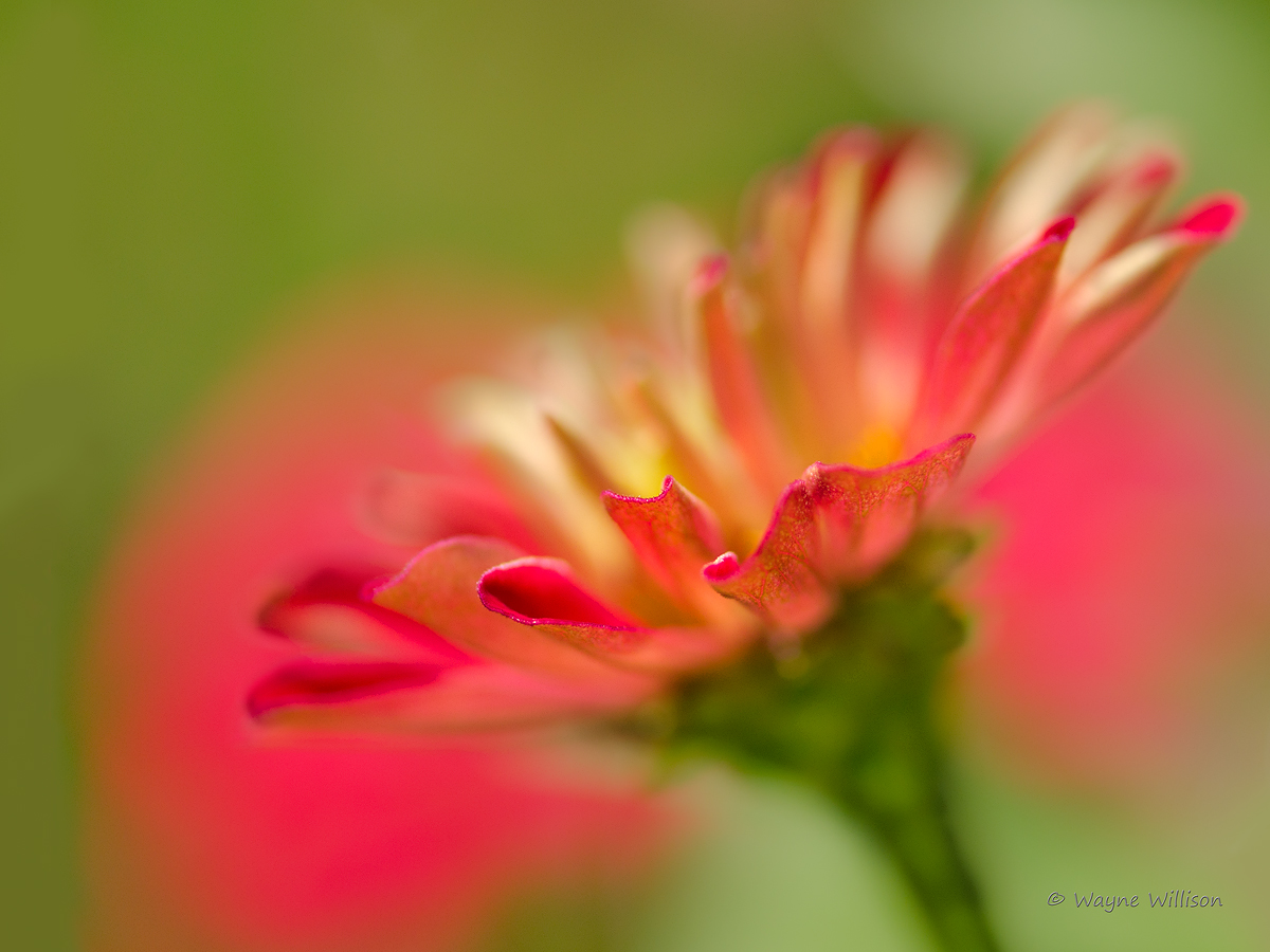
Another garden Zinnia fills the lens.
D7000 105 micro, f/3.3 1/2000 hh
Comments
16 comments
Comment posted by Lon Overacker on August 24, 2011 at 3:15 PM
Wayne,
Really love the softness and color. The bit of sharpness up front works wonderfully to anchor and have a place for the eye to rest. Interesting how the bg worked out here. I'm almost wishing that the nice color blobs of red were positioned in opposite corners to they competed less with the flower. But that's just a thought as much of this is simply about the color. I'd say well done.
Lon
Registered on November 24, 2006, 521 Posts, 19147 Comments
Comment posted by Bill Fach on August 24, 2011 at 4:28 PM
Wayne: Very pleasing color palette and I like your DOF/POF choices. Pretty darn nice BG too. >=))>
Registered on November 1, 2003, 1805 Posts, 26981 Comments
Comment posted by Morris McClung on August 24, 2011 at 5:58 PM
Powerful color! I also like the diagonal line of the flower and the dof, pof choices. Beautiful work.
Registered on May 7, 2007, 670 Posts, 19650 Comments
Comment posted by Ramamohan Pai on August 24, 2011 at 6:10 PM
Great selective focus for the few petal edges there, Wayne. Looks great to me with the red wash in the background.
Registered on November 1, 2003, 550 Posts, 9037 Comments
Comment posted by Harley Goldman on August 24, 2011 at 6:24 PM
Beautiful image. You selective focus works really well and great colors.
Registered on November 19, 2003, 586 Posts, 11271 Comments
Comment posted by Gary Yeoh on August 24, 2011 at 7:58 PM
Wayne:
Beautifully done soft focus. Like the red wash in the bg. No suggestion.
Registered on September 1, 2009, 588 Posts, 8184 Comments
Comment posted by Wayne Jones on August 24, 2011 at 10:26 PM
Hi Wayne,
Composition, colors, bokeh, and selective focus are all beautiful.
Registered on April 18, 2007, 953 Posts, 6435 Comments
Comment posted by scott lanz on August 24, 2011 at 10:26 PM
Wayne, I like the colors, POF, and comp. I do find the BG wash is a little strong and competes (blends) with the main subject, but still a very nice image overall.
Registered on November 14, 2003, 840 Posts, 12902 Comments
Comment posted by Anne K. Rusk on August 24, 2011 at 10:31 PM
I find these flowers difficult to compose and you have mastered it here. They have such a colorful impact in person and images normally fall short, but in this one the color is the subject and highlighted so well. Very nicely done!
Registered on October 10, 2010, 65 Posts, 904 Comments
Comment posted by Mauro Pasquero on August 25, 2011 at 3:12 AM
Beautiful creation. Very pleasant image with great colors.
Mauro
Registered on January 21, 2010, 650 Posts, 2500 Comments
Comment posted by Brigitte Lorenz on August 25, 2011 at 7:21 AM
wonderful softness and light...very nice!!!
Brigitte
Registered on January 10, 2009, 187 Posts, 1507 Comments
Comment posted by Ian Wolfenden on August 25, 2011 at 11:45 AM
Gorgeous, Wayne ! The flushes of colour surrounding the sharp petal rims strike the eye immediately, and the placement of the flower to the R, hinting at the opening of the centre, seems just right to me.
Registered on May 18, 2007, 1108 Posts, 7647 Comments
Comment posted by Nathan Buck on August 25, 2011 at 2:36 PM
Great BG and an interesting point of focus that you chose to use, Wayne. I love the color of the bloom and the BG.
Nathan
Registered on November 1, 2003, 1101 Posts, 13589 Comments
Comment posted by Craig Myers on August 25, 2011 at 2:50 PM
Very nice layering of focus: the sharpest areas create nice separation between the front and back of the flower, and there is just enough definition in the back of the flower to distinguish the flower from the background reds.
Registered on September 1, 2008, 85 Posts, 757 Comments
Comment posted by Angela Classen on August 25, 2011 at 9:51 PM
Love the color combo, the comp and your point of focus. Beautiful!
Registered on June 13, 2007, 434 Posts, 2742 Comments
Comment posted by Robert Dayton on August 27, 2011 at 9:51 PM
Impressive, Wayne! Good selective focus and DOF choice.
Registered on November 11, 2008, 281 Posts, 3958 Comments

Comments
16 commentsReally love the softness and color. The bit of sharpness up front works wonderfully to anchor and have a place for the eye to rest. Interesting how the bg worked out here. I'm almost wishing that the nice color blobs of red were positioned in opposite corners to they competed less with the flower. But that's just a thought as much of this is simply about the color. I'd say well done.
Lon
Beautifully done soft focus. Like the red wash in the bg. No suggestion.
Composition, colors, bokeh, and selective focus are all beautiful.
Mauro
Brigitte
Nathan