Nature Photographers Network
This is the preserved archive of the original Nature Photographers Network. The community continues at naturephotographers.network.
Tumblers
‹ PreviousLandscape GalleryNext ›

Tumblers

by Lon Overacker

Gallery: LandscapePosted September 22, 2011335 views22 comments
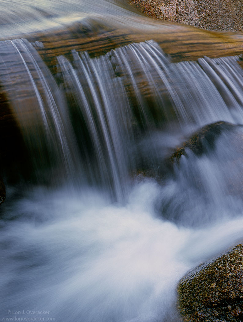
Thanks very much for the comments on my last image. Lately I've been going through the rest of my images from the Sonora Pass trip, some six weeks ago now. First pass through I almost discarded this one because it was underexposed, it was purplish-blue from the Velvia and it just didn't look very good on the light table. Well, I'm filing stuff away today and figured I better scan it anyway before stuffing it in a binder.

I'm glad I did. I kinda like it and am fairly happy with the processing. But of course I would like your feedback. All honest and constructive comments welcome.

4x5, 210mm, V100F, f/16 @ 1/2s

Thanks!
Lon

Comments

22 comments
Comment posted by Tom Hilton on September 22, 2011 at 7:12 AM
Sorry, no criticism....I like the shot a lot....
and you are shooting film?
Very interesting...
Registered on September 19, 2011, 68 Posts, 668 Comments
Comment posted by Bill Chambers on September 22, 2011 at 8:06 AM
Can't find any real criticism here - looks very nice to me. I'm just barely awake, but this looks very pretty to my eyes. If I had anything, I wish there was slightly more room on the left.
Registered on April 10, 2005, 753 Posts, 21216 Comments
Comment posted by Nick Bristol on September 22, 2011 at 8:54 AM
No criticism from me either, Lon. This is very nice. I think your comp works really well and I enjoy the movement of the water. I especially like the looks of the water at the top left side. The contrast between the flowing water and the somewhat diagonal lines in the rocks really works well together.

Nick Bristol
Lone Rock, WI
Registered on February 1, 2004, 752 Posts, 14140 Comments
Comment posted by Harley Goldman on September 22, 2011 at 10:07 AM
I am liking the middle of the frame, but the lower right rock is throwing out the composition for me. I think I would prefer it cropped at the bottom, just above that rock.
Registered on November 19, 2003, 586 Posts, 11271 Comments
Comment posted by Morris McClung on September 22, 2011 at 11:10 AM
The crossing lines of the water and rocks behind work so well! I like this for the subtle contrasts in textures, tones, and colors.
A lovely intimate, Lon.
Registered on May 7, 2007, 670 Posts, 19650 Comments
Comment posted by Youssef Ismail on September 22, 2011 at 11:48 AM
Lon,

I have to agree with Harley. But in addition to that, the dark area on the left bothers me as well. Possibly a crop from that side as well.
Registered on November 1, 2003, 474 Posts, 5555 Comments
Comment posted by Joseph Campisi on September 22, 2011 at 2:02 PM
Beautiful intimate little waterfall shot Lon. The only thing I would suggest would be to tone down those white highlights in the foreground water a bit. They're not blown, but they seem a little too bright to my eye, and they pull my eye right to that spot.

I think Harley's square crop suggestion has merit, but I actually like the detail of that foreground rock. And as far as what Youssef says, rather than cropping the dark area out, maybe lightening it would be a better solution.

Overall, a nice little scene!
Registered on November 24, 2008, 304 Posts, 3211 Comments
Comment posted by Charlie Baugh on September 22, 2011 at 2:41 PM
It is a beautiful image. I wonder if the water is flowing over a log and not rocks.
Registered on April 18, 2011, 329 Posts, 1985 Comments
Comment posted by Lon Overacker on September 22, 2011 at 3:10 PM
Thanks for the comments and observations folks. I struggled with the balance in this comp. And actually it's a crop, so there is more room on the left, however it's just more black space and I thought it wasn't adding to the image. Lightening the dark area on the left isn't really an option. Can't create detail when there is none... ;-) Interesting that there are two ways to look at - either too tight on the left or need more room and detail. I think I'll toss in the un-edited and un-cropped version for reference.

I like the idea of a crop Mr. H. and have played around with that. I think it works as an alternative comp and the compromise is losing the fan-out and texture of the water. Choices, choices.

Charlie - great observation. It is in fact a log that the water is tumbling over. I guess I never thought it might be perceived that way because of course I was there and already know what it is.

Thanks for the comments folks. I'm thinking that with a number of varying opinions, that tells me this isn't the strongest of images..
Appreciate the open feedback.

Lon

ps. so you can see quite a distance between point A and point B. Oh, btw, even with my original crop I did a little bit of cloning in the URC to put a little rock texture in rather than having a black corner.
Registered on November 24, 2006, 521 Posts, 19147 Comments
Comment posted by Charlie Baugh on September 22, 2011 at 3:29 PM
I'm not sure why it being a log makes it a more interesting image but somehow it does for me. :smile:
Registered on April 18, 2011, 329 Posts, 1985 Comments
Comment posted by David Schwaegler on September 22, 2011 at 3:32 PM
The crop suggestions are interesting. If applied they would move the image much more toward abstract and be fundamentally different than what you are presenting. I like the foreground rock because it explains the water flow, and the dark left side doesn't bother me at all.
Registered on December 4, 2003, 232 Posts, 1652 Comments
Comment posted by Robert Stough on September 22, 2011 at 5:57 PM
A lovely intimate streamscape Lon. The flow of the water over those striated rocks is beautifully done. I like this comp just as it is with that flow being complimented by the foaming pool and rock.
Registered on November 20, 2010, 26 Posts, 273 Comments
Comment posted by Rudy Ruberti on September 22, 2011 at 7:53 PM
What I really like here are the vertical lines created where the water leaves the log (which I also thought was a rock until I saw the repost), as well as the lines in the water and on the log. Therefore, I like the idea of a crop off the bottom. These scenes remind me of filling up water bottles while backpacking in the Sierra.
Registered on October 28, 2008, 179 Posts, 1875 Comments
Comment posted by Dan Roberts on September 22, 2011 at 8:16 PM
I like tighter versions of flowing water like this. Nicely done.
Registered on March 9, 2011, 69 Posts, 501 Comments
Comment posted by Paul Duval on September 22, 2011 at 8:22 PM
Lon,
I'm a sucker for water veils, many of the log in stream shots I've attempted look more apocalyptic than pleasant and peaceful. This pulls that off. I can hear the rushing water looking at this.

Paul
Registered on June 30, 2009, 508 Posts, 1907 Comments
Comment posted by Navin Sarma on September 22, 2011 at 11:25 PM
gotta say, i like your first version best, and the foreground rock framing the scene. i dont like seeing too much of the top of the falls, feels like it detracts from the peaceful action below. i like the warmer colors in the first version more than the the blues of the second. again, love the textures in your waterfall images.
Registered on July 17, 2011, 233 Posts, 1373 Comments
Comment posted by Anil Rao on September 23, 2011 at 1:55 AM
I am glad that you didn't discard this after all. The composition is beautiful. I love it because of how it showcases the dynamics of falling water while retaining a strong abstract quality as well.
Registered on November 15, 2003, 234 Posts, 4923 Comments
Comment posted by Preston Birdwell on September 23, 2011 at 2:57 PM
The color, tonality and detail are great. Like our esteemed colleague Mr. Harley, I find the rock on the LRC to be a bit distracting. Cropping from the bottom removes a lot of the interesting detail in the water and also removes the clue as to why the flow itself is doing what it does. Cropping also makes the image too tight, in my opinion.

I love the concept, Lon, but I wouldn't put this one in the your top tier.

--P
Registered on November 1, 2003, 471 Posts, 5188 Comments
Comment posted by Jude Haase on September 23, 2011 at 3:08 PM
Beautiful composition Lon!! :toast:
Registered on April 3, 2006, 236 Posts, 1657 Comments
Comment posted by Tony Kuyper on September 23, 2011 at 10:34 PM
Sorry for tuning in late. I like the scene, but am equally impressed with the transformation from the post original. You really pulled a good image out here. It gets at that "computer" type vision that is as important as seeing things in the field. Maybe they really aren't all that different, I'm not sure, but it helps to be able to do both.
Registered on November 1, 2003, 364 Posts, 22328 Comments
Comment posted by David Edwards on September 25, 2011 at 4:57 AM
A lovely intimate waterfall scene, Lon. It's interesting to see the original compared to the finished image. There's lots to like in the image, like the wonderful log and water textures. The balance doesn't seem quite as good as your previous comp's, but it is still very engaging. It almost feels like the left side of an image that's been cut in half. Perhaps it's the angle of view causing this or maybe the lower right rock being in the frame is throwing off the balance a little. A lovely scene none the less.
Registered on December 6, 2008, 142 Posts, 2623 Comments
Comment posted by Jay Levin on October 21, 2011 at 3:43 PM
A belated critique, Lon. I say, leave it alone. You can drive yourself nuts trying to improve upon an already beautiful image. Initially I was wondering what the URC was, but your earlier images answer that. The water flowing over the log is gorgeous, and that's what the eye focuses on anyway.
Registered on April 24, 2009, 21 Posts, 184 Comments