Gallery: FloraPosted October 8, 201177 views8 comments
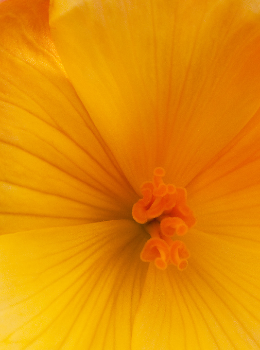
Shot this back in August and just got around to taking a good look at it. Not sure how the center works with the rest of the image but I like the light and lines of the petals.
Thanks for looking.
Comments
8 comments
Comment posted by Pat Sampson on October 8, 2011 at 6:18 AM
I like this very much Bruce but I wouldn't be able to resist cropping from the top to a square aspect ratio. Love the abstract quality, the radials and the texture of the center.
pat
Registered on May 19, 2007, 953 Posts, 15989 Comments
Comment posted by scott lanz on October 8, 2011 at 9:24 AM
Excellent. I agree with cropping from the top for simplicity and symmetry, but I think I'd prefer a 4 x 5 ratio.
Registered on November 14, 2003, 840 Posts, 12902 Comments
Comment posted by Vincent Nobel on October 8, 2011 at 9:34 AM
Great photo! Love the crop and how you placed the main subject on the lower front third of the image - well balanced all around!
Registered on June 16, 2010, 57 Posts, 175 Comments
Comment posted by Morris McClung on October 8, 2011 at 10:38 AM
I agree with Pat on the crop. And it seems to need a touch of mid-tone brightening. But, that's a matter of taste. I like the color as well.
Registered on May 7, 2007, 670 Posts, 19650 Comments
Comment posted by Albert Darmo on October 8, 2011 at 10:09 PM
Hi Bruce Beautiful lines and color Yes, a crop on top, would make this image even stronger
Albert Darmo
Registered on November 25, 2008, 1386 Posts, 11978 Comments
Comment posted by Anne K. Rusk on October 8, 2011 at 11:26 PM
I love begonias for their Dr. Seuss-like centers. Before reading the other responses, I was thinking that the curve at the top takes away from the straight lines leading out of the center. Wonderful colors and symmetry!
Registered on October 10, 2010, 65 Posts, 904 Comments
Comment posted by Ken Smith on October 9, 2011 at 1:00 AM
Bruce, that's a sweet shot! the dark center, converging lines, and oozing orange curly thingys are great. Nice shot!
Registered on September 5, 2008, 449 Posts, 2444 Comments
Comment posted by Gary Yeoh on October 9, 2011 at 9:42 PM
Bruce:
Interesting composition. I like the of center placement of the stigma and the radiating lines. I agree with a slight crop up the top and also maybe some brightening.
Registered on September 1, 2009, 588 Posts, 8184 Comments

Comments
8 commentspat
Albert Darmo
Interesting composition. I like the of center placement of the stigma and the radiating lines. I agree with a slight crop up the top and also maybe some brightening.