Gallery: FloraPosted October 8, 201192 views6 comments
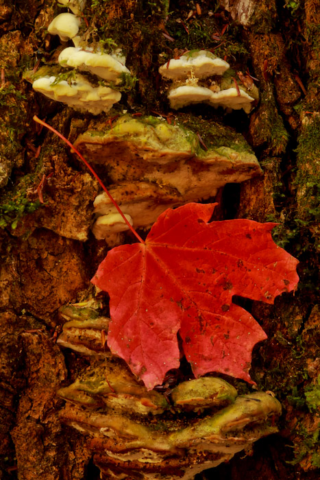
Went to the upper peninsula Michigan for a week. Its peak week for colors up there.
7D
f16
iso 100
1.3 sec
Comments
6 comments
Comment posted by Pat Sampson on October 8, 2011 at 6:20 PM
Todd,
I like this as posted but I think I might like a little more light to see the detail of the bg better or possibly a touch less saturation. Superb composition for my tastes.
pat
Registered on May 19, 2007, 953 Posts, 15989 Comments
Comment posted by Todd Bielby on October 8, 2011 at 8:34 PM
Thanks pat. I thought it was a little to saturated to but I didn't add any saturation to it. But I did Back off on the saturation a bit and it looks much better. Thanks for the suggestion.
Registered on March 10, 2011, 169 Posts, 392 Comments
Comment posted by Nathan Buck on October 8, 2011 at 11:17 PM
Nice textures and color Todd. Overall, a tad more light might help. Color looks OK for me. Did you add any sharpening to this version? I could use a tad more sharpness...
Nathan
Registered on November 1, 2003, 1101 Posts, 13589 Comments
Comment posted by Richard Teller on October 9, 2011 at 10:23 AM
I like the earthy colors in this image. Nicely seen.
Registered on August 23, 2010, 1162 Posts, 6692 Comments
Comment posted by Morris McClung on October 9, 2011 at 6:01 PM
I also like the comp and the light. And the repost looks more natural.
Registered on May 7, 2007, 670 Posts, 19650 Comments
Comment posted by Gary Yeoh on October 9, 2011 at 9:15 PM
Todd:
The repost looks great. Nice color. Also wish for a little more sharpening.
Registered on September 1, 2009, 588 Posts, 8184 Comments

Comments
6 commentsI like this as posted but I think I might like a little more light to see the detail of the bg better or possibly a touch less saturation. Superb composition for my tastes.
pat
Nathan
The repost looks great. Nice color. Also wish for a little more sharpening.